QUESTION: What logo formats should my DIY branding suite include?
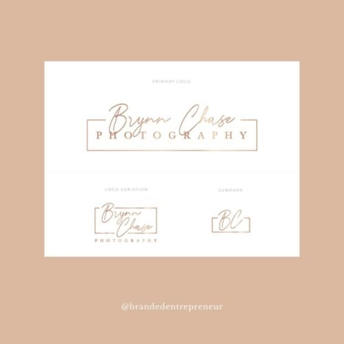
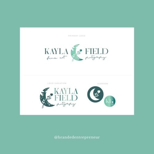
ANSWER: Your business should have at minimum, a primary logo and secondary logo (usually horizontal and vertical formats), a submark, and an icon. If you want more options, including a stamp, wordmark, and signature will set you up for success!
Branding isn’t just your logo.
If you know anything about the way I do what I do, you know that there’s one thing I will stand by literally forever: Branding is NOT just your logo. And if you’re looking at yours like it is? Well, you’re setting yourself up for a much more difficult road to success than if you consider all of the appropriate components as being part of your brand.
Anything customer-facing that represents your business should be branded – not just through the logo on it, or the palette used – it’s about everything from the specific words you choose when you’re speaking to your people (online, and off line!), to the clothing you wear in your branded photos.
Your brand materials should be able to fit any space!
But today – we’re not talking about the whole ecosystem. The messaging, vision, and other elements that come together to create your branding deserve their own full blown editions on the blog!! Today, we’re focusing on the responsive formats of logo that you need, especially if you’re on the DIY train. Because while your branding includes so much more than just your logo, your logo and associated marks should be able to do a TON of work for you!
The best way for them to do that, is if they can fit seamlessly into any space you need them to. That means having a suite of responsive logo materials that you’ll be able to put on your invoices, on your signage, in the corner of your social posts, and in your tab previews on Chrome!
1 – Primary Logo
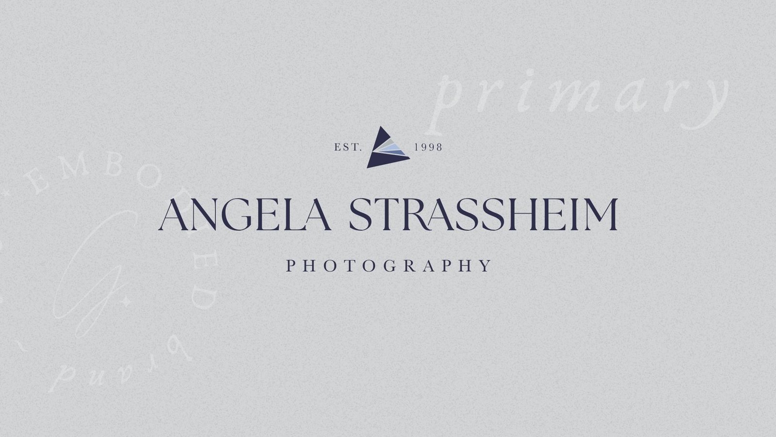
Of course, the first logo format you’ll need if you’re creating your branding materials yourself, is your full logo. Sometimes I recommend starting with this one, because usually it’s the design that’ll have the most components. And that means once you have it, you can use it as a baseline to reformat into the other layouts you’ll need! For example, once you have your full format, you have your font choices, 99% of the time. That means, you’ll be able to make a monogram icon, or an initial icon, super easily! (If that’s the route you want to go in for those materials, that is.)
Your full format logo may include things like the date you established your business, or even your location. It might include a tagline for your company, about what you do, or who you serve – or even both! This one gets to have multiple layers, can include an illustration (or not), might be vertical, might be horizontal – this is the format you have the MOST freedom with, because it has the fewest limitations.
A few things I do recommend to avoid (but obviously there are always exceptions to every rule!) is gradients, or complex textures. Or at least, if you DO want to include those components, you design an option that DOESN’T have those. Why? In a word: implementation. Your logo materials will be easier to use on actual items in the real world, and will be easier to resize into large formats like billboards or large scale signage, if they don’t include pixel-based items like, for example, watercolour.
But like I said… there’s an exception to every rule! And sometimes a suite of materials specifically calls for a gradient or complex texture in the background. As long as you’re breaking the rules in a cohesive, intentional way… the world is your oyster, babe!!
2 – Secondary Logo
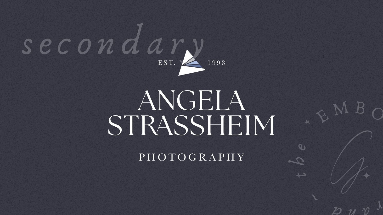
A “secondary layout” is sometimes also known as an “alternate layout” for your primary logo. The way I like to tell people to think about this format, is as if it’s a reformatting of your primary logo. It might use typography differently. It might stack the text differently. Maybe, it uses different colours, or a different combo of text and illustration, if your logo includes illustration.
I tend to lean in the direction of “if your primary logo is horizontal, your secondary should be loosely vertical”, and… the other way around, too. The reason for this is simple – what we’re aiming for with your logo materials, is to have formats that fit everywhere. Which means you’ll want something with all of the details for your business (or at least most of them!) that first in vertical spaces, and that fits in horizontal spaces.
It’s not always a perfect “this one is a rectangle and this is a square” situation, or a “these flip ratios perfectly” layout, either. More often than not, you’ll end up with something loosely square, and something else loosely horizontal, and that’s okay! But giving yourself the option, means you don’t have to worry about squishing a design that doesn’t fit the space allotted for it.
3 – Submark
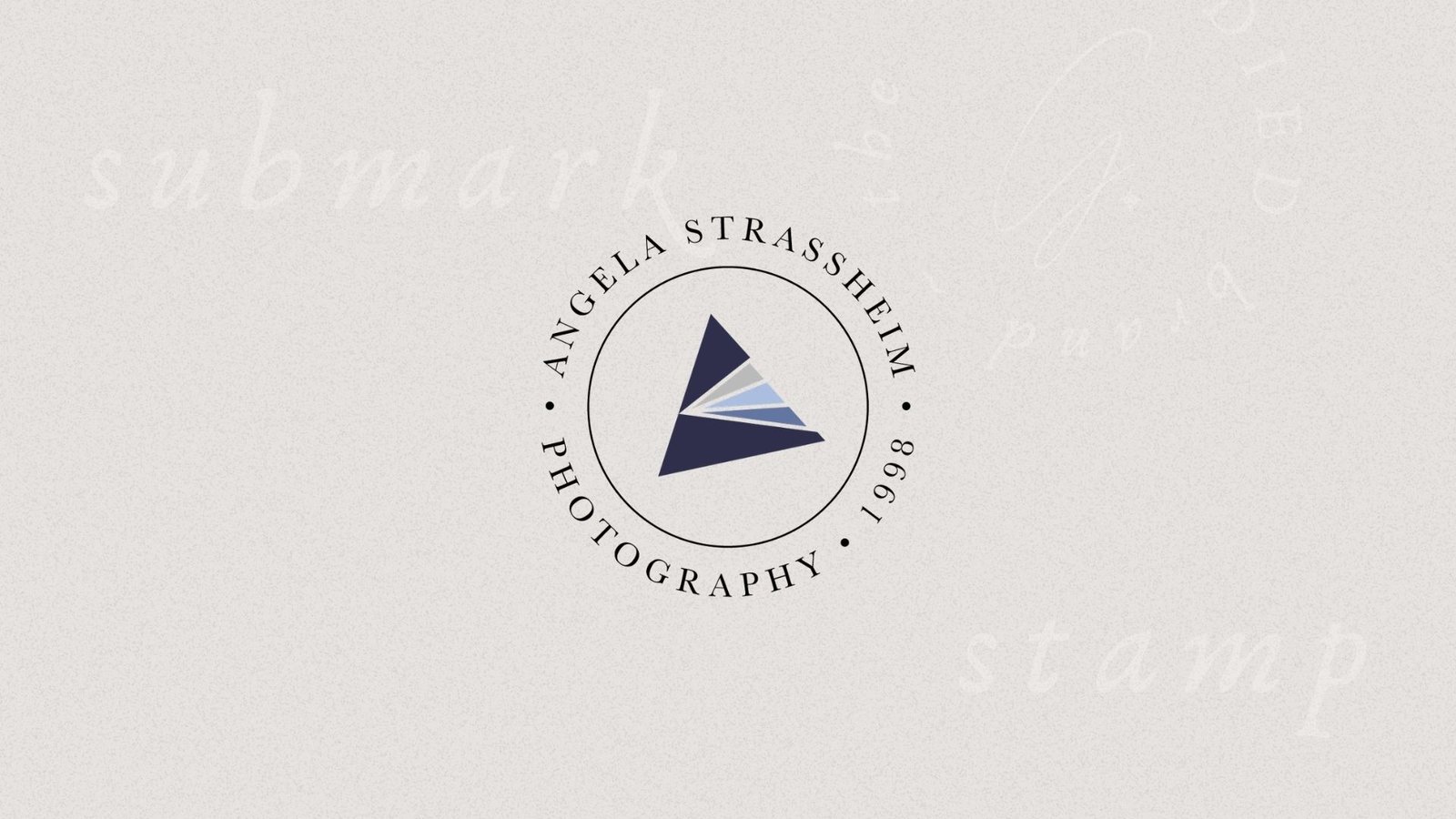
The “submark” for your brand suite can look super different depending on what you do, and in some cases, you can actually merge it with the “icon” option you see described below. This mark is intended to be a round/square layout, and it includes a simplified version of your business information. If you have a tagline included in your primary materials, you’re unlikely to include it here. Think about what might work for a business’ profile photo on social media, and you’ll be pretty much imagining a submark! They fit really well into that space.
Depending on how things come together, you may not even spell out your whole business name in this item – and that’s okay! It may be a slightly more complex monogram – or… just the monogram. Which brings us to…
4 – Icon
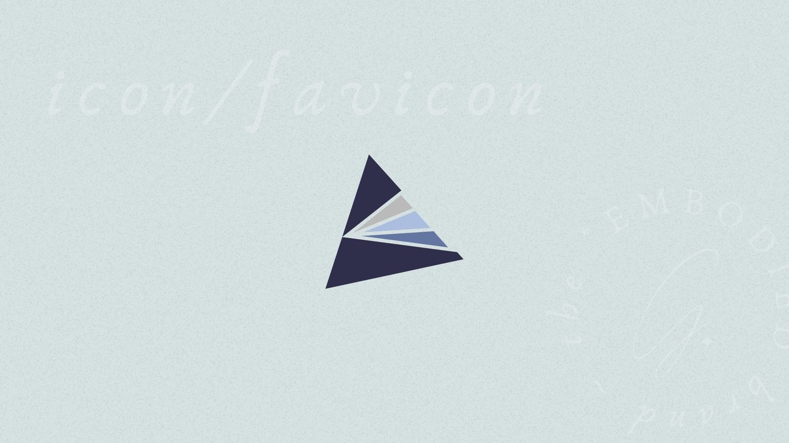
Your icon! As I said, sometimes icons and submarks are effectively the same (or 100% the same). And that’s okay! Keeping things simple where you can is usually a good choice – but icons have a few more limitations than submarks do. So your icon might be a submark, but it’s less likely for an item specifically designed as a submark to work as an icon, if that makes sense.
That’s because you want the icon for your branding suite to be INCREDIBLY small. And when I say “incredibly” here, I mean it needs to be recognizable in placements as small as the favicon in your browser tab. It has to be super simple, and super streamlined, otherwise it won’t be able to do its job!
5 – BONUS: Stamp / Wordmark / Signature
If you want to be EXTRA thorough with the designs you include in your DIY branding suite, you might want to include a stamp format, wordmark, and/or signature! These items are included in things like my top tier branding packages, but you can create them for yourself too. Sometimes, a submark is already in a stamp format – sometimes it’s not!
When I say “stamp format” what I mean is something that would work really well on an actual round stamp. Think about something you might have cast in brass, to then use on wax seals!
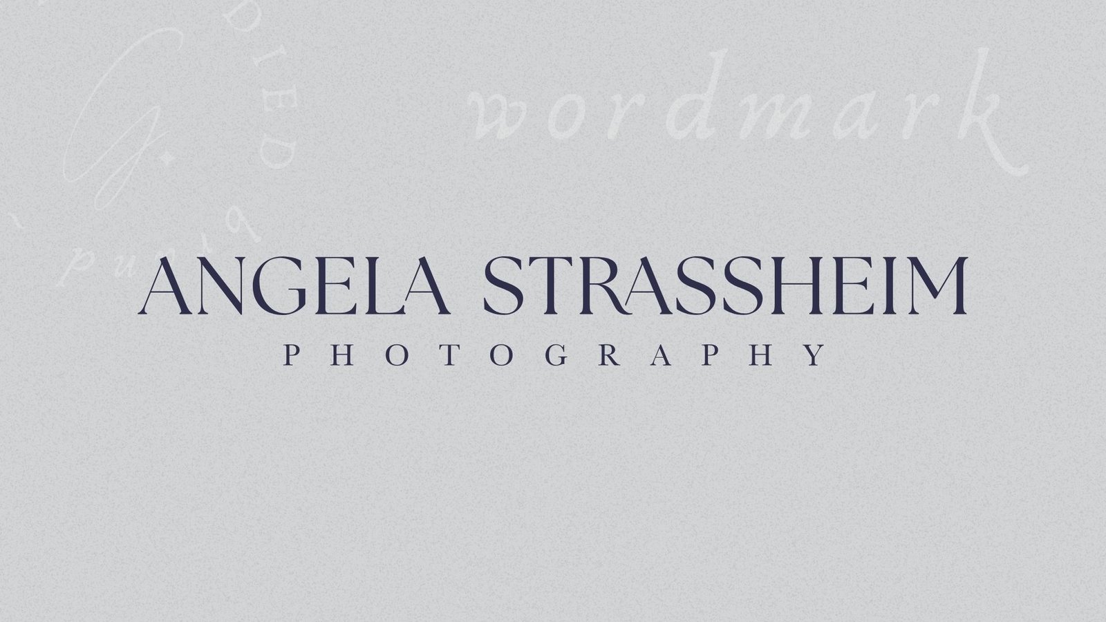
Wordmarks, are similarly straightforward in what they refer to. A “wordmark” is a mark in your suite, that ONLY uses text. Now, your primary or your alternate MIGHT already be wordmarks! But if you have illustrations included in your more primary materials, then giving yourself options without them can expand your suite into a set of options that fits in more spaces really well, without a ton of work from you.
And of course, then there’s the “signature”. And it too is exactly what it sounds like! It’s your signature, but created using a script font that aligns with the branding you’re working with for your business, even if your brand doesn’t technically include a script font in the other materials. I find that adding a signature, especially for creative brands, helps bring warmth to your overall suite, and makes things feel more personal. You can use them in all kinds of placements, from the end of your emails, to peppered into your web pages!
You don’t have to do it alone – there are designers like me who can help!
If you love creating content for your business, and you’re a confident DIYer, then it’s time for you to get to work! But if you’ve read this and you’re like “Oh god, I have to do so much more than just a logo” – we should talk. You do NOT have to do this alone, and you don’t have to lean on trial and error, either. You can work with a seasoned professional, who knows exactly how to make your content line up with the needs of your ideal clients, and attract them naturally. Which at the end of the day, is why you need a brand ecosystem to begin with!
So if you’re looking for a little help, I’m here to make that happen. But if you’re off to the races to DIY it – happy designing!








0 Comments