50+ Autumnal Colour Palettes to Inspire Your Next Project
Autumn vibes are where it’s at this season!
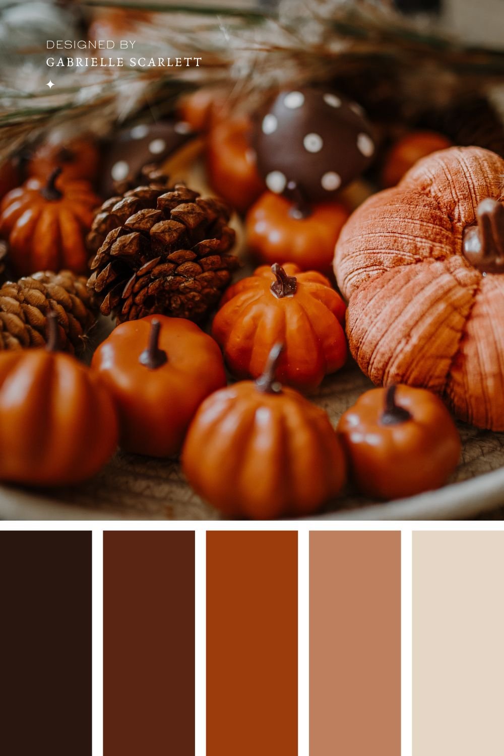
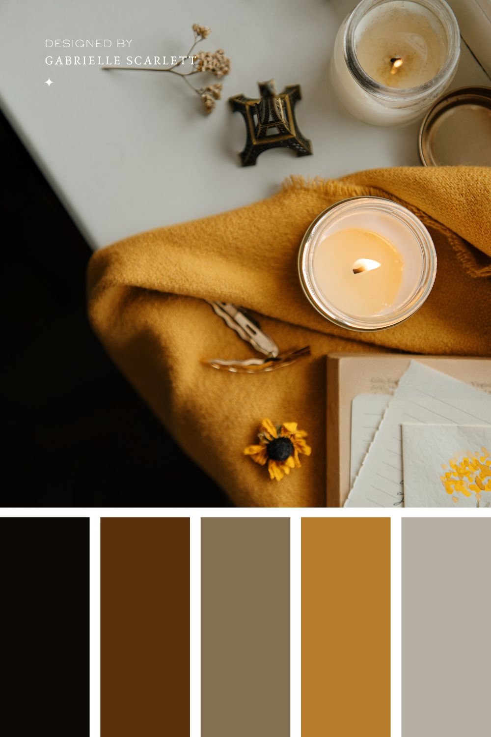
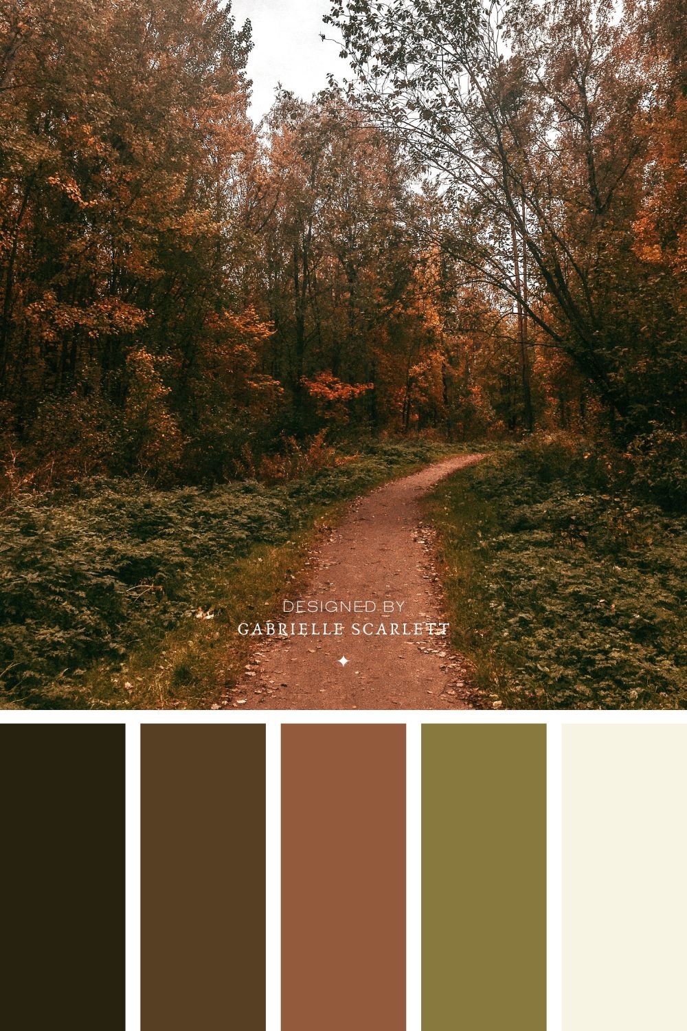
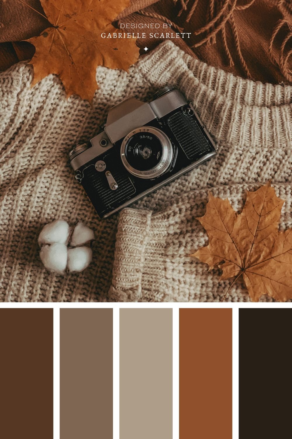
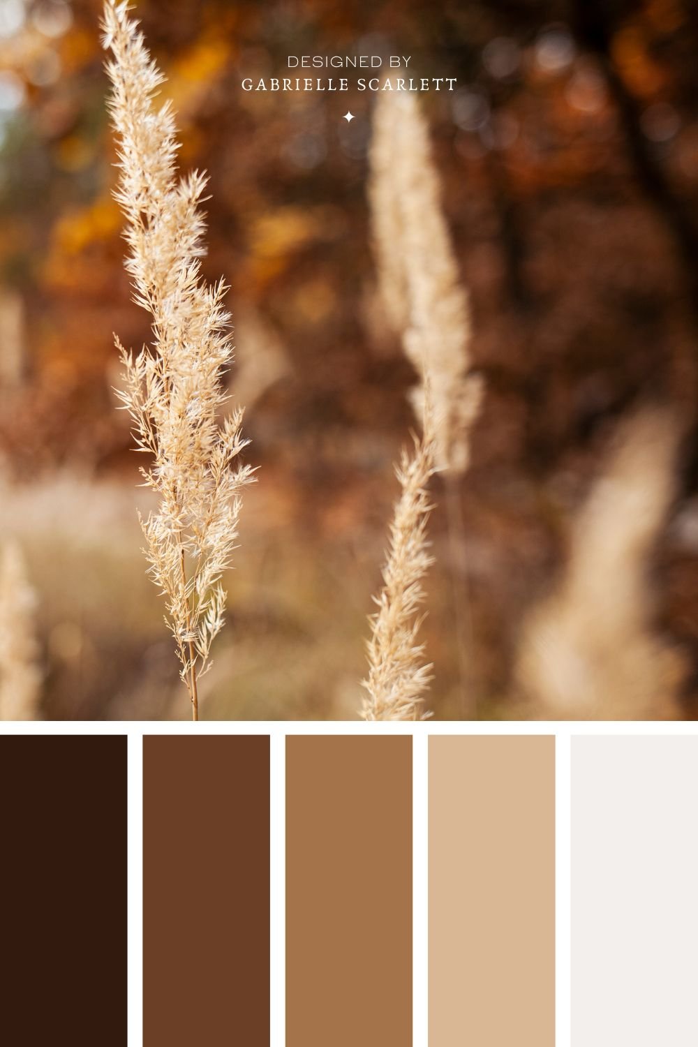
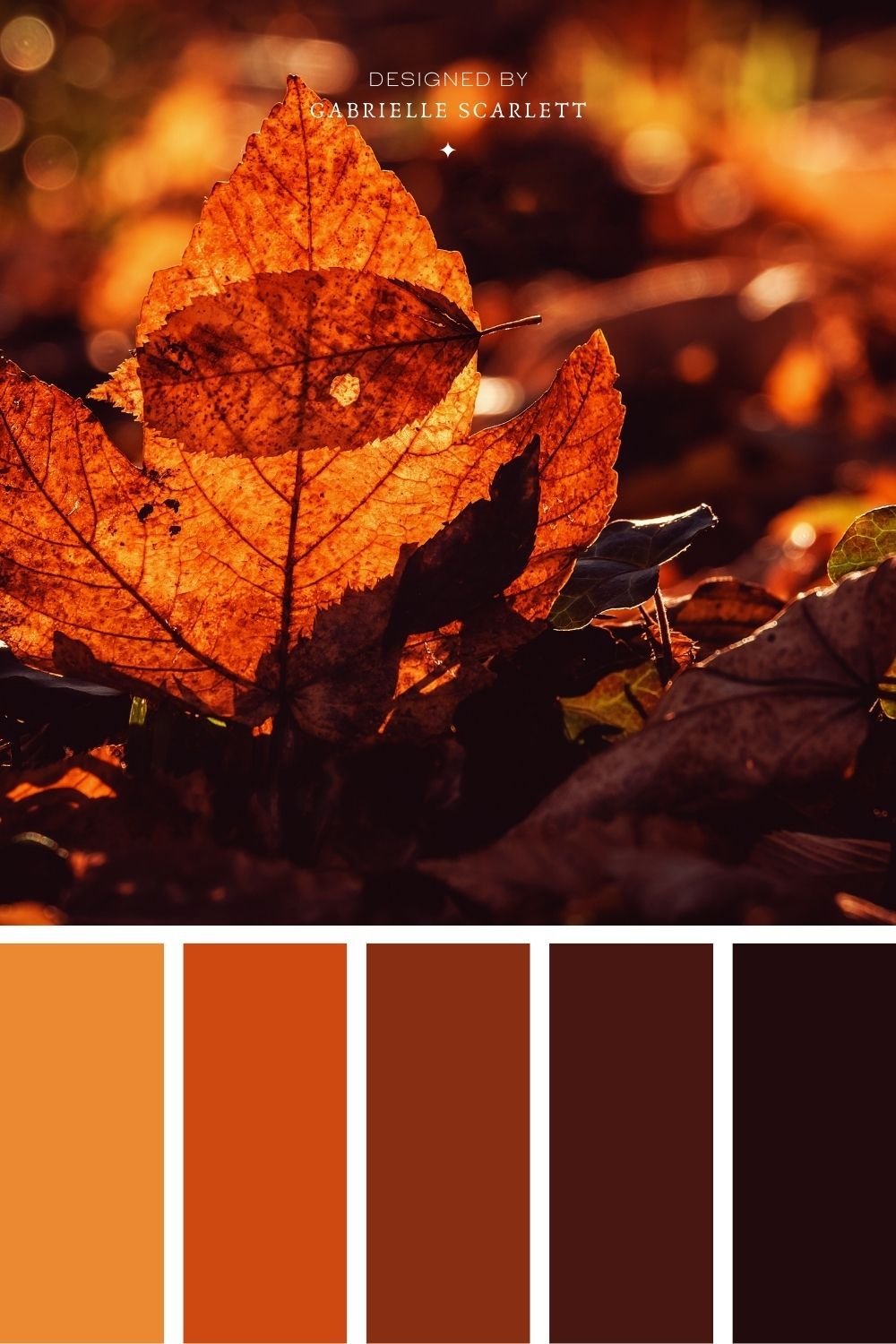
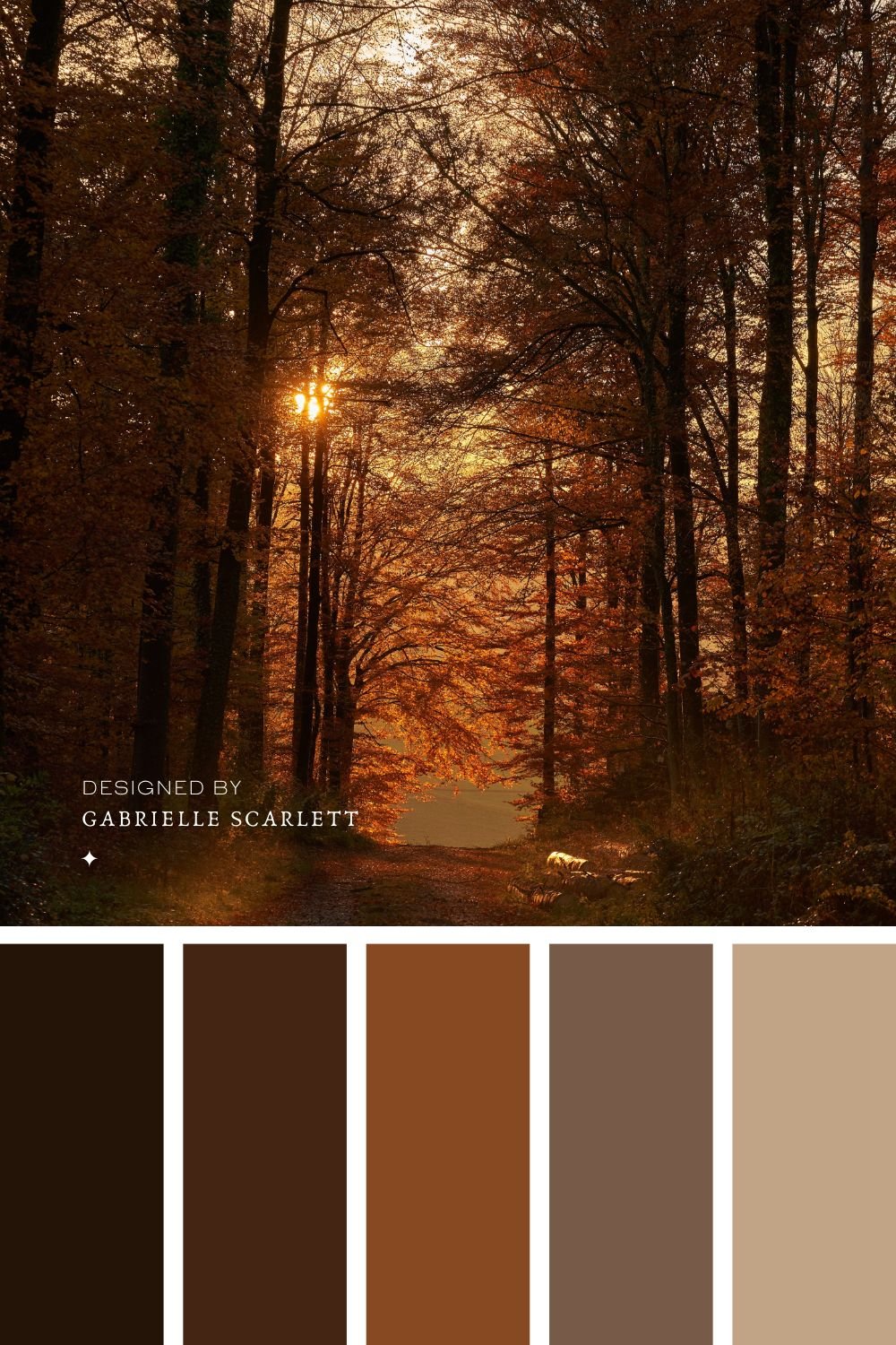
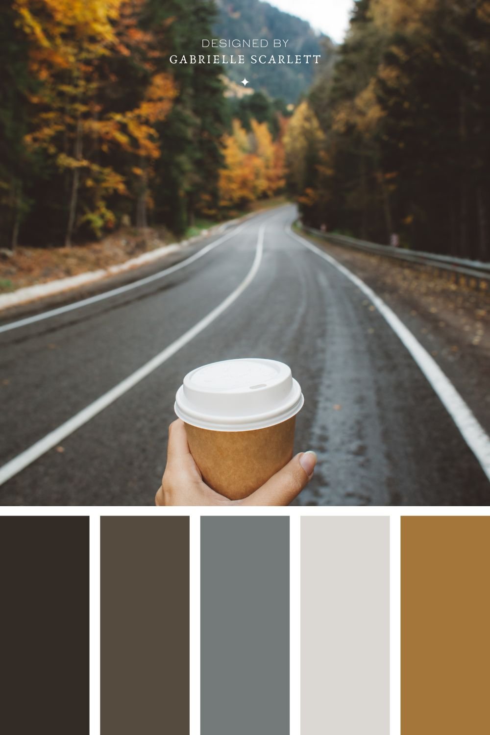
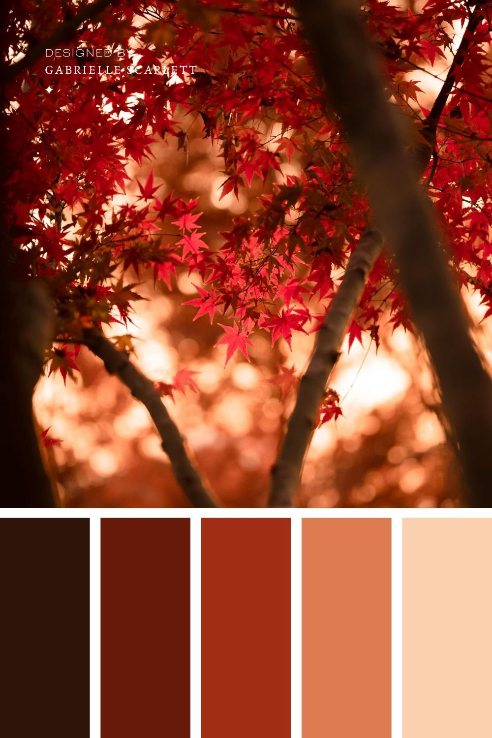
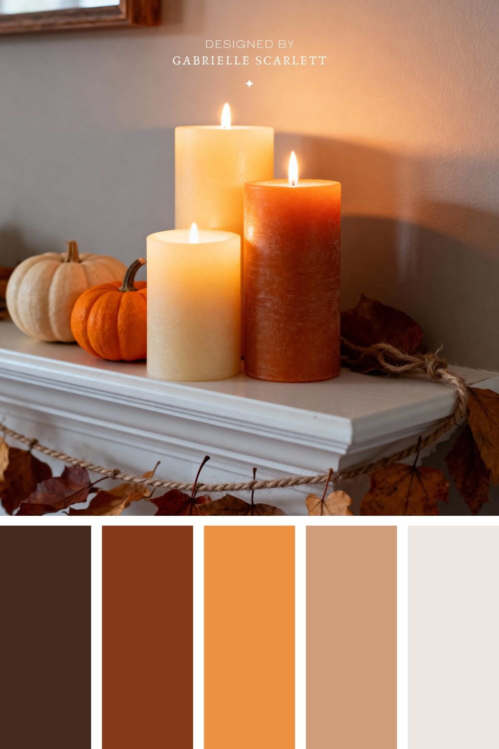
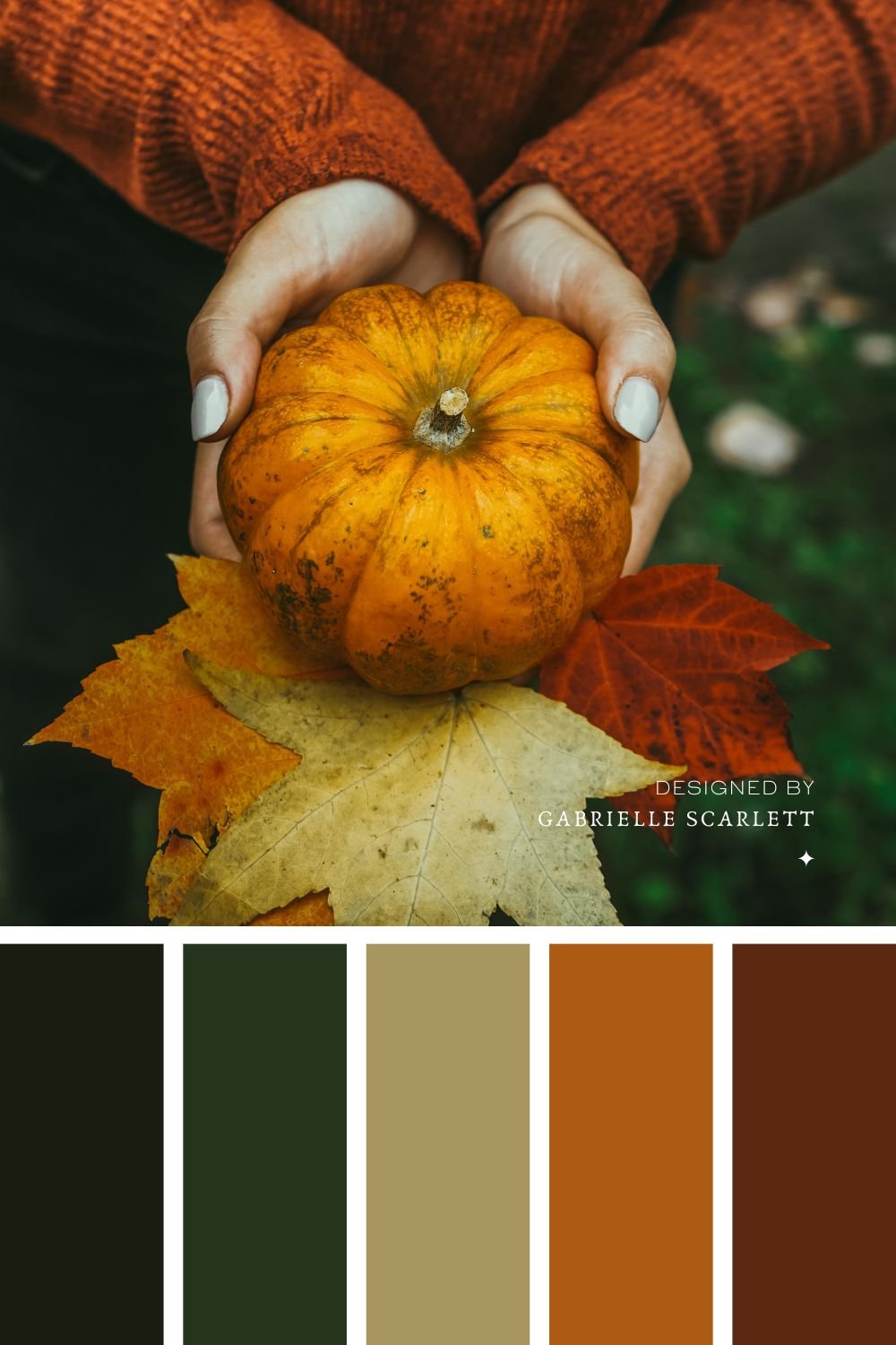
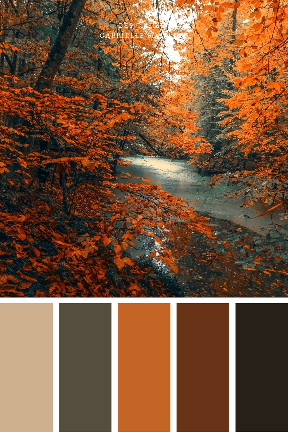
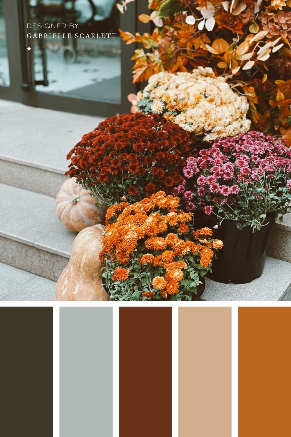
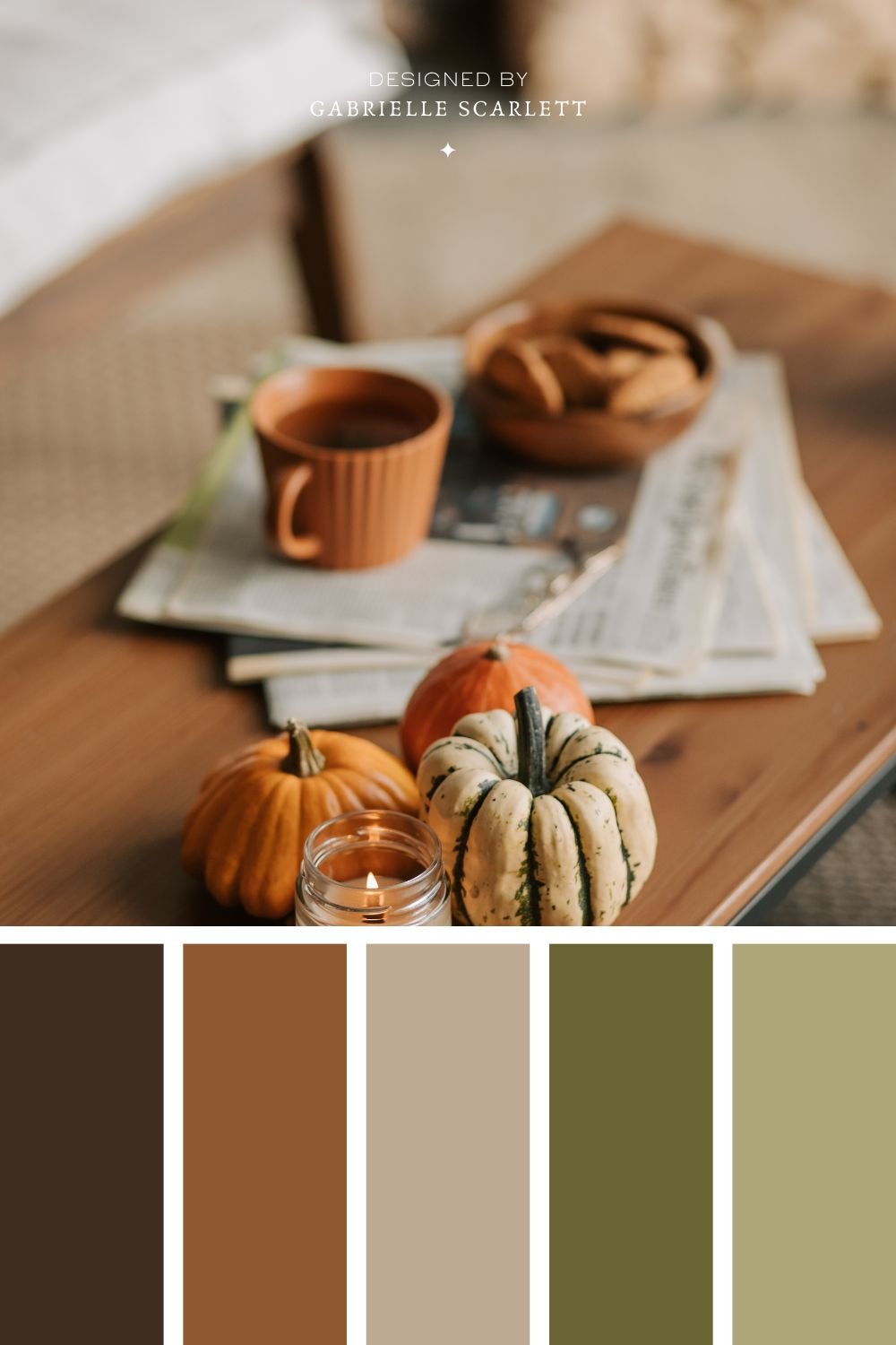
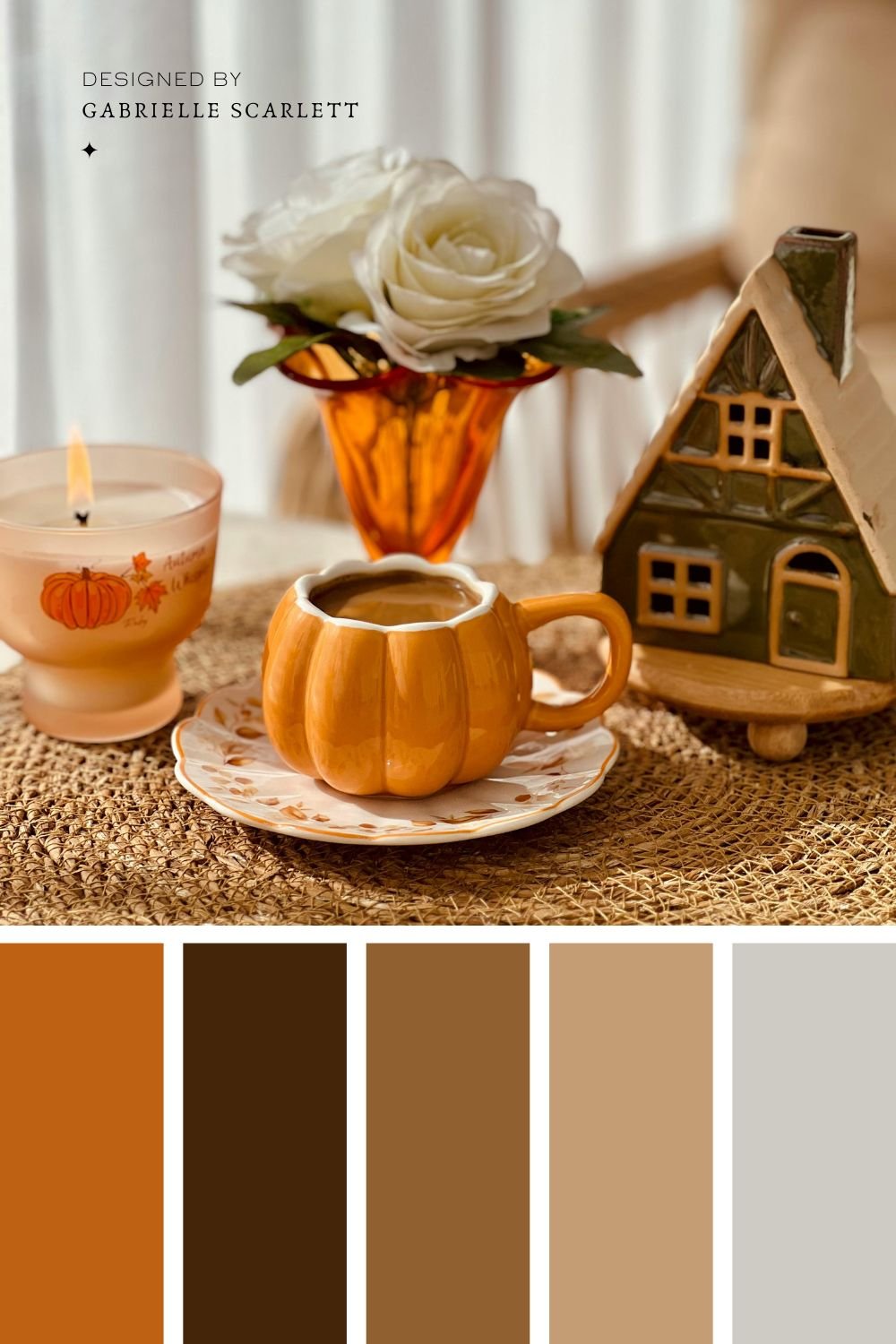
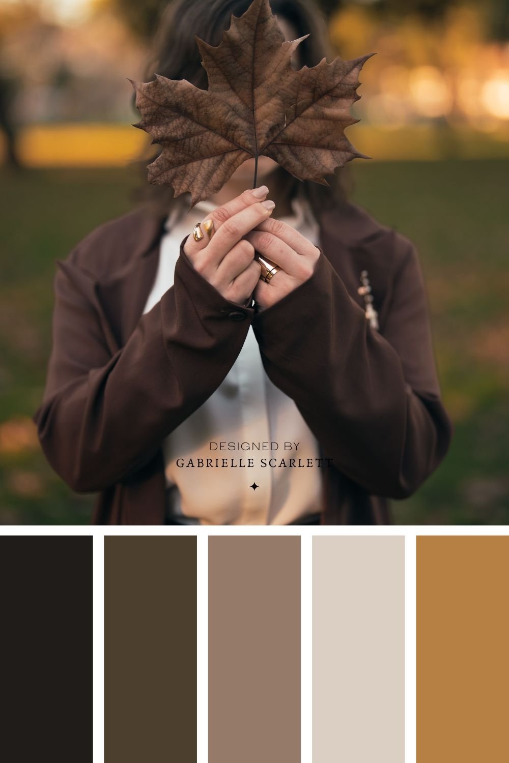
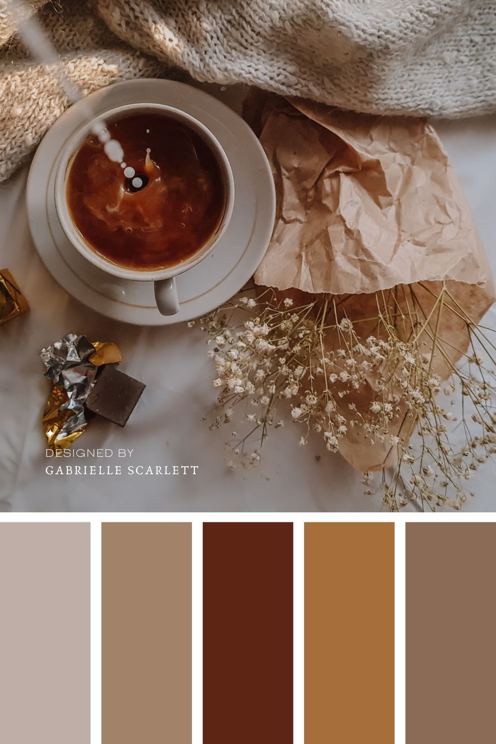
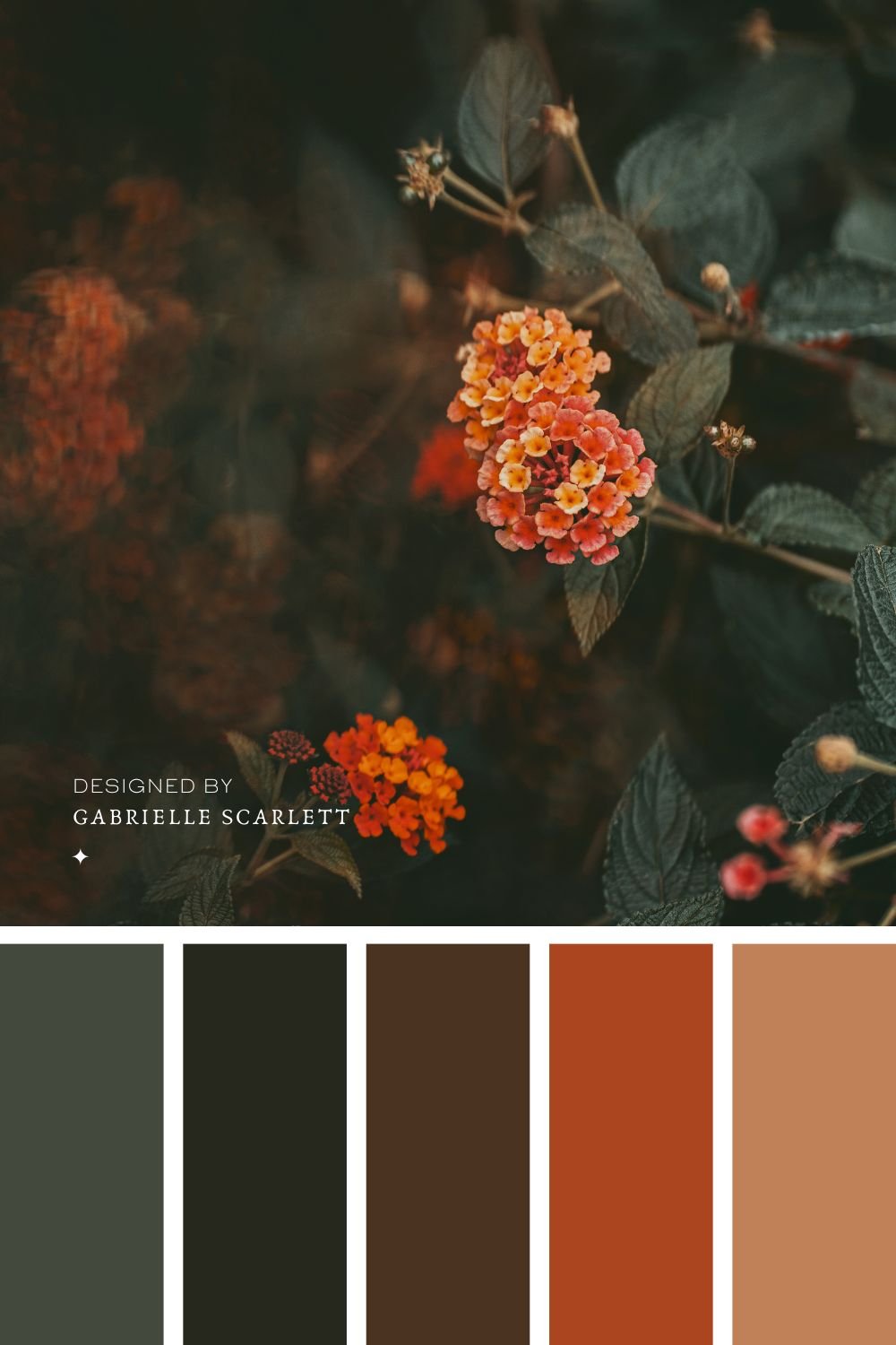
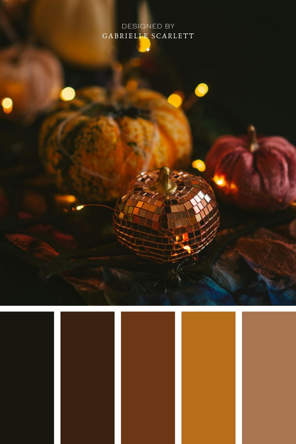
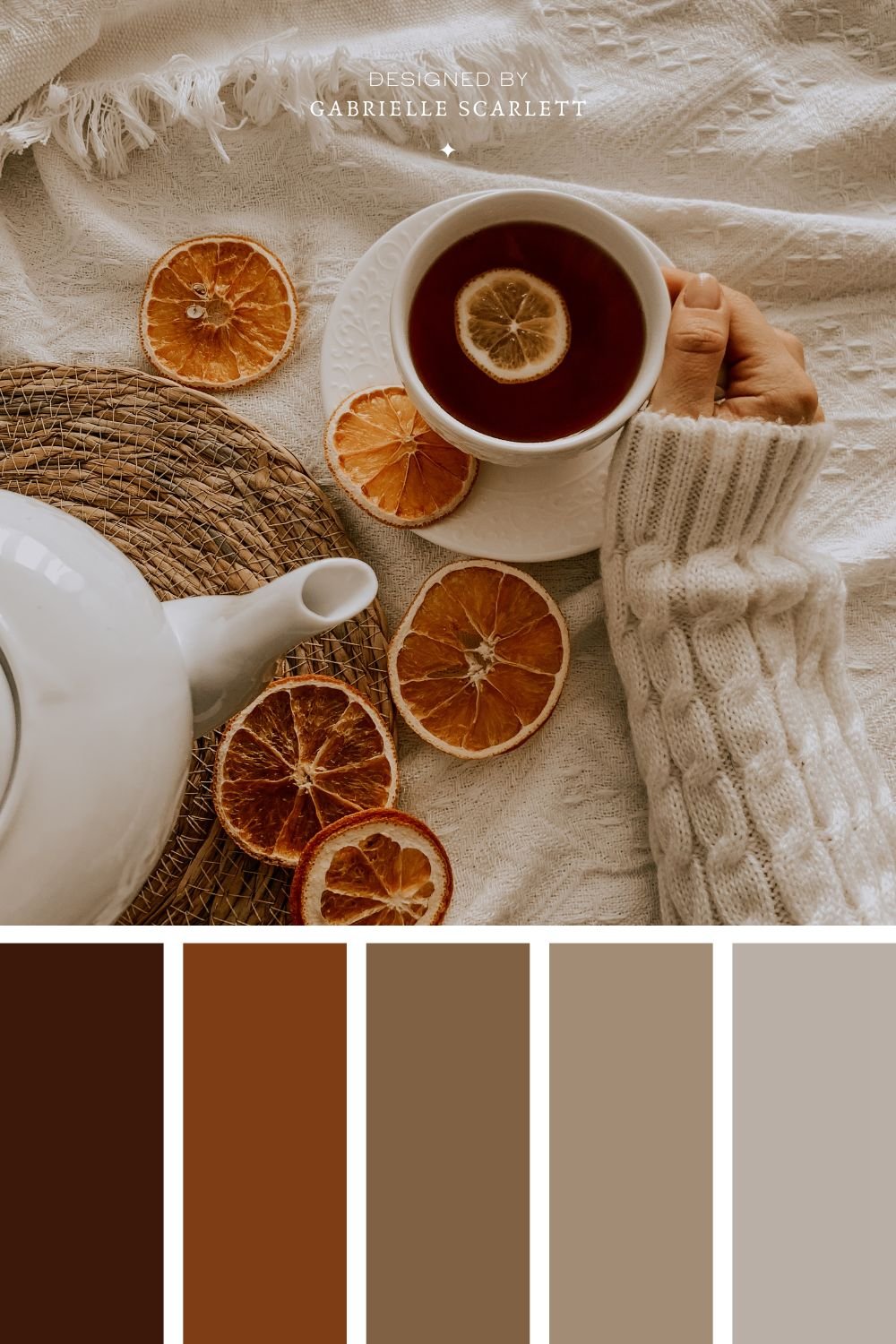
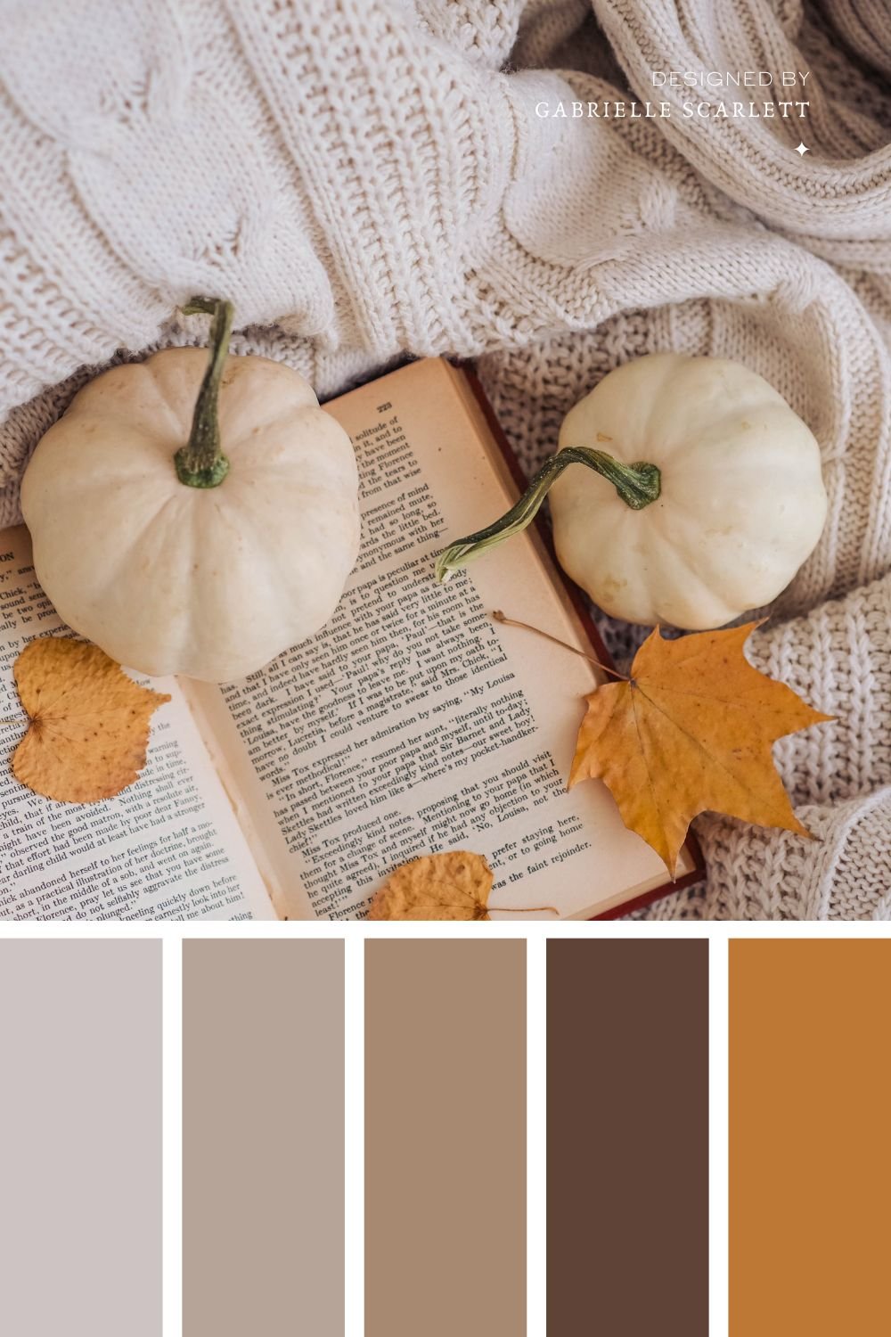
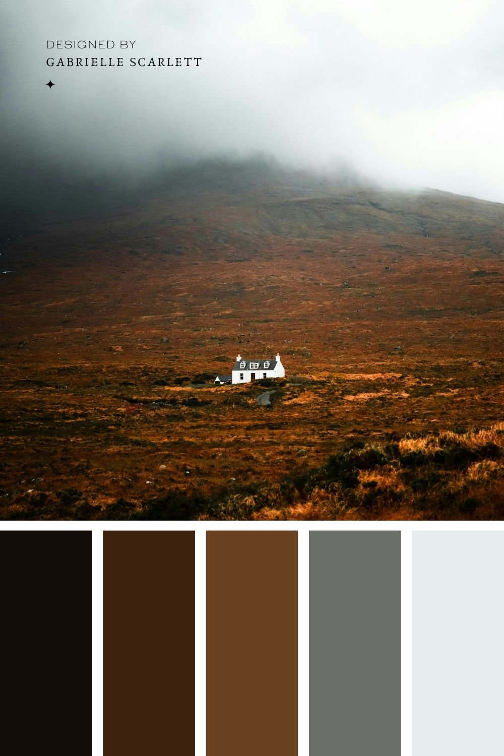
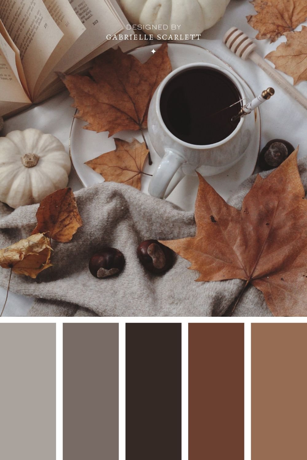
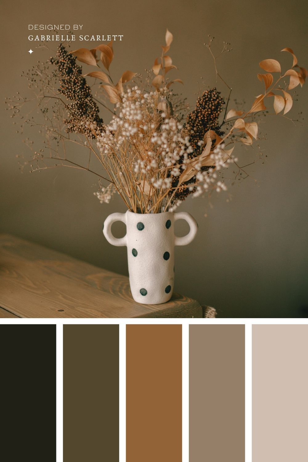
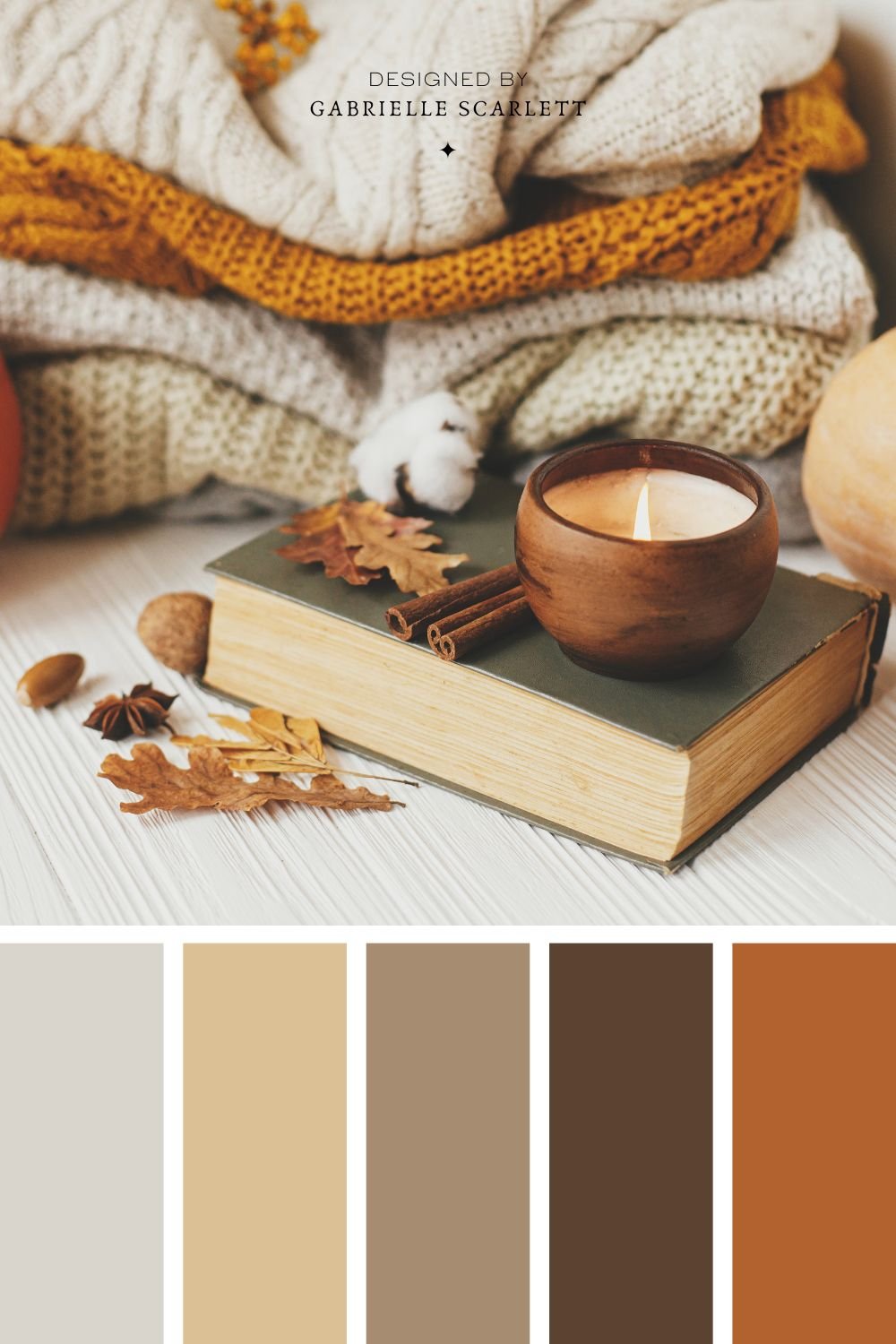
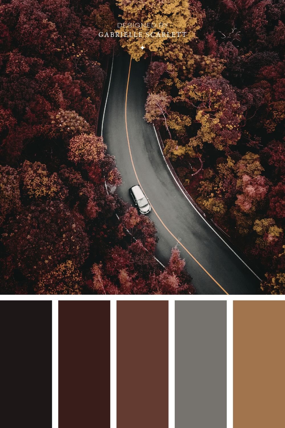
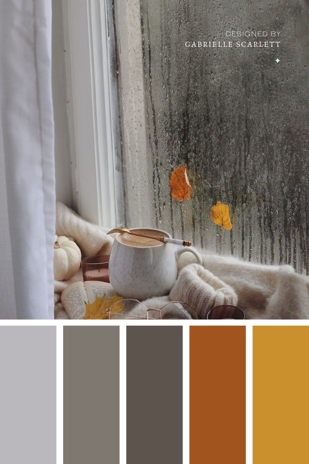
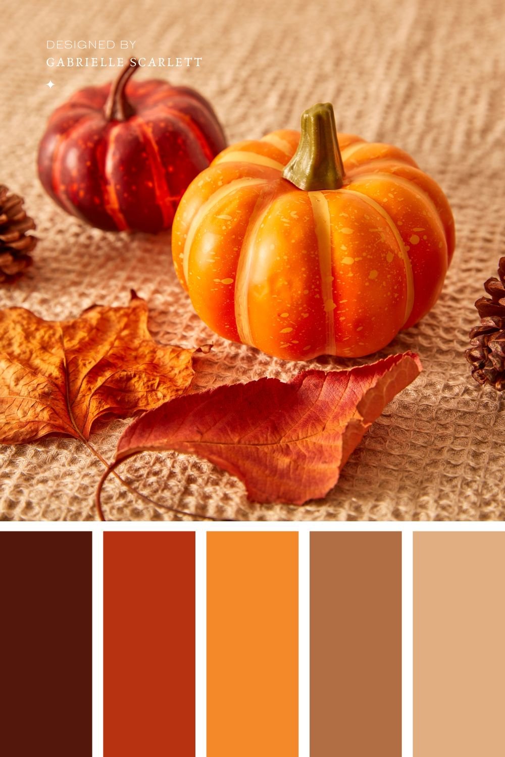
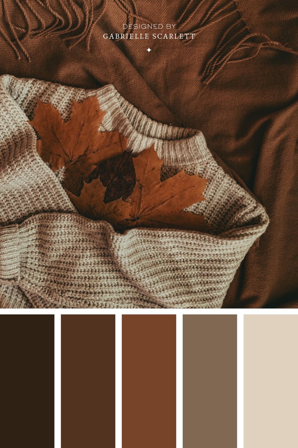
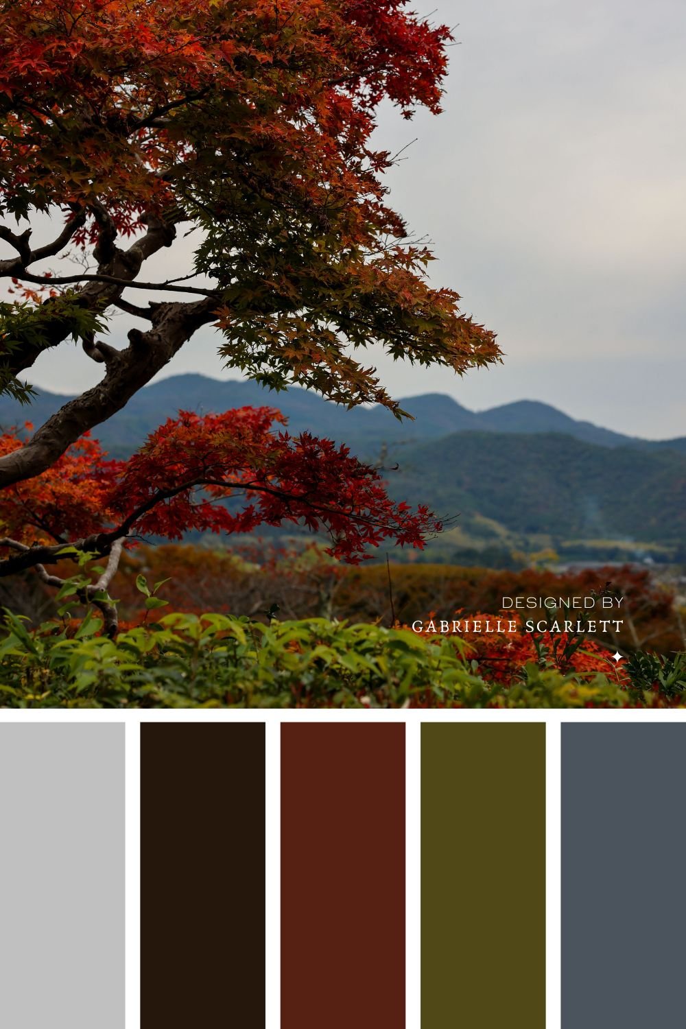
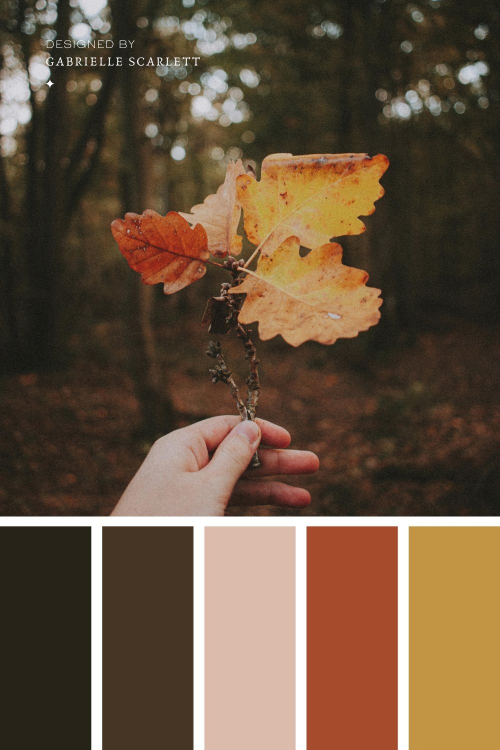
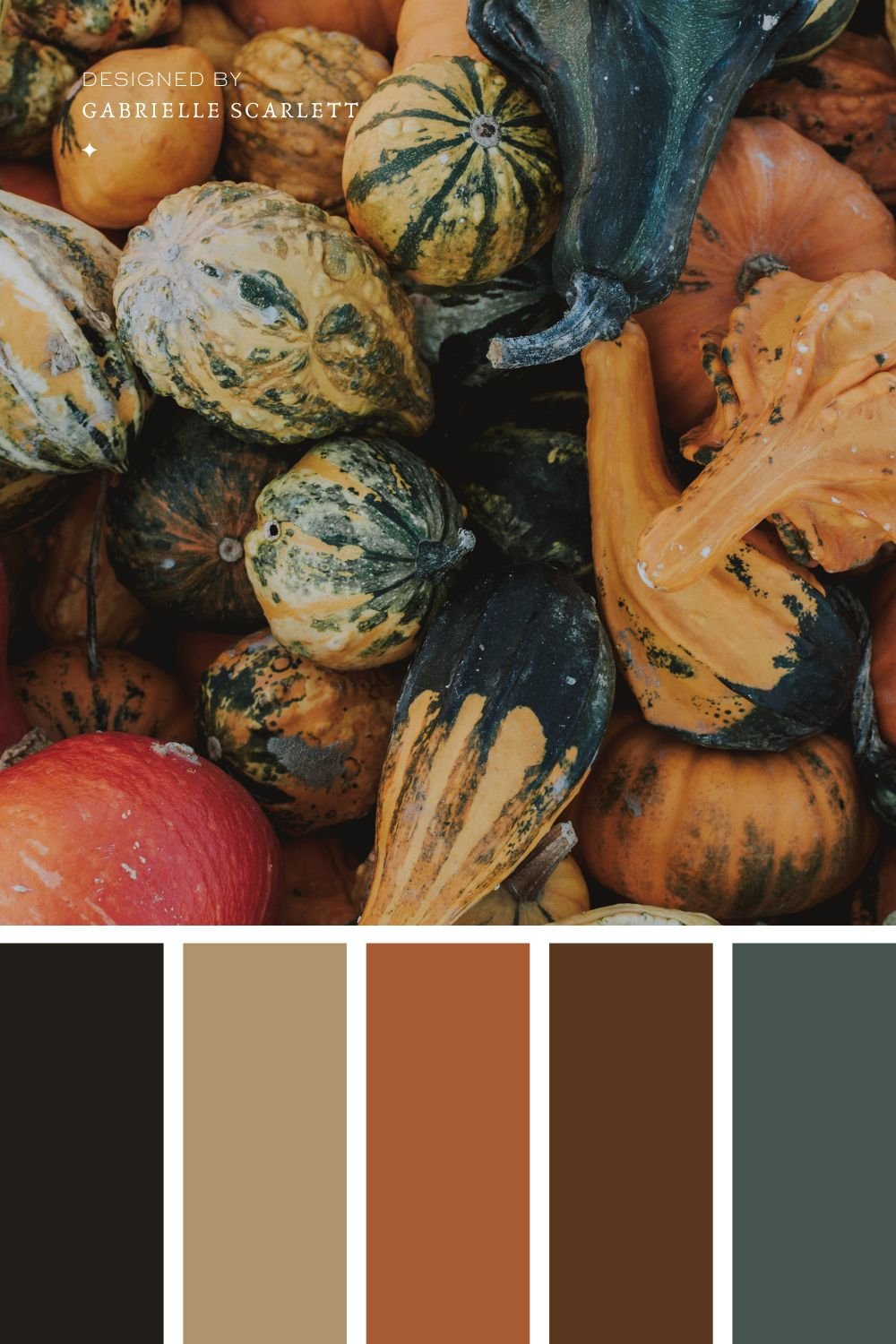
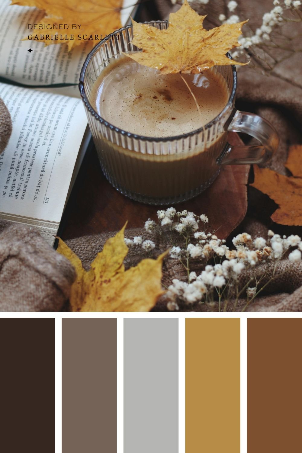
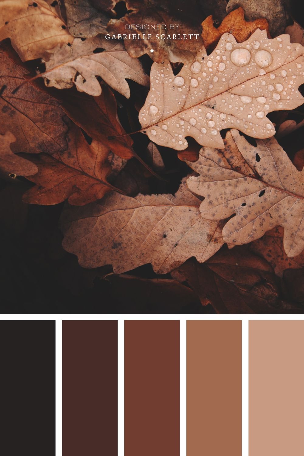
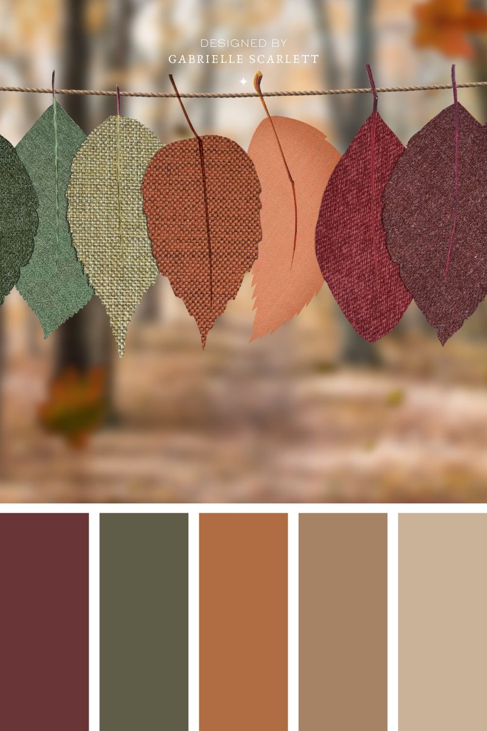
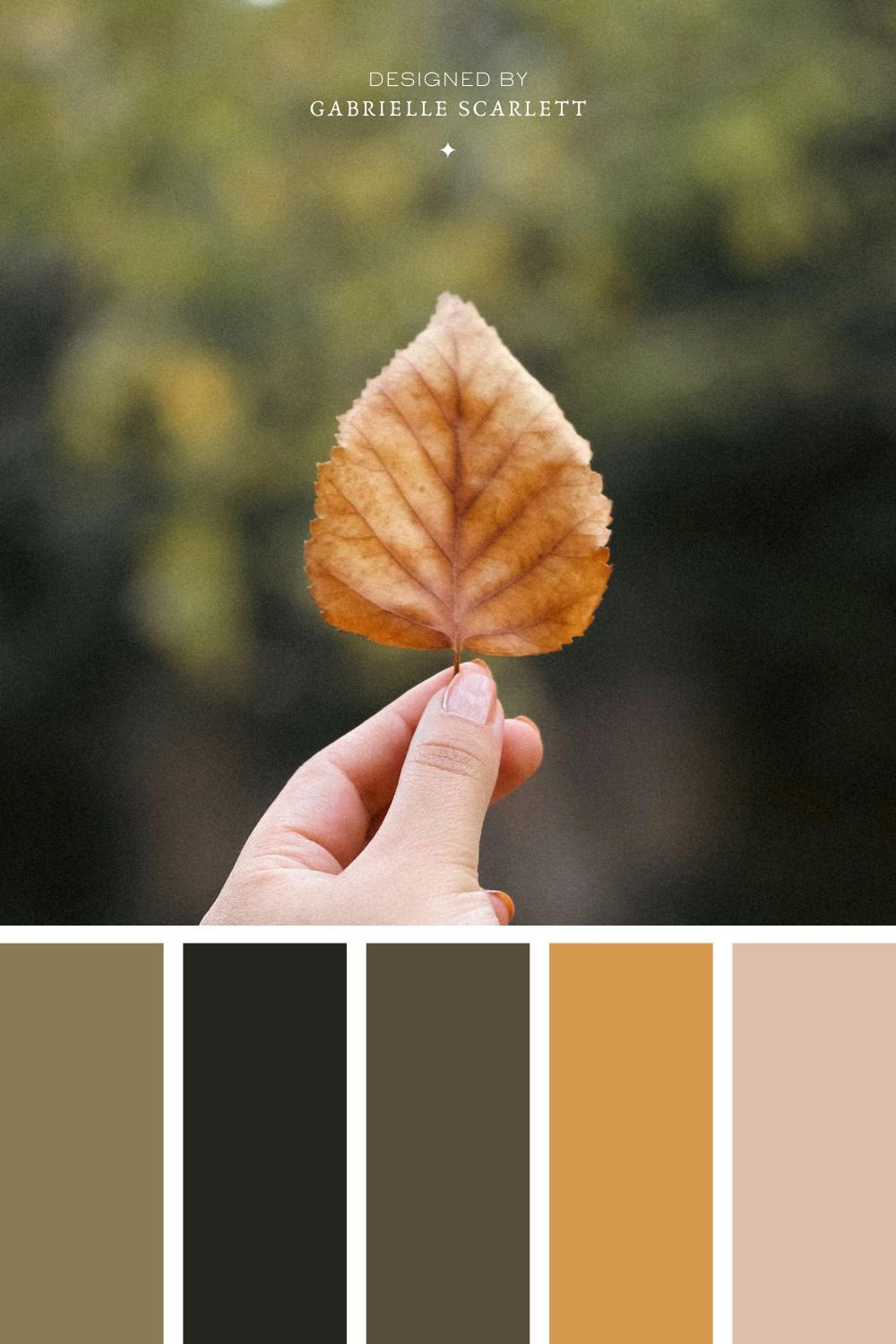
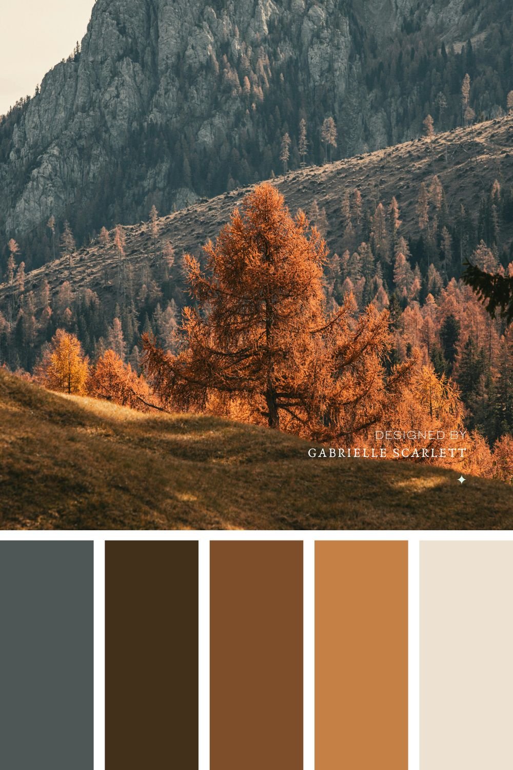
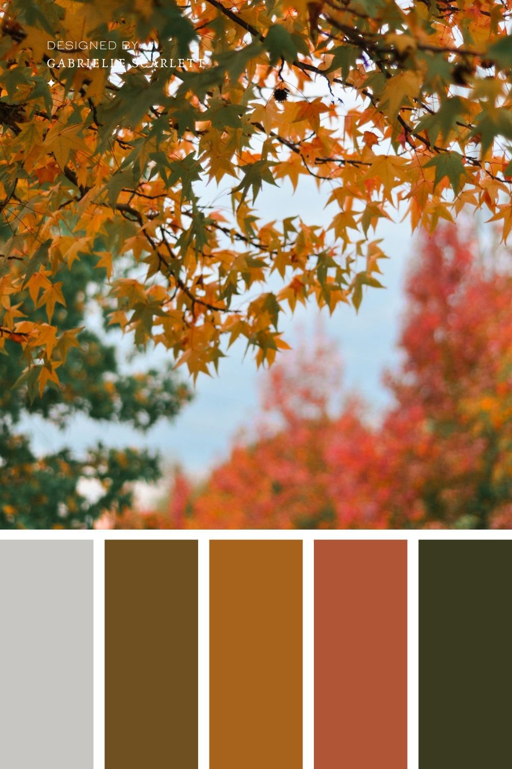
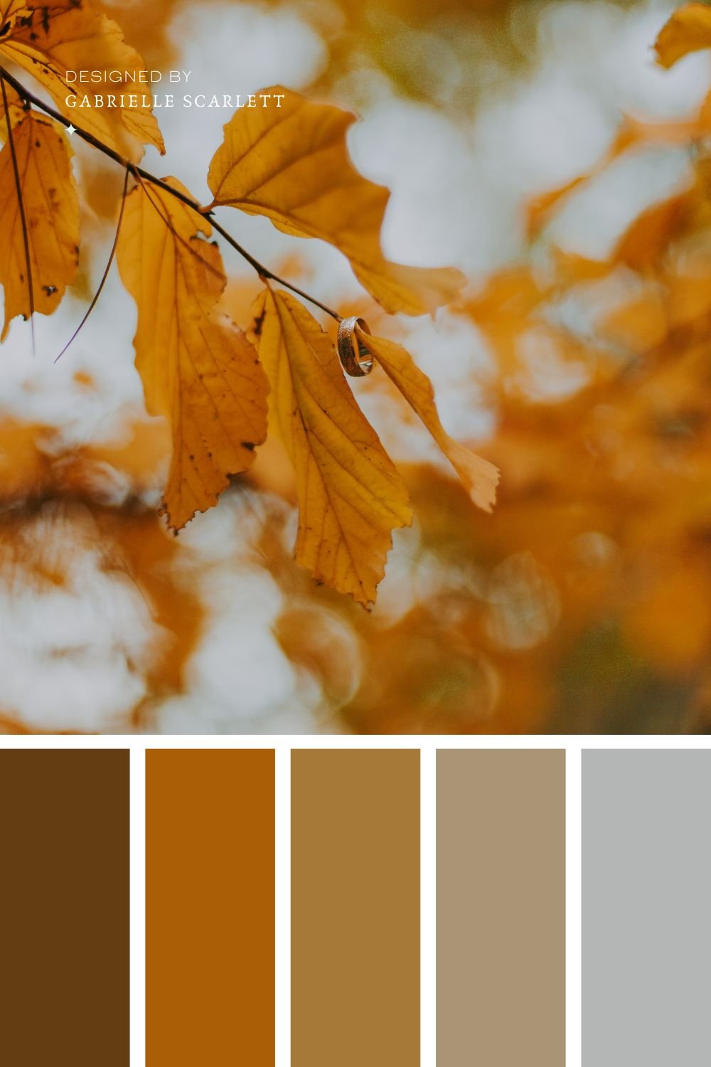
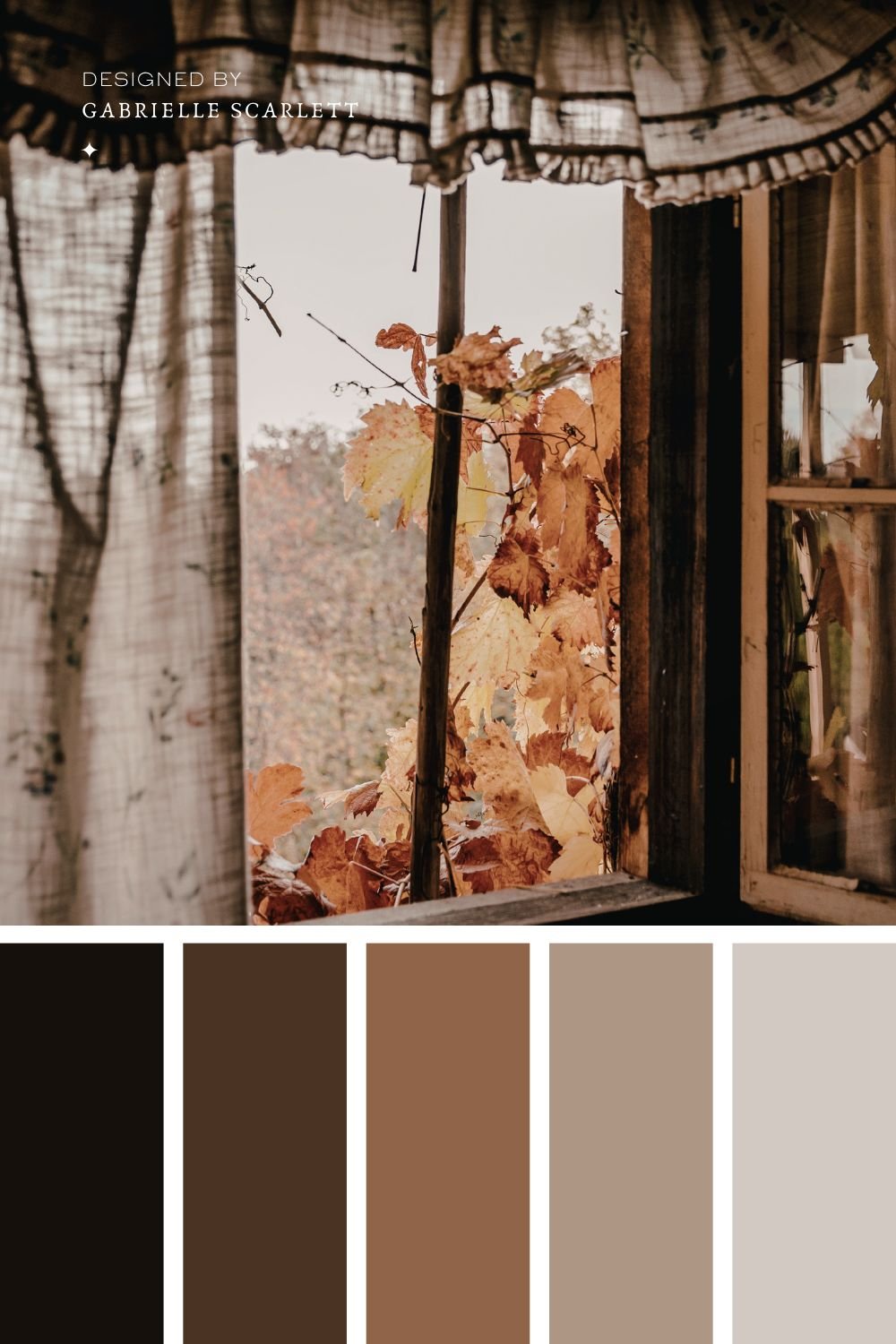
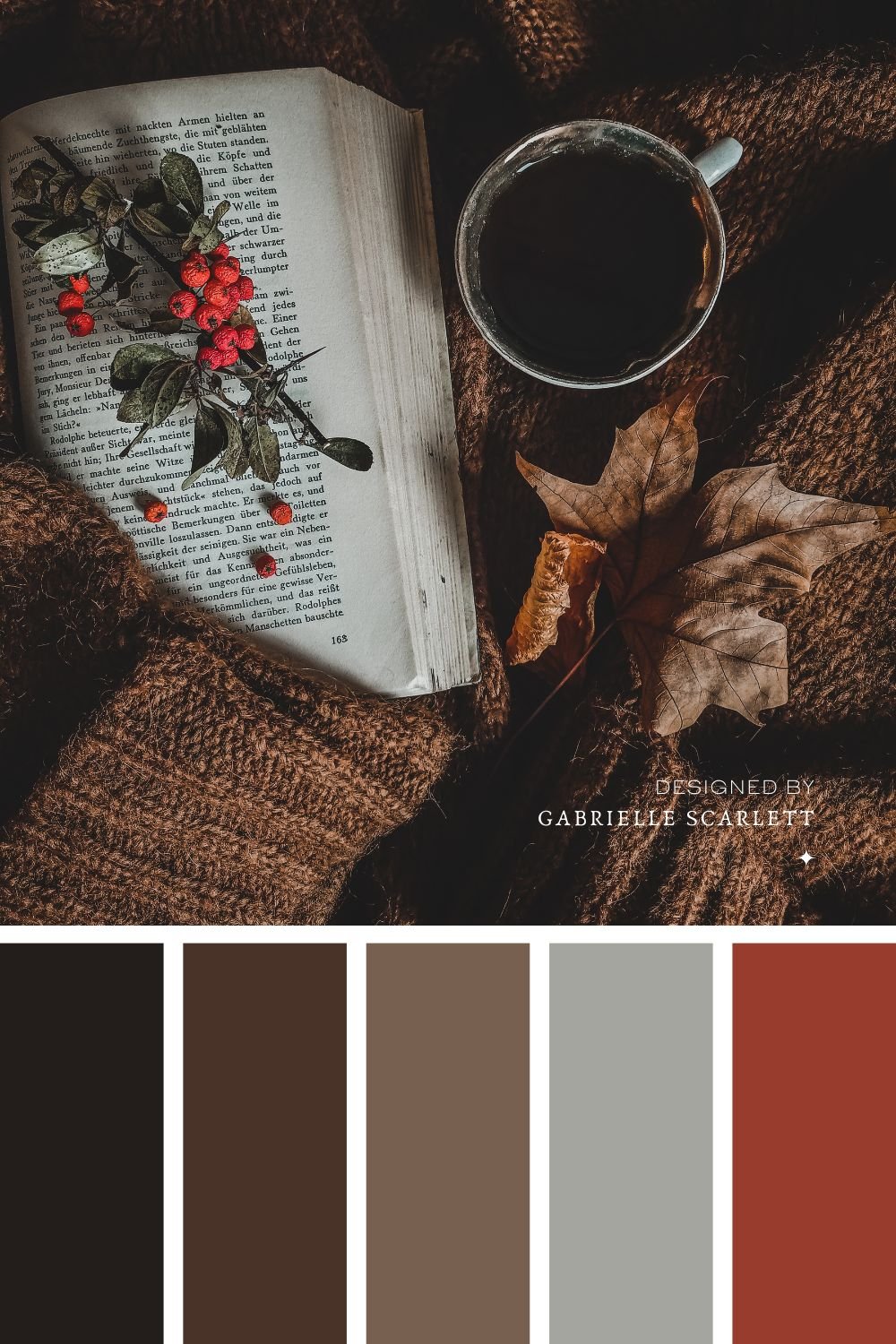
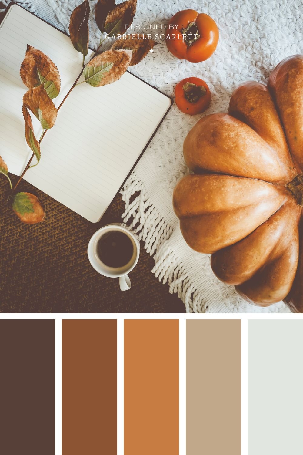
Whether you’re creating a branding project for your business, or getting ready to decorate a space in your home, autumn inspired palettes feel cozy, comfy, and warm. There are so many options – you can lean into oranges, greens, neutrals, or a combination thereof! You’ve got options that range from fully monochromatic to chaotic and vibrant, depending what your project needs in thoes arenas.
And when it comes to their colour psychology… they get to draw from the impacts of all the hues involved, PLUS the overall tone you create by combining them. So you can do some really complex colour work with autumnal palettes!
Autum is Endlessly Comfy
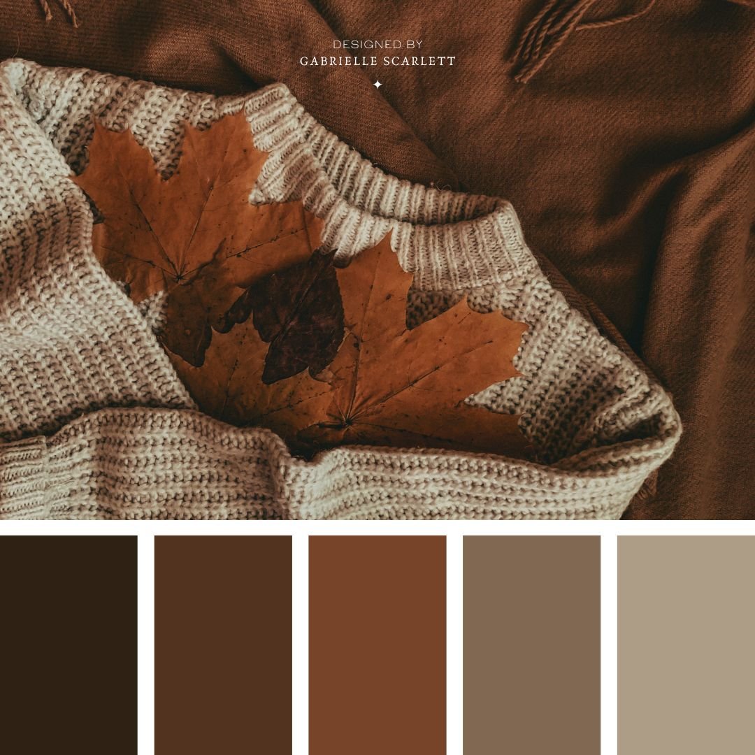
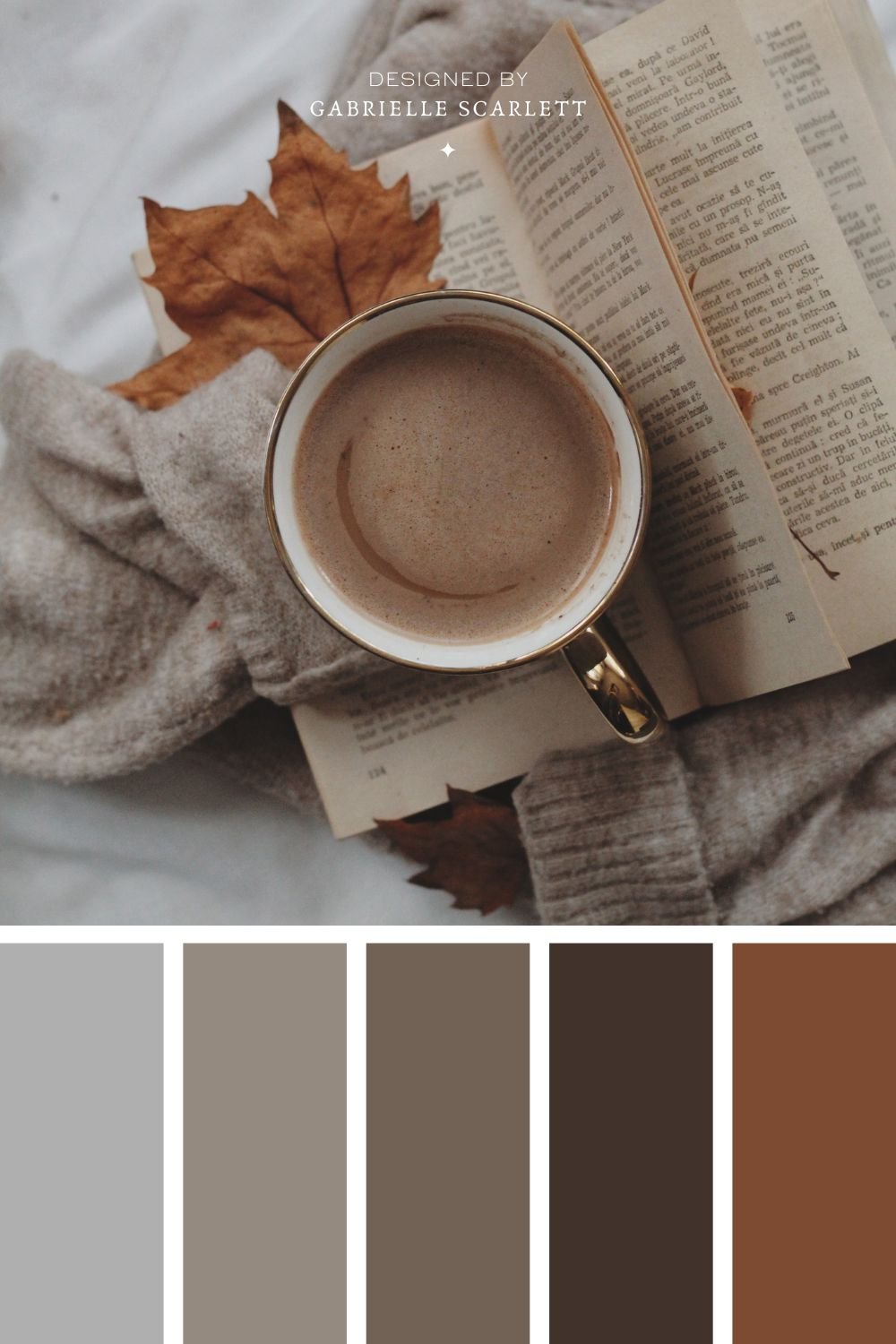
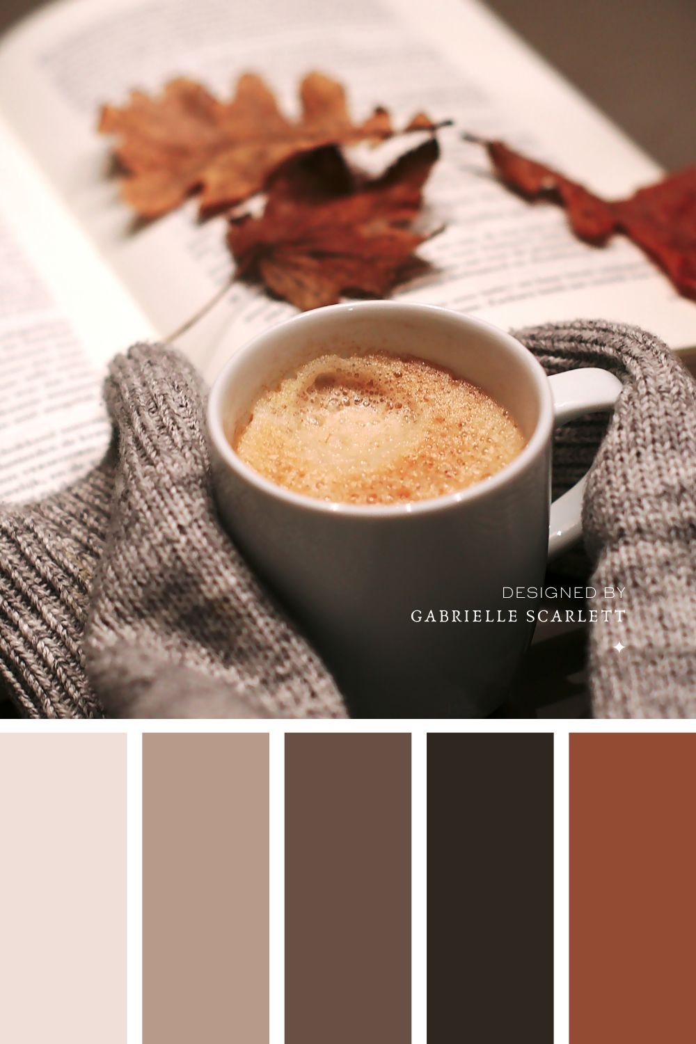
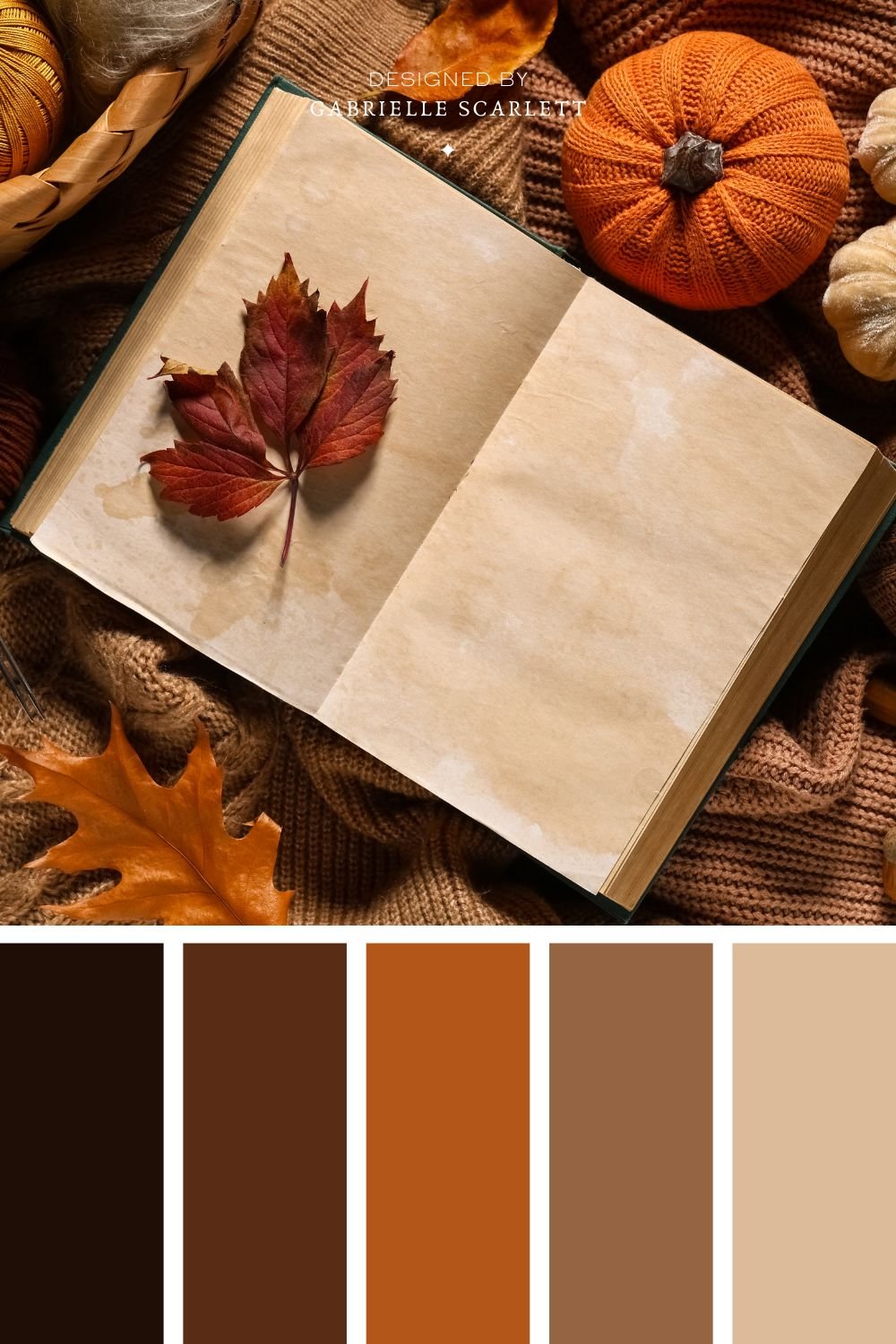
The biggest draw of autumnal, fall colour palettes, is the cosiness that’s just straight up infused throughout the options you’ve got. It’s easy to see in action, because even the inspiration photos you’ll use if you’re aiming for an autumn inspired palette for, for example, a new interior design project, will probably include textures like knit, leaves, and other very organic feeling components.
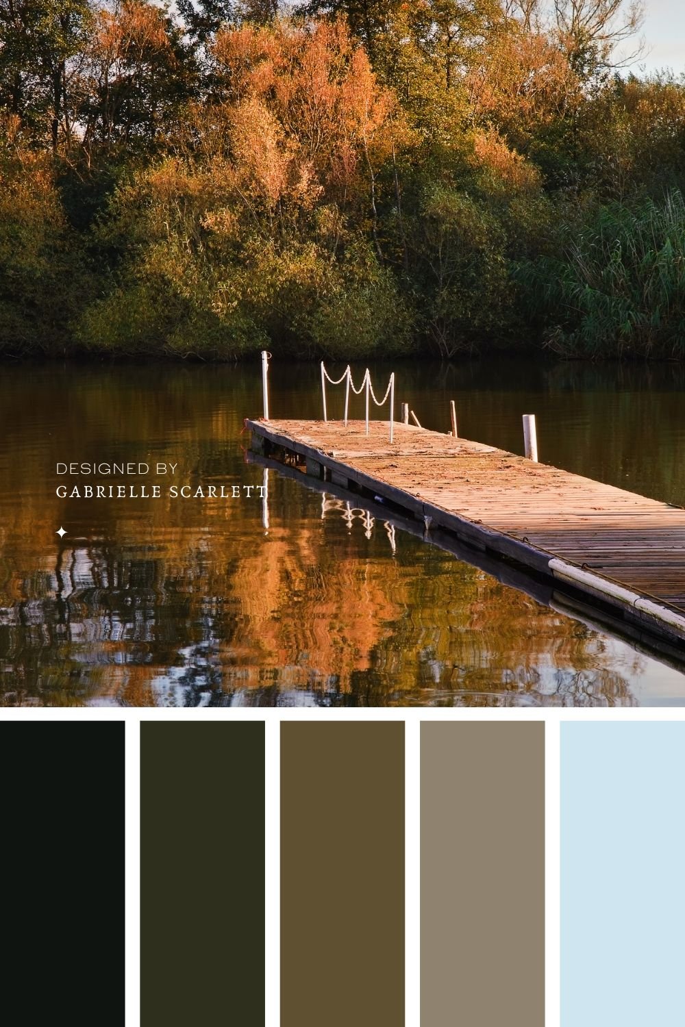
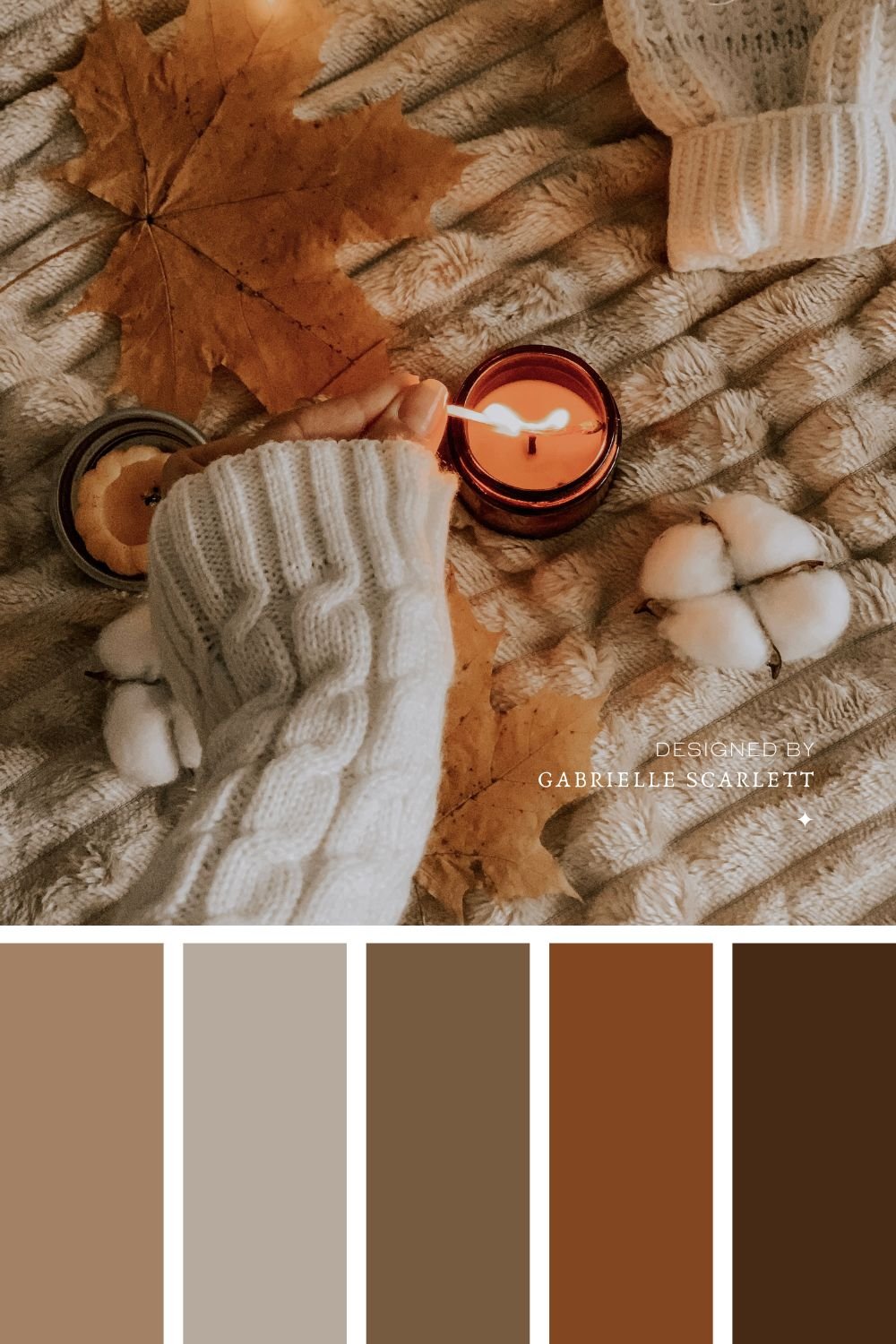
When it comes to using autumnal palettes in your branding…
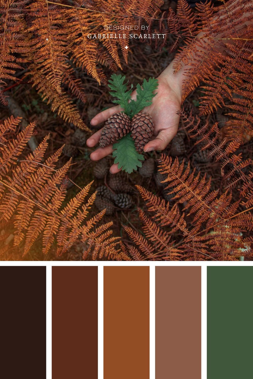
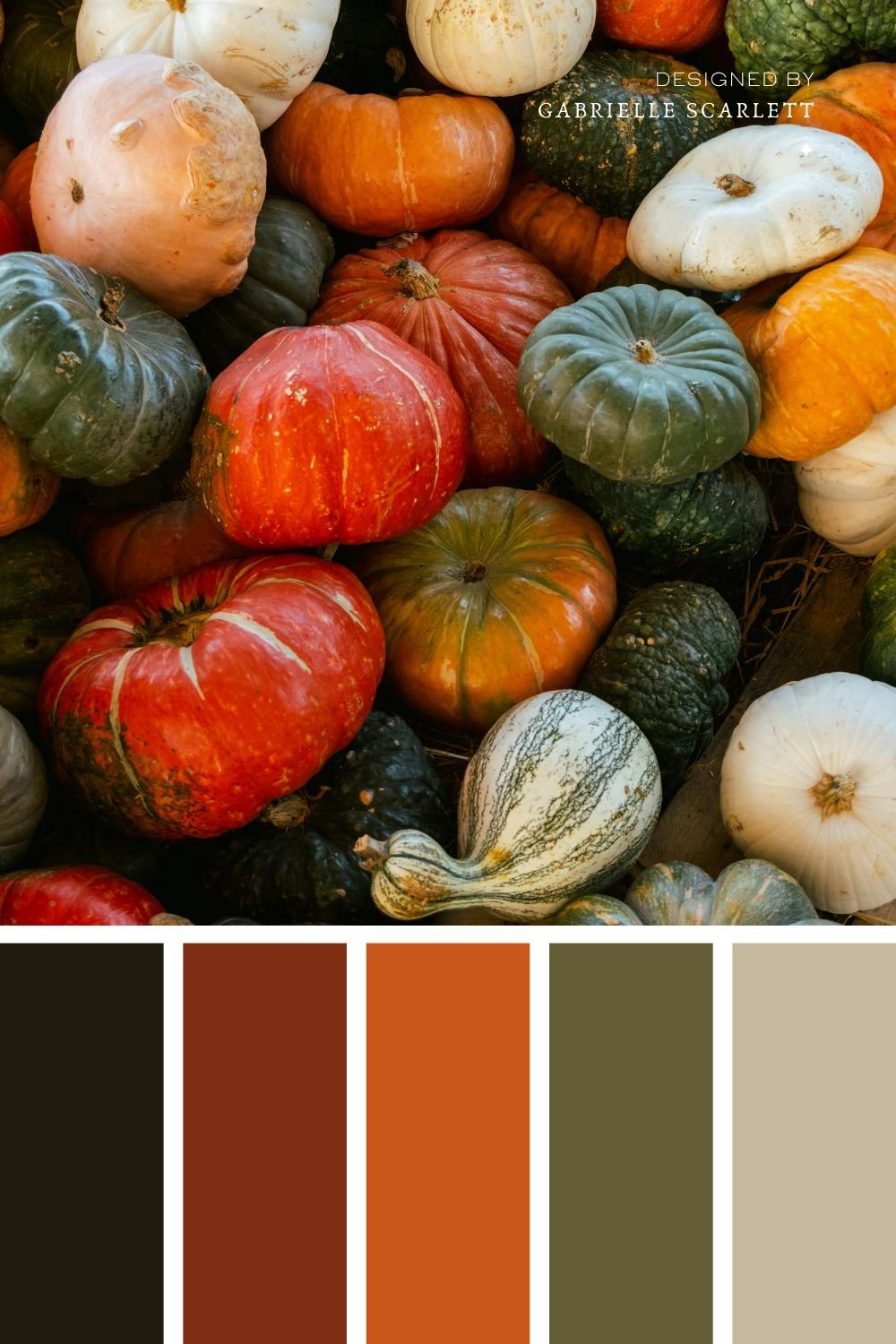
As I mentioned, autumnal palettes benefit from the impacts of the hues involved. So if you’re leaning into oranges, and neutrals, you’ll likely end up with a palette that feels friendly, warm, and welcoming! If you lean more strongly into the green side of things, then you get all the benefits of using a “go” colour, plus the factors brought in by the mood you create with your hues more specifically. You can go vibrant and saturated, to bring some energy in, or, lean back into some grey tonality for a more moody!
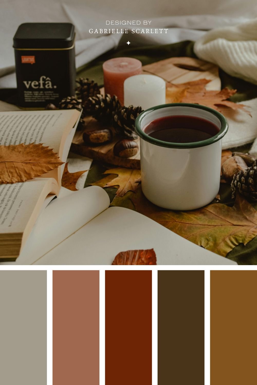
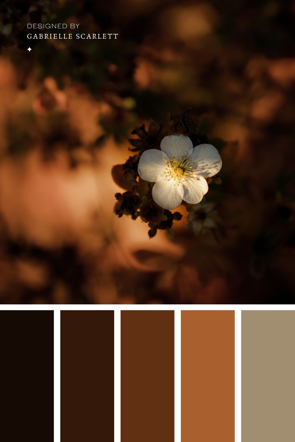
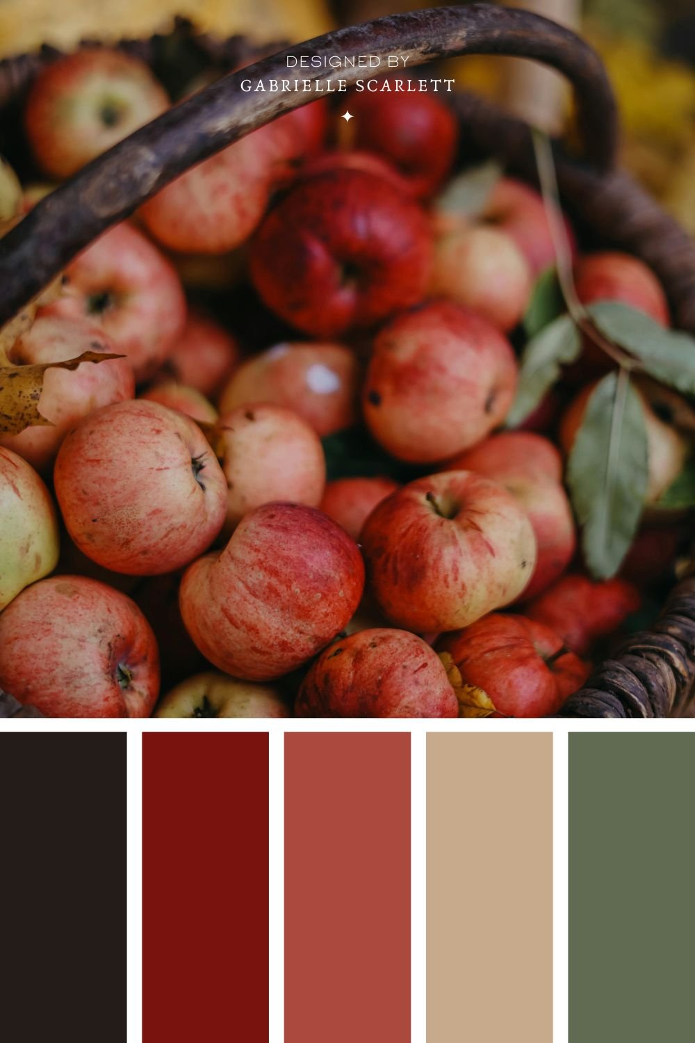
Having trouble picking your autumn tones?
There are a lot of options when it comes to hues you can use for your autumnally inspired brand – just like there are for any palette, whether it’s monochromatic or not. Autumn hues are versatile – there are bright ones, and muted ones, and light ones, and all of them are tonally going to communicate something slightly different to your people.
When you’re picking the hues you’re going to use for your brand, you want to work from the TONE you want communicate with your future clients. What do you want them to FEEL when they look at your branding? Do you want them to feel calm? Energized? Thoughtful? All of those are going to require different pairings of tones.
If you want to go for a thoughtful vibe, you can try leaning into lighter hues, or muted ones. If you’re going for “energetic” try a palette with a pop of a super saturated green, that will bring vibrance and youth to your online presence
Want to start with your own image?
These palettes make great starting points, but if you have a specific image or mood board you want to start with, you can totally do that instead! Grab your image or images, and then, get that colour picker going!! If you’re not a Canva user, or an Adobe guru, then sites like Coolers.co can make your process super simple. Just pop your image in, and it’ll generate palettes based on it for you to tweak and choose from! Adobe has a similar free tool here, if you’re more of an Adobe human.
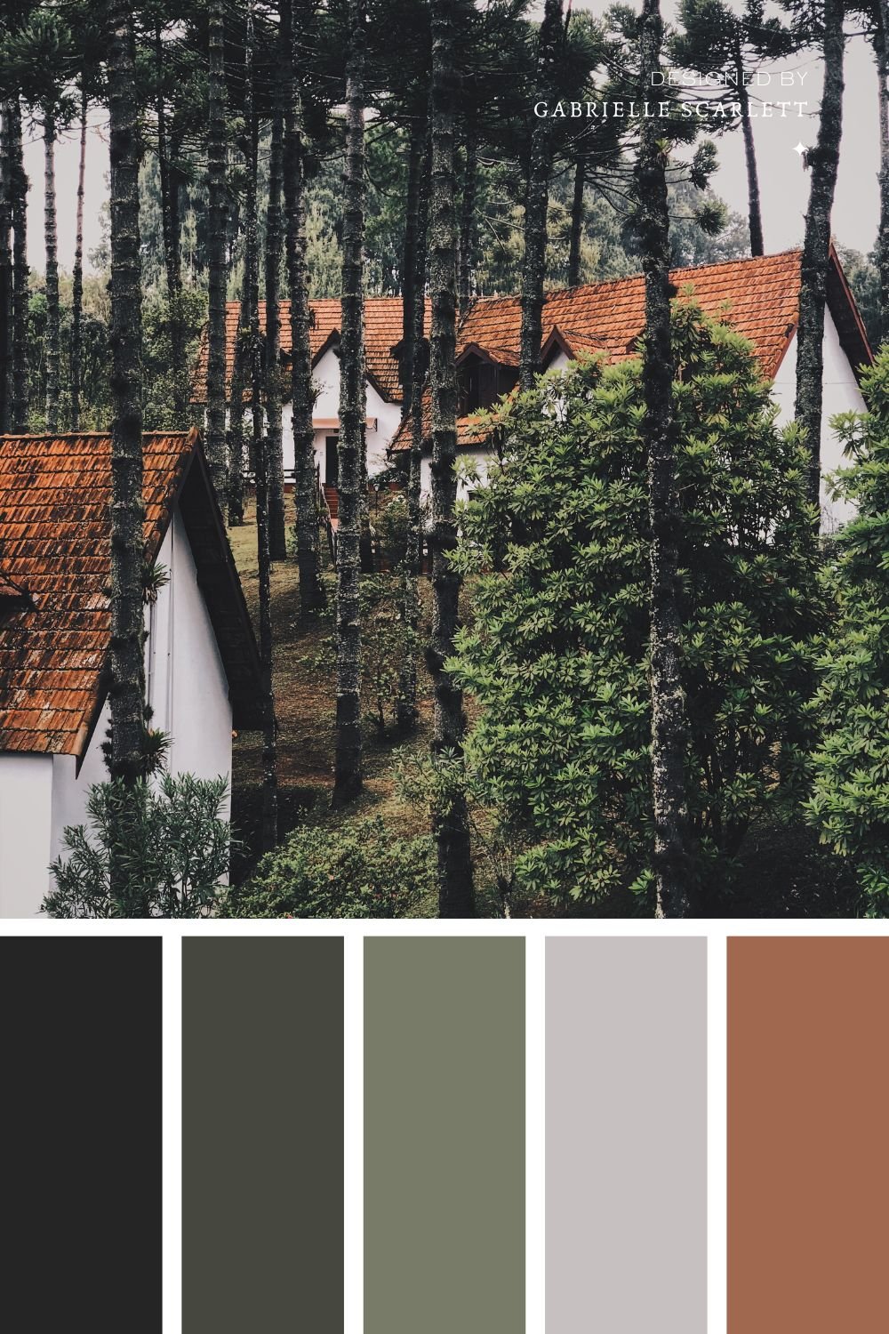
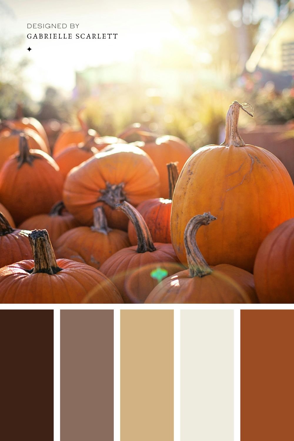
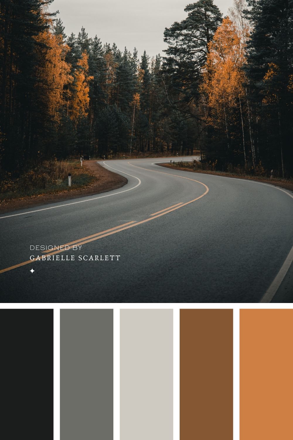
So I have my palette – Now What?
Start using it consistently! Success after rebranding (or branding for the first time) comes down largely to consistency. You want to make sure that once you’ve chosen your fall inspired colour palette, you use it across all of your social media, as well as your entire online presence. Inject it into any branding images that you take for your company, including the wardrobe in your headshots. Make sure that the vibe created in your content aligns with the mood created by the palette!
If you’re using an autumnal colour palette, your goal is to keep your presence intentional, because you have SO many directions you could go in. Once you’ve locked it in, stick with your chosen hues, and maintain consistency across your presence!
Pin me for later!








0 Comments