

QUESTION: What logo formats does my business need in a branding package?
ANSWER: Your business should have at minimum, a primary logo and secondary logo (usually horizontal and vertical formats), a submark, and an icon. There are others, but these should ensure you have everything you need for nearly any location you’d need to place a logo for consistent branding!
Branding Packages Include All Kinds of Things
When you work with a professional designer to create a brand suite for your business, you’re going to get a TON of materials. Sometimes it’s even overwhelming – especially during the process itself, when you’re getting demos sent at you left right and centre. But at the end of the process, you should come away with a variety of powerful communication tools, that you can use to promote your business everywhere, for years to come.
But what does that actually MEAN, and how can you make sure that you have everything your business will need after you’ve been sent the tools, and it’s time for you to take over using them?
Your Business Needs a Responsive Logo
The biggest component that you should make sure is included in your branding package, is a responsive logo. If this is your first time hearing that phrase – don’t worry, we’re going to break it down. A “responsive logo” is just a logo that has been provided in a suite optimized for placement ANYWHERE that you could possibly want to put a nod to your brand in your print or digital materials.
Need something vaguely vertical for an ad? You should have it. What about an item that’s so small, it fits in the corner of a sticker you’re handing out at an event, but is still identifiable? Yup, you should have that too. And of course, you’re going to need something in a horizontal format to place at the top of invoices, right? Again – that should be in your suite.
This ability to be placed anywhere your logo needs to go is what makes it “responsive” and in this day and age? It’s everything.
Consistent Branding Requires Formats that Fit Anywhere
We live in an increasingly digital world, which I talk about a lot. But one of the things that means, is if you’re going to build brand recognition, you need to have branding materials that are adaptable. It looks seamless and sleek as a profile image, as much as it does on your storefront. And that’s not always all about balancing ONE item so that it can be used everywhere, it’s about creating an ecosystem of graphics that work together to support your brand. Because let’s face it – if you’re using ONE logo as your physical signage, on your merch, as your profile image, and on all of your printed materials, then you’re likely compromising readability in half of those placements.
Take for example the “favicon” for your website. You know that little icon that shows up in the tab on Chrome when you’re on a website? Yeah. It’s SO SMALL. It’s not reasonable to have one item that would be readable there, because then if you use it other places… it would necessarily be missing the text that gives people full context about what you do.
So in the interest of having a responsive logo suite, that can fit anywhere you need to put it… what should be in your branding package by the time you’re done with the design process?
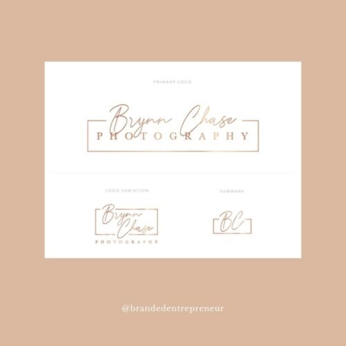
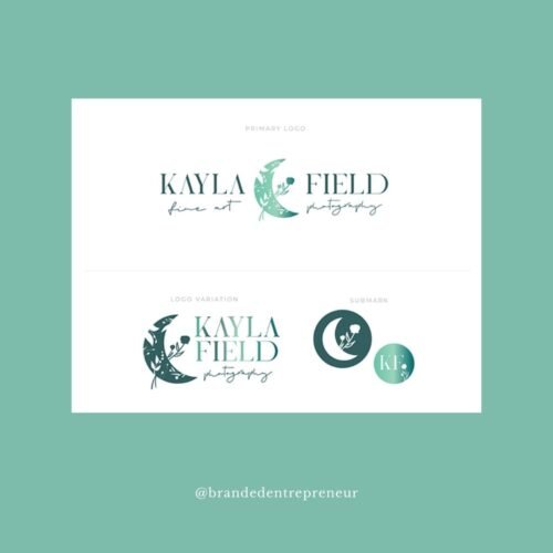
1 – Primary Logo
Obviously first on our list, is your primary logo. This is usually a vertical or horizontal format, that includes all of the details about your business that you’d want people to gain from your logo materials. If you have a personal brand, it might have your name, and then a second line with a description of what you do, for example. It may include the year that you started business, if that’s important information to share with your people.
It’ll likely also include a graphic of some kind, but won’t always! Primary logos can absolutely be in the form of a “wordmark” (a logo that lacks an illustrative graphic) in certain cases.
So it might look different from brand to brand, but ultimately, your primary logo is the flagship piece of branding material that should come with your package, and everything else used in your suite should both connect back to it, and be derived from it.
2 – Secondary Logo
Now, secondary logos are a bit controversial, in some circles, because… aren’t they just your primary logo… shifted around? Well, yes… and no. Not every secondary logo is the components of the primary logo just shifted for orientation, but sometimes they definitely are, and it can seem redundant to be provided this material by a branding designer – you might even find yourself asking whether it’s confusing to use these two versions interchangeably, because shouldn’t you just use one?
I do totally get why you’d ask those questions, but we’re going to use an example to break this one down a bit. Starbucks. Whether it’s their vertical logo, their horizontal logo, their stamp, or other icon, you recognize right off the bat that it’s Starbucks, because you’ve seen it before. You make the connection between the icon, and the font – it’s not confusing that sometimes it’s vertical, sometimes it’s horizontal, etc.
And the same is true for your brand! Using these different formats isn’t confusing, it allows you to have the appropriate format for different spaces you might need to use your logo.
So between your primary logo, and your secondary logo, you should have (at least loosely) a horizontal and vertical version of your materials to use in different placements.
3 – Submark
Your submark is one of the pseudo-optional selections in your logo suite, depending on the format of your secondary logo – but… it can be super important to ensuring consistency across all of your promotional platforms! Usually submarks these days are designed to fit into a small circle. This makes them perfect for things like profile images, which are incredibly important for social platform consistency. Now, when I say that it’s “pseudo-optional” what I really mean, is sometimes, it makes the most sense to use your “icon” option in that placement instead.
But most businesses would benefit from having an option for their logo materials that will fit (with the information included, that’s the crucial part) into a circle or a square, which may not be as straightforward with your primary and secondary logo.
Sometimes, it’s in the format of a “stamp” style, and that can create fabulous opportunities for physical branding, for things like circular stickers, or if you’re feeling EXTRA fancy, you might actually have a brass stamp worked up to seal client gifts with a dollop of wax! A handcrafted, luxury touch.
4 – Icon
Aside from your primary logo, your “icon” is likely the item in your branding suite that you’ll be most familiar with! It’s exactly what it sounds like – it’s an icon, that’s a part of your brand suite, that identifies your business. These are usually designed (or rather, I should say SHOULD be designed) for uses like that “favicon” I mentioned earlier. It needs to be recognizable at an incredibly small scale, and is intended to be used in those placements, or as an accent on things like your website.
Icons are an area where the usage can get really fun – they can be used on merch, as a detail within your social posts… the world is your oyster, and icons are a great way to inject subtle nods to your brand into your content.

5 – Wordmark
When I made the list at the top of this post that talked about the necessary items you’ll definitely need, I didn’t include “wordmark” in that list. And that’s because we’ve finally arrived at the items that not every business needs! And also, that may have some amount of overlap with the other materials.
Your “wordmark” is the version of your logo that doesn’t include any iconography, but includes all of the text (or at least most of it) that’s included in your primary or secondary logo. It’s ideal for placements where imagery isn’t needed, and usually ends up being horizontal in layout. This is usually included for variation, but depending on how complex your primary and secondary logos are, might be a necessity! It depends on your specific brand suite, but including a wordmark might give you more freedom to place your logo in locations that even your horizontal full version might not fit.

6 – Signature
A “signature” is another one that I’ve not listed as necessary for every business, because… well, it’s just not. This is an item that can be really helpful if you have a personal brand though, or if you’re a solopreneur who wants to bring some personal flair into the suite that you use to promote your business. Let’s say you want to sign off the emails to your list with a personal touch – a signature that’s designed to fit into your brand suite will do the trick nicely!
But as I said, not everyone needs a signature. And alternatively, some primary or secondary logos might already be in the format of a signature, depending on the style used to create them.
Not Every Business Needs Every Format
As I’ve said (probably repeatedly now) not every business needs every format! Each brand suite should be customized to the specific needs of your business – if you have a physical store or studio, you’re necessarily going to need different materials than those who focus on e-commerce. And those styles of business might have different needs than a personal brand that offers training, because you’re likely to have different print materials – or maybe even none at all.
Your branding package should be customized to you – but at the end of the day, no matter what your business does, you’re going to need that branding suite to be responsive, and fit in different placements across your presence.
Looking for a New Branding Suite for Your Business?
So if you’re in the DIY boat, work on making sure that you have a fully responsive logo design for your business, so that you can be consistent in your branding! But if you’re not feeling confident with the DIY route – let’s talk. I’d love to discuss creating a package that fits your needs, and helps you remain consistent in your branding no matter where you’re putting your content online, or out in the world!


0 Comments