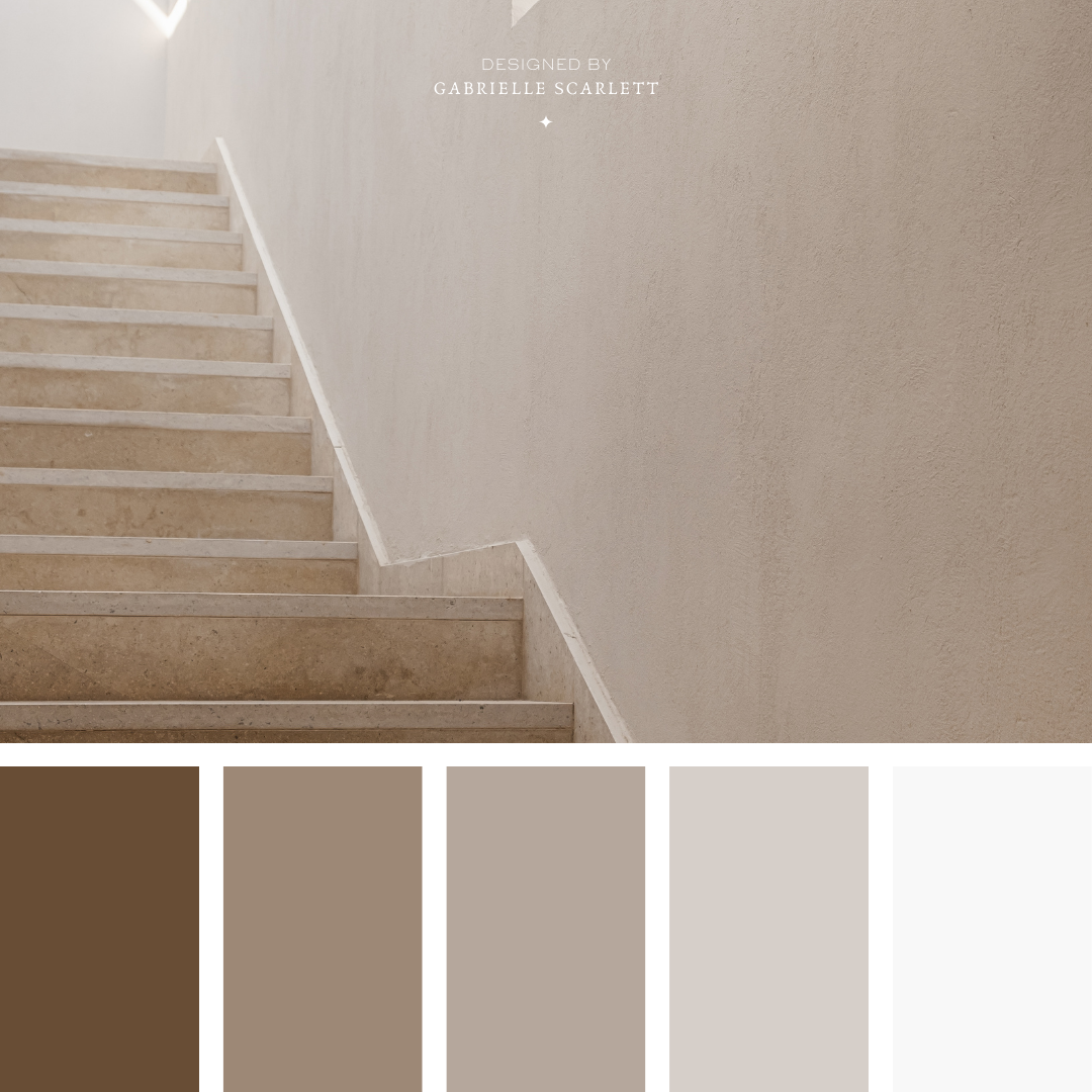
✦ 25 Neutral Colour Palettes to Inspire Your Next Project ✦
When I work on branding projects, one of the absolute first steps I take is creating the mood board for the business. The purpose of that mood board? Curating the vibe that we’re going to implement across the business’s presence. If you’ve been through my branding process before, you know that one of the first elements delivered to my clients is this mood board, which naturally has the colour palette worked in!
It usually also has elements like the style of graphics we’ll be using, or the textures we’ll be incorporating. But all of this to say: colour palettes are one of the absolute first elements that we nail down when we’re working on a business’s presence.
The Importance of your Palette
This is because your palette sets the tone for your overall branding moreso than any other element of your content. It’s also the very first component that your client’s brains process when they look at your content – so it’s deeply, deeply important to your brand’s ability to attract new customers to your business! Remember, you have about 150 milliseconds to make the *right* impression on your brand’s viewers. (Which is like, less time than it takes some people to blink. I wish I were exaggerating.)
Setting The Tone
So if your palette sets the tone, and it’s one of the first things your clients notice… what impression do you make if you use a neutral colour palette? How does it impact the mood of your branding?
It sounds like a cop out… but it depends on the specific palette, and how you use it.
Just like any other monochromatic (or mostly monochromatic) palette, you can create VASTLY different moods with neutral hues!


Is a Neutral Colour Palette Right For Your Business?
The first question to ask yourself is the first question to ask yourself before you create *any* branding materials for your business. Who do you want to attract? In other words: who is the ideal client for your business? If you don’t quite know, don’t worry – I have a totally free worksheet that can help you figure it out.
Once you know who they are… you’ll be able to answer the question of whether they’ll be attracted to a neutral palette, or whether your business is going to need something more colourful to catch their eye.
If you *are* working with an audience who will be awed by the subtlety of neutral tones, then you’ve got the more difficult job of actually choosing the palette itself.


Where should you start in choosing your Neutral Colour Palette?
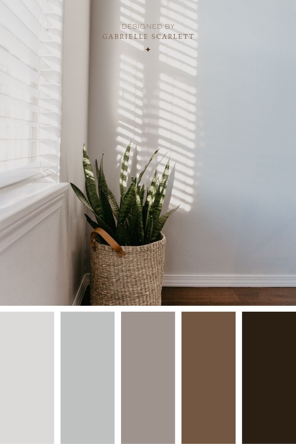
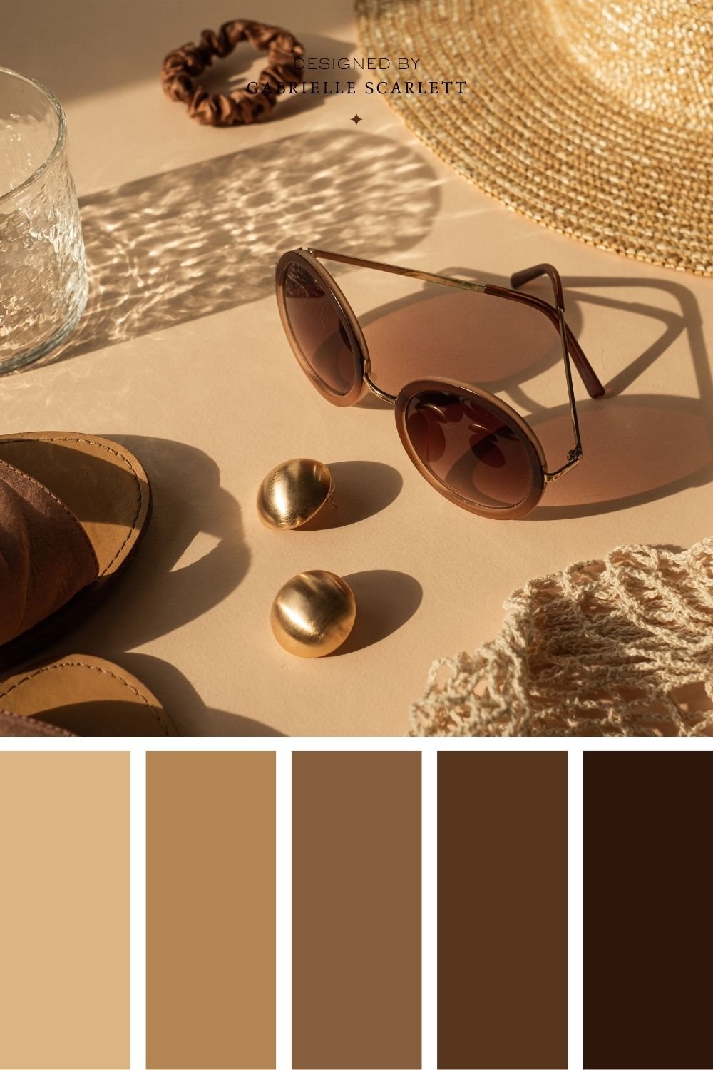
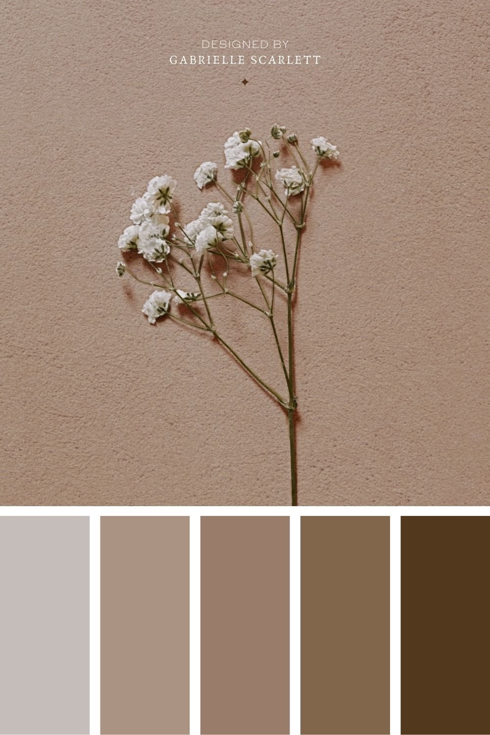
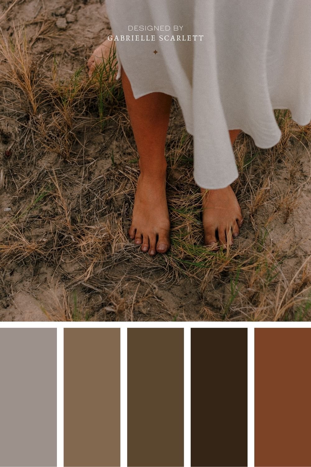
This is kind of a loaded question – but once you have your ideal client outlined for the project, it’s time to start mood boarding. And for neutral colour palettes, I recommend starting with one to three images that encapsulate the feelings you want your clients to have about your business/brand.
Then, get that colour picker going!! If you’re not a Canva user, or an Adobe guru, then sites like Coolers.co can make your process super simple. Just pop your image in, and it’ll generate palettes based on it for you to tweak and choose from! Adobe has a similar free tool here, if you’re more of an Adobe human.


So I have my palette – Now What?
Start using it consistently! Success after rebranding (or branding for the first time) comes down largely to consistency. You want to make sure that once you’ve chosen your neutral colour palette, you use it across all of your social media, as well as your entire online presence. Inject it into any branding images that you take for your company, including the wardrobe in your headshots. Make sure that the vibe created in your content aligns with the mood created by the palette!
If your neutral palette is light, and airy, and uplifting, keep things light, and airy, and uplifting. If the neutral colour palette you’re using is deep, and moody, and ethereal… same deal. Stick within the mood that is curated by the colours you’ve selected.








Pin me for later!







0 Comments