

Creating a Witchy Colour Palette for your Business is like creating ANY Colour Palette
So you’re in the process of DIY-ing your witchy brand – that’s AMAZING, and I want to start off by congratulating you!! Not for things like “stepping into your power” or “starting off right” – but because you’re taking steps at all. Getting consistent branding in place is an unavoidable step of promoting your services, or your shop, or your… well, anything. Because without consistency, you won’t be memorable, and without being memorable… well, you know why you’re here, I don’t have to parrot myself back to you.
One of the earliest steps in the DIY branding process might feel like creating a logo, or naming your business – but personally, I recommend starting earlier than that. Which is why “step one” is… starting at the beginning!

Step One: Start at the BEGINNING
The beginning of DIY branding might not feel like “branding” at all, especially if you think about a brand as exclusively visual content. But… spoiler… it’s not. Your branding is so, so, SO much bigger, and so, so, SO much more powerful than that!
The branding for your business encompasses everything public facing (and internal!) that communicates about your business. Which means it’s not just your logo. It’s everything from the colours you use, to the illustrations you use, to the specific words and tone you write in when you’re communicating with your audience. There’s a LOT more to it than just a little icon and some text you slap at the top of your website, or on the tags for your items in your shop. So if you’re going to create the branding palette for your witchy business, you have to start BEFORE the actual “palette” step, if you want it to actually work for you and your business.
Your Values
To effectively get to the colour palette for your witchy brand, you have to start at the ground, and work up. Foundations need to be clear, outlined, and in black and white (so to speak) otherwise… you’re building on shifting sands. Now, that’s not to say that you can’t have intuitive elements of this process, or that it can’t be based in a “feeling”. It absolutely can! But giving yourself those details in writing, clearly, helps ensure that they don’t STAY in the abstract, and that you know what your direction is. So, starting at the beginning means outlining the values that underlie your business.
What does your business STAND for? What does your business CARE about? Answer those questions, and if you can’t… start even earlier. Why are you doing what you’re doing? Why does your business matter? And I bet when you start with that… you’ll arrive at those underpinning values super quick.
Your Ideal Clients
Next up on deck with “starting at the beginning” is another step you might have already done (but I don’t like doing things by halves, so you’re getting the description anyway.) You need to know who your ideal client is. “Ideal Client” doesn’t refer to the ONLY person who will buy from you in the future, it’s just a sort of imaginary amalgam of the profile for the people who most-need what you do, whether that’s providing products in a witchy shop, or securing your reiki services.
So answer this: who needs, and is going to purchase, what you do? And the answer, contrary to popular belief, should NOT be “everyone”. Obviously everyone needs what you do – but… the “is going to purchase” part is a big deal here. Who do your services appeal to? Who do you WANT to work with? These are all components of your ideal client, and they have to be explored.
Once you know who this imaginary person is… you need to consider what they’re drawn to. Do they prefer light tones, or vibrant ones? Are they more drawn to dark academia vibes? Speaking directly to this ideal client with your content will help ensure that your visual components draw them in, which helps lead to that whole “memorable” thing I was talking about earlier. And you want to be memorable, right?
Your Focus
The final foundational component that I recommend you consider when you’re creating a grounded baseline for forming your palette/branding, is your focus. What do you actually do? Are there tones and palette components specifically drawn from that? For example, if you’re a photographer who works with spiritual humans, and you have a specific style, you get a ton of information from that.
You already have clients, and have created work, and have a portfolio – so… you get to start from the tone of your work. You know it attracts the right people already! If you’re not a creative, then this gets a little more difficult to use as a baseline, but there are aspects you can draw from that might be helpful. If you are a Reiki Master, for example, there might be a specific chakra-associated colour you want to focus on in your branding. Think about these aspects of what you do – of your focus.
If you have a shop that exclusively sells crystals… you probably want to have crystal imagery in your branding. If you work with the Akashic Records, how can that be represented in the iconography and graphics you choose to use? There are so many elements of your focus that can be brought into your branding to communicate clearly with your people, and outlining your focus can help make that happen.
Once you’ve thought about, and outlined in writing your values, your ideal client avatar, and your focus, you should have a pretty solid starting point for moving to the next step!

Step Two: Start with LIFE
Having all of the above outlined means you can move onto actually getting some visuals put together, which means its time for your mood board! Now, when it comes to mood boarding, I always recommend two things. First, you should start with life, and second, you shouldn’t limit yourself.
Those might sound contradictory – but if you’re creating a witchy brand, you’re probably a particular kind of person. And in my experience, one of your traits is likely that you don’t like feeling like you’re in a box. I get it, I don’t like that either! So I like to emphasise that your branding isn’t a limiting boundary – it’s a guide that lights your path. And you should take that same approach to your mood board!
Creating a Witchy Mood Board
Creating a witchy mood board for your business starts by compiling. Grab STUFF. You can do this physically, you can take pictures of your altar (if you have one!), you can pin scraps of fabric, leaves, scrapbooking paper, etc to an actual pin board if you want. You can go onto Pinterest and start wildly pinning things you love. Or, you can use what I tend to use, and go head over to Canva and open up a new file, where you grab bits from online, photos you’ve taken, photos and elements from the Canva library – anything that draws you in, aligns with your values, ideal client, and focus, and feels RIGHT.
Odds are, when you do this, you’ll start seeing trends and patterns in the items you’re using. You’ll see come colours consistently appearing in the things you’re placing on your board. You might even find a set of graphics that 100% exemplifies the tone you’re going for! But don’t limit yourself. It’s not time to start excluding things until you’ve created an inclusive baseline.
Pruning Your Witchy Mood Board
Once you’re satisfied with your chaos-mood-board, with all of the things, whether it’s physical or digital, you’ll probably have a TON of stuff. And some of it… might not need to make the final cut. Maybe you notice the pattern that there are lots of earthy, neutral, rich tones in the content you’ve collected, but there’s also pops of vibrant blue that just… don’t fit. It might be the case that these are important, and you want to keep them – but them not fitting with the overall board might be an indication that they need pruned.
So, prune your board. Weed things out until it feels cohesive, like something you (or your ideal clients!) would happily hang on their wall. It’s important to note that sometimes… this process kind of hurts. You might remove things you love in and of themselves – and that’s OKAY. Although you loving your brand is deeply important to its success, ESPECIALLY as a witchy and/or intuitive business owner, that’s not the same thing as EVERYTHING YOU LOVE being included.
Otherwise, we wouldn’t need to include considering your Ideal Client or your focus in the baseline foundation for creating all this in the first place.

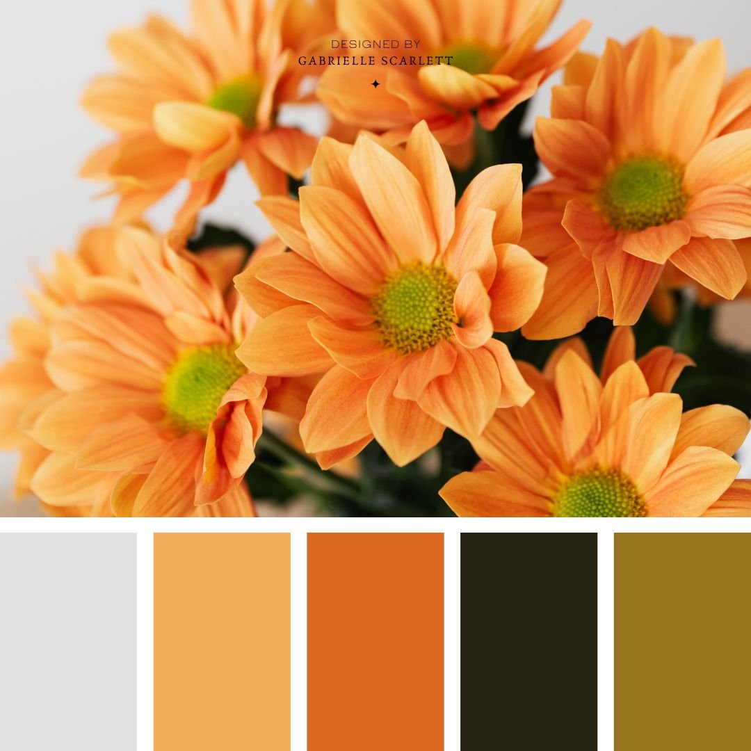
Step Three: Select Your Colours
Once you get to this point… please pause, and celebrate. You’ve done the HARDEST part of creating your branding, especially pruning your mood board to arrive at something concrete and cohesive. That’s not easy, and I won’t pretend that it is.
But once you have that content in front of you, it’s finally time to actually pull out the colours (and possibly textures!) you’re going to use moving forward for your branding!
Some Cool Tools That Can Help:
Since you have a mood board, you might even be able to cheat a little in this process. Remember that thing about starting with life? Well, the images you used are a magical little starting point for eye-dropping the fuck out of the colours that repeat in the board. Or, you can feed them into something like coolors.co, and it will help you create a palette from the items you’ve selected! You might even be able to scroll in Canva’s side bar, and use its auto-generator to pick colours that appear on your board, if you’ve built it there. If it’s a physical board/altar/collection of things… you can cheat by taking a picture of it, popping THAT into one of those tools, or uploading it to Canva and eye-dropping or using that same side-bar tool.
Pay Attention to Contrast & Usability:
When you do select your tones, you’ll want to pay attention to a few practical factors. First, you want to make sure that you have enough contrast in your tones that they won’t look like a mud-puddle when you actually start using them. You’ll also want to make sure that you don’t have 20 of them, but… there are always exceptions to that rule.
Avoiding colour discordance will hopefully be pretty straightforward for you, since you started with life, and therefore shouldn’t have TOO many super saturated vibrant colours in your mood board to begin with! But… there are exceptions to THAT rule too, so use your discernment. I’m not here to limit you, please remember that! I once created a witchy brand palette that broke all the rules, and even included a gradient orb from which my client could colour pick ANY tone, and it would line up with their branding no matter what, like magic. Is that normal? Absolutely not. But for her brand… it made sense. So we broke all the rules!
And just like that… you’ve got a palette!

Step Four: START USING YOUR WITCHY COLOUR PALETTE
This wouldn’t be a full guide if I didn’t talk about what you need to do AFTER you have your palette! First of all, you have to move on to creating and selecting other elements, like the graphics you’re going to use, any illustrations that will be included in your brand, your logo – there are tons of things left for you to do.
But once you have your palette and your witchy mood board, you can use those as a starting point to make that process smoother! So, once you have your palette… start using it to create the rest of your content. Your mood board should help a ton with setting the tone – so when you’re choosing fonts for your logo, think about that tone. Do the fonts you want to use line up with it? Do they feel like they’d belong on your board? Every decision you make from here on out should either align with the content on your board… or augment and extend it with elegance and purpose (or… something-else and purpose. Basically as long as it’s got purpose, you’re good!)
Need Some Support Creating Your DIY Witchy Brand?
PHEW. Okay so we’ve gone through a lot here today, because there’s a lot involved in creating a witchy branding palette for your business. And there’s a lot to creating branding overall, no matter whether it’s for a witchy business or a… not-witchy one. So needing a bit of help in the process, is totally reasonable.
Or, wanting custom illustrations or graphics from a designer who can feel into what you need, and make your vision a reality without you needing to rely on pre-created designs that are already out there available for sale and anyone and their brother could already be using it to promote their business.
So if that’s you, and you’re feeling overwhelmed by this process, that’s okay!! And I would love to help you create branding that will support your business to grow. So let’s talk, and see whether one of my packages fits your needs. Because your witchy business deserves branding that SINGS!

Pin Me!


0 Comments