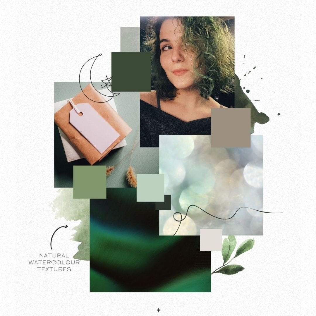
✦ What’s in a Brand Package? ✦
If you’ve followed me for a while, you know that your brand is much, much more than just a logo. In fact, I no longer offer logos individually, because a brand suite will serve your business ten times more powerfully than a logo on its own.
A logo without the foundation of a full brand suite behind it, is just a pretty picture. A logo WITH the power of a full brand suite behind it can magnetically attract your ideal clients, because it’e rooted in their needs. It can represent the values of your business, because it’s based in those, solidly. And it can create an ecosystem where your business can flourish, and where your creative work feels natural, because… it’s inspired by the tones of your work.
So if I don’t offer packages with just a logo… what *do* I offer?
What’s Included?
I have three primary packages that business owners can choose between, but the most popular is my mid-level package (or a custom variation on it.) So that’s what I’m going to walk through for you here! It serves the needs of most businesses that aren’t looking for major package design.
The package includes:
1. Access to the Embodied Brand Process
2. Mood Board Design
3. Colour Palette Selection
4. Custom Texture Design
5. Font Set Selection
6. Primary Logo Development
7. Secondary Logo Development
8. Submark/Favicon Development
9. Brand Board Delivery
10. Popular Asset Formats
And then depending on the type of business you have, and the style we want to achieve for your brand content, we might want to include:
11. Custom/Hand Drawn Graphics
12. Team Focused Brand Style Guide
13. Live Implementation Training
Breaking It Down
I’m a person who likes to know *why*. It’s one of my favourite sentences (second to “no”) so if I’m telling you that you need tools for your business… I want you to know why I’m saying that, specifically. That’s why we’re going to go through all of these elements one by one, and get into what they actually are, and even more importantly: what it means for your business to have them.
1. Access to the Embodied Brand Process
This is specifically one of the benefits of working with me, as opposed to other professionals in the branding space! Over the time I’ve been building brands, I’ve honed down a specific process for getting to the root of the values that underly your work. And you’ll get access to the parts of that process that help us root your brand through your values, style, niche, and target clients.
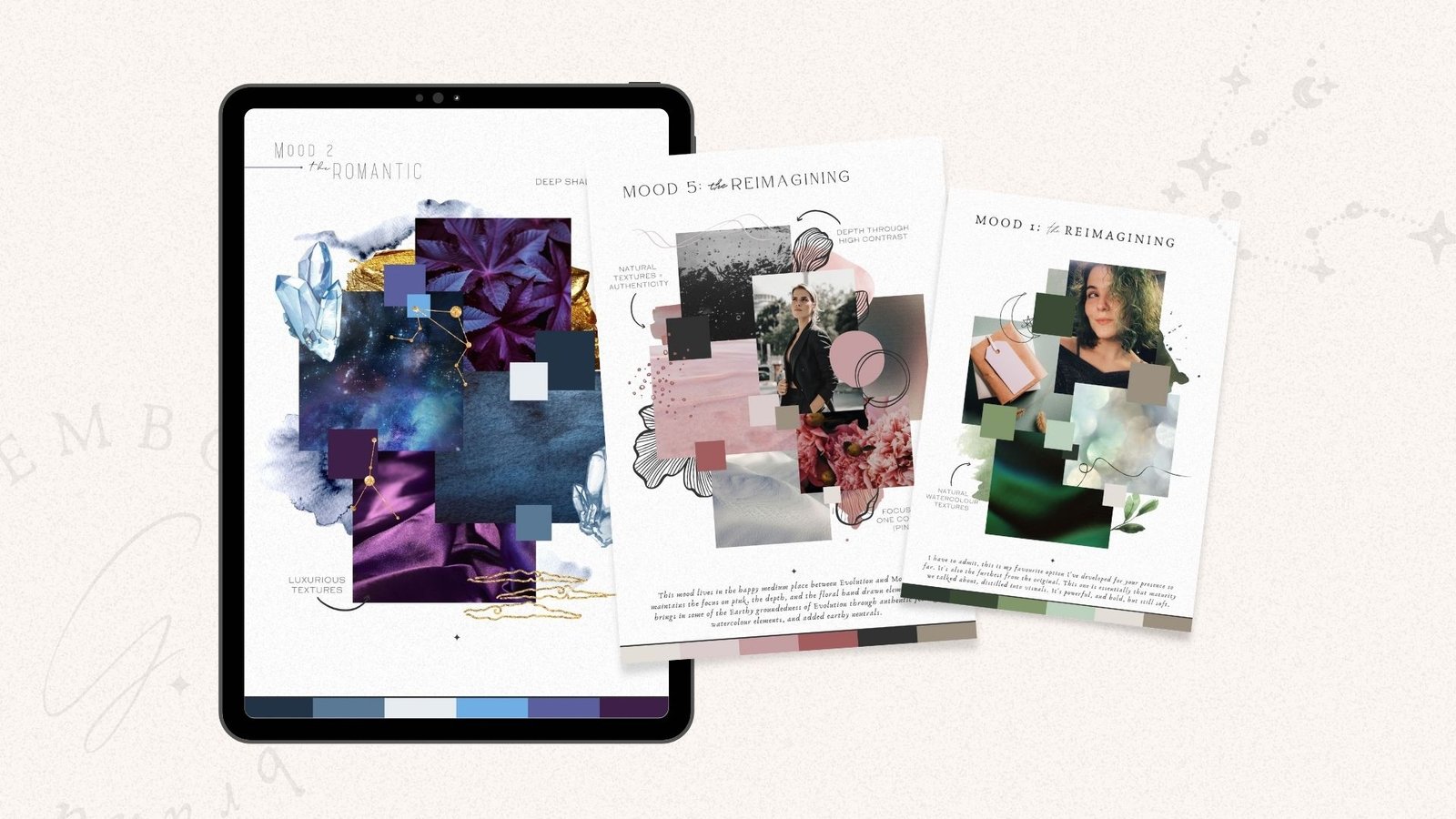
2. Mood Board Design.
This is the first step of the building of your actual visual brand content! The first thing I do, is create a mood board (usually a few of them, actually) for us to discuss, that way we can refine the tone that you want to be sharing with your people. This phase is usually delivered as a pdf, with some questions for you to consider as you look at the boards themselves, and some explanations of the origins of each element included.

3. Colour Palette Selection
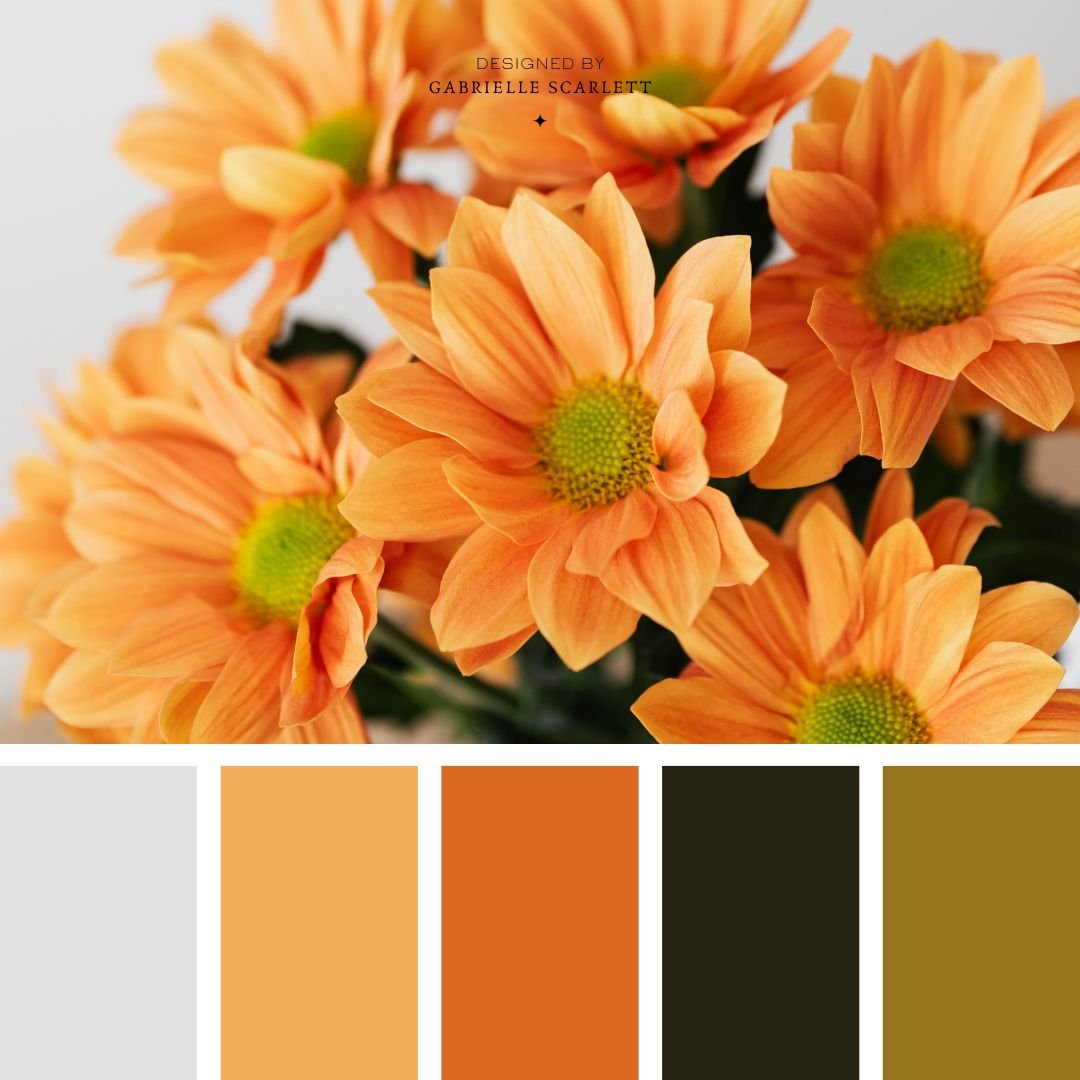
Colour palettes are usually created in tandem with your mood board, as one of the elements on the board itself. So once we select the overall mood, we might make tweaks, but we’ll be pretty close to having your colour palette as well! At this phase, I deliver a multi-page PDF that includes your final mood board, and colour palette to approve.
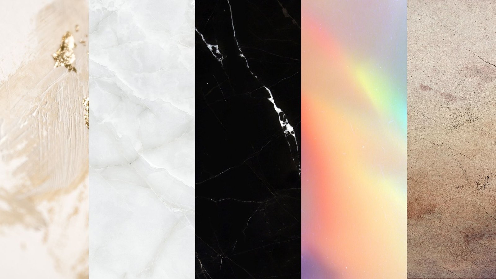
4. Custom Texture Design
While we’re getting your colour palette selected, and your mood board solidified, we’ll also hone in on the texture(s) to use with your brand. These may be as simple as a custom metallic texture to use in your social media content, or as complex as the tones of the sketched graphics we’ll develop in different phases. Textures have varying levels of importance depending on your business – for some, especially less creatively/visually based businesses, they’re an essential means of adding depth and dimension to your overall online presence. But for those who ARE creative/visually based businesses, you may be able to get away without including a branded texture, if the visuals of your work adds the necessary dimension to your presence on its own.
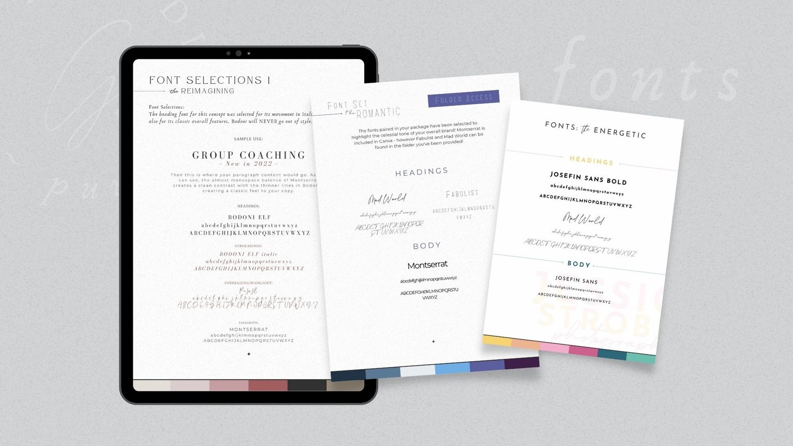
5. Font Set Selection
Now we get to get SUPER specific, and get into fonts! Usually, 5, 6, and 7 are developed simultaneously, and delivered that way as well. For most businesses, I deliver a couple of demos for these, that we discuss and refine together so that you’re completely comfortable with the tone created. For your fonts specifically, I also like to include “in context” demos, so that you can see what the fonts will actually look like when you’re implementing them in content! Usually the set is 3 fonts, but there are situations where a fourth is necessary.
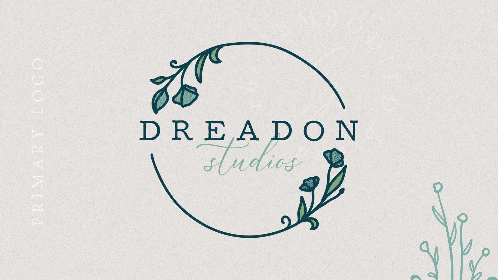
6. Primary Logo Development
Your primary logo is developed in this phase. The primary is usually all-encompassing – so your full business name is used, including potentially your establishment year, and sometimes a tagline or title depending on your business. Sometimes, you can get away with having ONLY this logo, but I definitely wouldn’t recommend it. Without other versions, you won’t be prepared to use your logo in different locations on different kinds of media, and in different available spaces.
This is still usually the most used logo of your set, because it’s the one that gives the most information about your business.
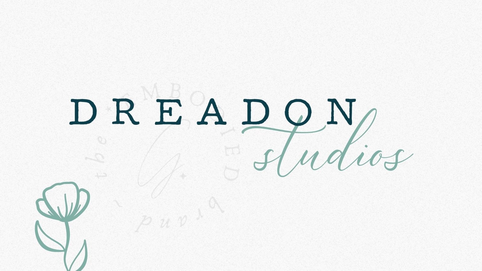
7. Secondary Logo Development
Logo variations come in all shapes and sizes! Some of them have more limited information, some of them are simply a reshaping of the same elements to fit into different ratio spaces, and yet others are a more complex version of your submark, as opposed to being a less complex version of your primary logo. Sometimes, businesses will have a set of variation logos, instead of just one! This is, again, usually to accommodate different formats that it’ll be used in during promotion. And it’s especially true for those who need packaging designed, as packaging has a tendency to require different ratios of a logo simply due to the different sizes of products in your product suite.
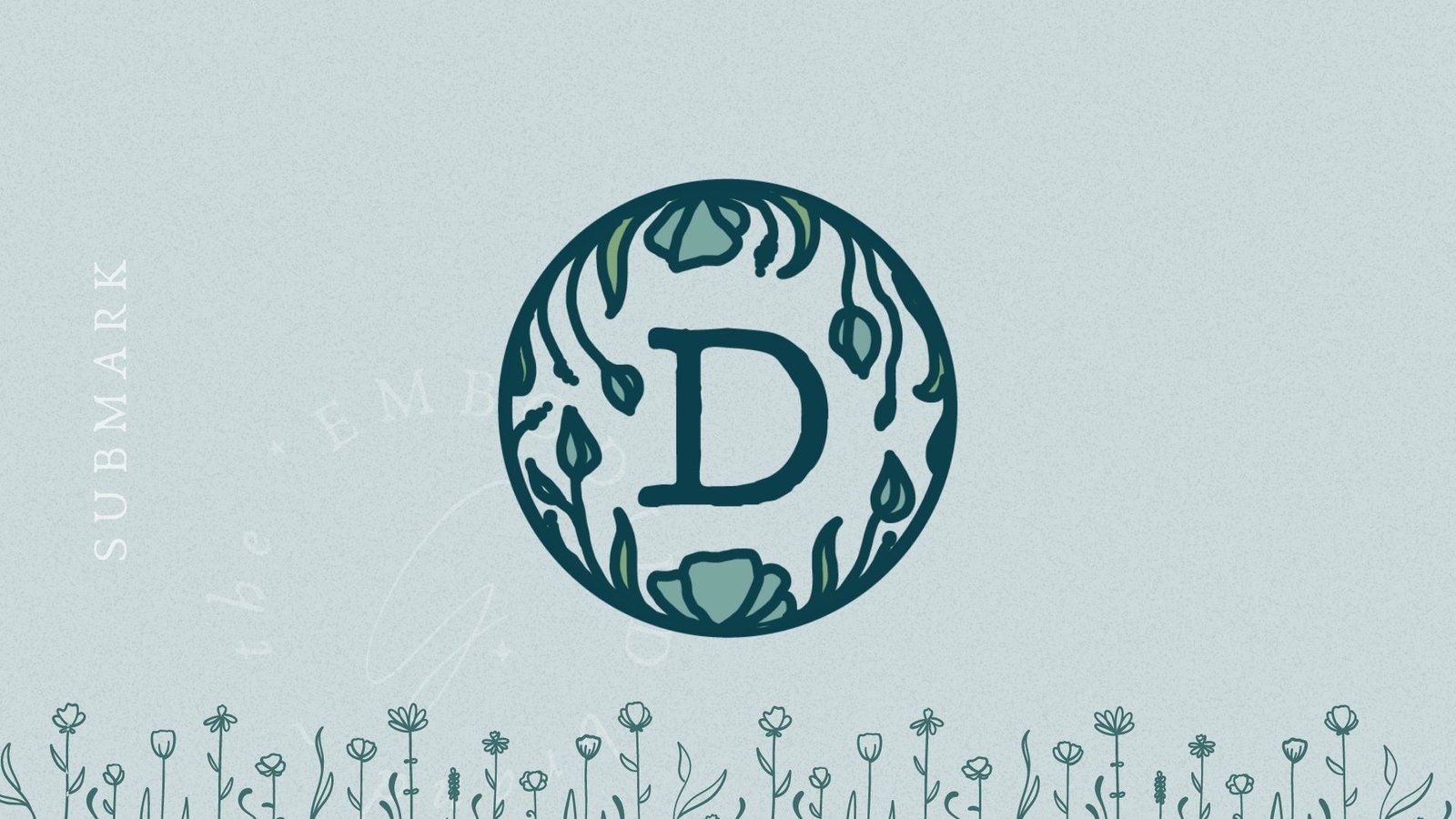
8. Submark/Favicon Design
I have a confession to make. I am mildly obsessed with submarks. They’re tidy, they’re fun – they’re about as distilled as a symbol for your business can get. Whether they include lettering, or a graphic element, I always deeply enjoy the process of symbolically boiling down your business values to something that represents them fully, in an immensely simple manner.
Your submark is best used in small formats – think the social media profile images for your business presence, and the little favicon in Chrome tabs. We want them to be readable and recognisable even when they’re THAT small. Usually, I also end up using them for business’s social media presences, as a background element in post designs, and a subtle means of branding otherwise simple content. You’ll find the submarks of my clients worked into the backgrounds of their websites as well, subtly stamped into their business cards, and implemented as wax seals for the delivery of client materials. There are about a million and one ways to use them – and with how creative my clients usually are, I encounter new uses of those materials every day!
(See more of the Dreadon Studios presence at www.dreadonphotography.com)
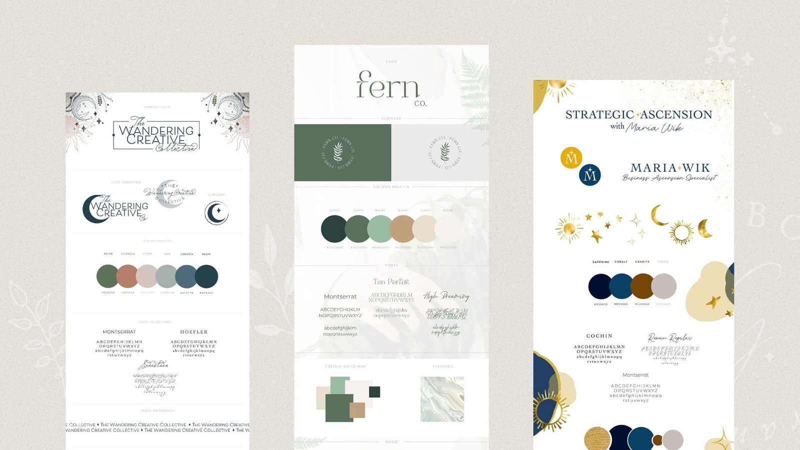
9. Brand Board Delivery
Once we’ve gone through the full process and you’ve approved your refined suite, it’s time for me to deliver your brand board! If you’re not familiar with the concept of a brand board, it essentially gets all of the previously mentioned content onto one page, so that you can see it all together. You can see how it works to curate a tone. If you’re looking for examples, there’s a whole bunch of them over in my branding portfolio, where you can get acquainted with the format.
10. Popular Asset Formats
The absolute final phase of developing your brand content, is delivery! And I deliver your assets in tidy, organized exported folders that ensure you have everything you need to use your content moving forward. And, if you at some point down the line end up needing a file type for a specific need that wasn’t provided, all it takes is reaching out and I’ll make it happen.
What if you want more?
There are other elements mentioned above, that may or may not be a good fit for your business! The first, is:

11. Custom/Hand Drawn Graphics
Not all brands need hand drawn elements. But boy when they’re needed… they’re PERFECT. This, of course, is talking about graphics beyond any hand drawn components included in your logos themselves. Those are ALWAYS included in a branding package with me. This element goes far above and beyond that, and provides you with a vector/png set of drawn elements that you can use across your presence, to set the tone, create the mood, and otherwise stand out from the crowd.
It can be anything from florals, to witchy elements, to patterns, to celestial sketches, to abstract shapes – whatever fits the needs of your brand, is what I’ll develop for you, and provide in a format that you can use for your presence in an ongoing fashion.
These are especially helpful for those who plan to eventually purchase a social media package, or physical packaging for products. These graphics provide texture, dimension, and depth – and not only that, but they set a consistent tone that carries throughout your presence, and is completely customised to you.
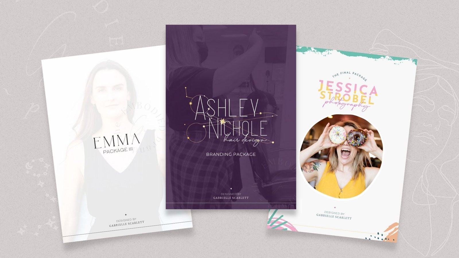
12. Team Focused Brand Style Guide
If you work with a team, and that team is going to be implementing your content for you… it’s super helpful for them to know how to use the tools I’m providing for your business. This means, that if you have a team or plan to have a team in the future, a style guide can help them maintain consistency across your content! It’s delivered as a video guide, or a pdf, depending on your preference, and it walks through how to use all of the provided materials, and maintain consistency no matter what your team is building.
13. Live Implementation Training
Another super popular upgrade to my mid-level brand package is a live implementation training following delivery. This is essentially an enhanced version of the team-focused brand style guide, in a video format – however, this version is live, with you, on a scheduled call, where you can ask whatever questions you have. If you’re someone with a team, you’re also welcome to invite them to the call, so that everyone who works with your content has a chance to have their questions answered!
The Results
All of these tools combined create a new, aligned as fuck baseline for your visual content, specifically designed to meet the needs of your business, and your audience. The process is targeted, collaborative, and no matter what: we don’t stop until you’re deeply, deeply in love with your content suite.
And after this process is through, we can move on to other implementation elements, like social media content packages, web design, and other branded business tools!
Pin me for later!







0 Comments