


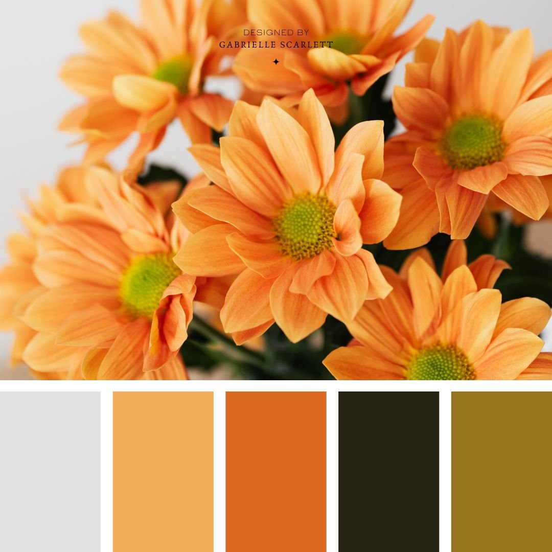
Sometimes choosing the palette for a project is the hardest part!
Making art involved a ton of steps. It doesn’t matter what kind of art it is – even if your goal is unfiltered expression… there’s gonna be thinking involved! And honestly, for me, sometimes the hardest of those steps is choosing my palette. It’s especially true if I’m painting – and sometimes, I like to give myself some starting points! In fact, that’s actually how this series of blog posts started in the first place.
But anyway, the point I’m getting to, is when you’re choosing a palette, you might want to think about the colour psychology behind the choices you’re making!
Red palettes are super versatile
If you’re leaning toward reds for your upcoming project, whether it’s a painting, or a brand design – there are tons of reasons to go that direction! Red is a POWER colour, which means it’s super communicative (not that other colours aren’t).
Red also has a duality to it, because it can create a sinister tone (think horror film poster) or it can infuse the theme of “love” (think valentines day) – and on the other end of the spectrum completely, depending on its use and where you are in the world, it can even be used to make political statements. Red has a LOT going for it. It’s also a “stop” colour – which when it comes to setting up buttons on your website (for example) generally means “maybe don’t use this for purchase buttons” but when it comes to art… it might be where the eye hovers the longest.
Red palettes can come from many inspiration sources…
Red palettes can be drawn from all kinds of different inspiration, but like most colour palettes… I prefer to draw from the natural world. Think “florals” and “autumnal vibes”! But there are loads of other sources of reds – like neon lighting, for example. These reds are going to come out extra vibrant no matter what, if you’re colour picking, and as a word of caution… you may not be able to print the red tones that land in these palettes as effectively as others. Vibrant, neon tones don’t work super well in CMYK, so if you plan on printing your work, or you’re picking a palette for physical artwork, make sure you’re selecting something that can actually be achieved!


Red hues are powerful, and bold
Red is a power colour, like I said. The power colours, loosely speaking, are red, blue, black, and white. It’s no coincidence the colours the political parties use… but anyway, that’s not the point. What I’m getting at here, is bold, powerful statements can be made with red in your work.
There’s also another association here that can’t go ignored, although it might feel a little weird to talk about – blood. Both of the “horror film” variety, and the “feminine power/menstruation” varieties. And we’re not going to get into a gender-politics discussion here (although did you know that’s one of the things my actual degrees are in?) but there’s the cultural reference to the scarlet letter – red, here, being the opposite of fresh white snow. The opposite of white (purity) isn’t black (evil) – it’s red, the impurity of the monthly bleed. I will resist the urge to go into a “the virgin and the whore” rabbit hole, you’re welcome.
But the point that matters here, is that if you’re looking for your art to call to the feminine rage we’ve all got bubbling under the surface… red.
That’s whether the red is soft, hard, vibrant, moody – you name it, the associations are there.


Every colour palette is all about balance
I talk about balance a lot when it comes to colour palettes, but there’s a good reason for that! Simply deciding that you want red for your palette, and that it will automatically be bold and strong because it’s pink… well that’s not really enough.
When you’re deciding on the TONE you want to communicate through your palette, you can bring energy into nearly any set of hues, through saturation, shade, tone, and cohesion.
Want to start with your own image?
These palettes make great starting points, but if you have a specific image or mood board you want to start with, you can totally do that instead! Grab your image or images, and then, get that colour picker going!! If you’re not a Canva user, or an Adobe guru, then sites like Coolers.co can make your process super simple. Just pop your image in, and it’ll generate palettes based on it for you to tweak and choose from! Adobe has a similar free tool here, if you’re more of an Adobe human.


So I have my palette – Now What?
Start using it consistently! Success after rebranding (or branding for the first time) comes down largely to consistency. You want to make sure that once you’ve chosen your colour palette, you use it across all of your social media, as well as your entire online presence. Inject it into any branding images that you take for your company, including the wardrobe in your headshots. Make sure that the vibe created in your content aligns with the mood created by the palette!
If your red palette is light, and airy, and uplifting, keep things light, and airy, and uplifting. If the red colour palette you’re using is deep, and moody, and ethereal… same deal. Stick within the mood that is curated by the colours you’ve selected.
Trying to decide whether pink palettes would work for your brand?
If you’re stuck on whether a red palette might work for your branding, or your upcoming project, I’d love to have a chat! We can talk about whether reds are actually the way to go, or whether the emotions you’re looking to instill in your audience would be better communicated with a different palette base entirely!
Happy designing!


Pin me for later!


0 Comments