


Sometimes your project calls for something SUBTLE
I’m the first person in basically any room to say that not all projects need neutral palettes. I mean, they’re trendy, and they appeal to a lot of people – but appealing to a wide audience isn’t always a winner. Even though I KNOW that sounds counterintuitive, I promise there’s logic there!
When it comes to creating your branding in particular, going with neutral tones because it won’t turn anyone off, misses the point in your branding content. That point being, of course, that your brand should be designed to ATTRACT your people! Not designed to repel the fewest humans. When we design branding, we’re not casting a wide net – we’re throwing out a line, to catch the exact right people for what you do.
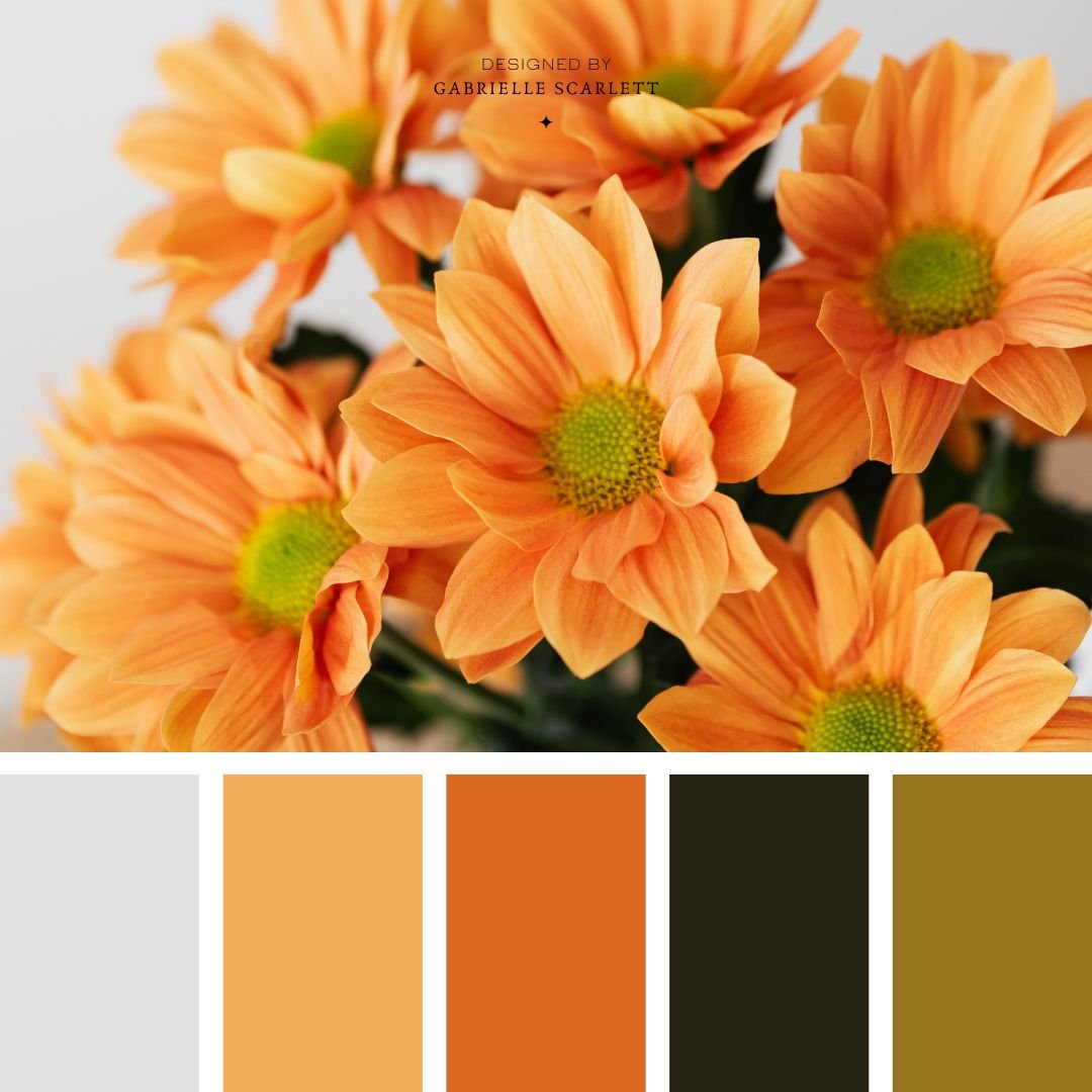
Earthy, Neutral palettes are great for all kinds of projects
That being said, sometimes neutral IS the way to go! It entirely depends on your project, what you’re doing… and hey, maybe that’s not even branding! And that’s okay. These palettes make great starting points for decorating projects – or even your next painting, if that’s the vibe you lean into in your artwork!
Neutral palettes can feel grounding
If neutral IS the vibe for your brand… it might be because of the colour psychology behind neutral tones, and what they do in concert with eachother. Specifically, they’re grounding colours. Which you can read as literally as you want to, because like… the literal ground is… brown.


Neutral hues are COMFORTING
Another important aspect of neutral hues is when they’re used correctly, they can honestly feel like a big hug. They’re comfort colours – they’re easy to see, they’re all around us, and they’re very natural tones. Which also makes it easy to find inspirational imagery if you’re looking at creating a neutral mood board before you start whatever you’re about to be working on!


When you use neutrals, it’s all about balance.
The idea of neutrals being “neutral” isn’t actually 100% true, because… well… there’s all kinds of neutral palettes. There’s even the NEW neutral… grey. Now, I’m not all about that vibe when it comes to decorating spaces, grey isn’t really my vibe. However, a nice, warm, lovely beige? I can get into that, in the right space.
But balancing neutral palettes is about more than that, too! You can create gorgeous, complex neutral palettes by balancing warm and cool neutrals, to create something really lovely. Or you can bring some more energy to your neutrals, by adding high contrast tones into the mix! At the end of the day, you can think of neutrals as a canvas in and of themselves. Neutral palettes can be just as complex as palettes with a vast array of hues, when they’re designed with intention.
Want to start with your own image?
These palettes make great starting points, but if you have a specific image or mood board you want to start with, you can totally do that instead! Grab your image or images, and then, get that colour picker going!! If you’re not a Canva user, or an Adobe guru, then sites like Coolers.co can make your process super simple. Just pop your image in, and it’ll generate palettes based on it for you to tweak and choose from! Adobe has a similar free tool here, if you’re more of an Adobe human.


So I have my palette – Now What?
Start using it consistently! Success after rebranding (or branding for the first time) comes down largely to consistency. You want to make sure that once you’ve chosen your neutral colour palette, you use it across all of your social media, as well as your entire online presence. Inject it into any branding images that you take for your company, including the wardrobe in your headshots. Make sure that the vibe created in your content aligns with the mood created by the palette!
If your neutral palette is light, and airy, and uplifting, keep things light, and airy, and uplifting. If the neutral colour palette you’re using is deep, and moody, and ethereal… same deal. Stick within the mood that is curated by the colours you’ve selected.
Trying to decide whether neutral palettes would work for your brand?
If you’re stuck on whether a neutral palette might work for your branding, or your upcoming project, I’d love to have a chat! We can talk about whether neutrals are actually the way to go, or whether you might be playing it “safe” a little bit. Because like I said, neutrals might not be the “safe” option you were thinking they are, depending on what the values are that underlie your business!
Happy designing!


Pin me for later!


0 Comments