I’m not here to tell you your brand should be boring.
Branding design should be unique to the business it’s being designed for – 100% yours. Designed specifically to call to your people, and communicate with them clearly. And I’m definitely not here to tell you that your branding should be boring – it should be whatever it needs to be! Whether that’s neutral and clean, or chaotic and colourful.
If your branding needs to have lush illustrations, rich colours, and vibrant imagery – then that’s what it needs. And there is NOTHING wrong with that! Nearly every rule in design is made to be broken, because there are just… exceptions. And some rules, like only using a certain number of colours, or only using a specific number of fonts, are fake rules anyway. Totally made up. Great to use if you don’t 100% know what you’re doing yet, or you’re DIYing your content, but it’s important to recognize that they’re not rules in the sense that if you break them, your content won’t convert.
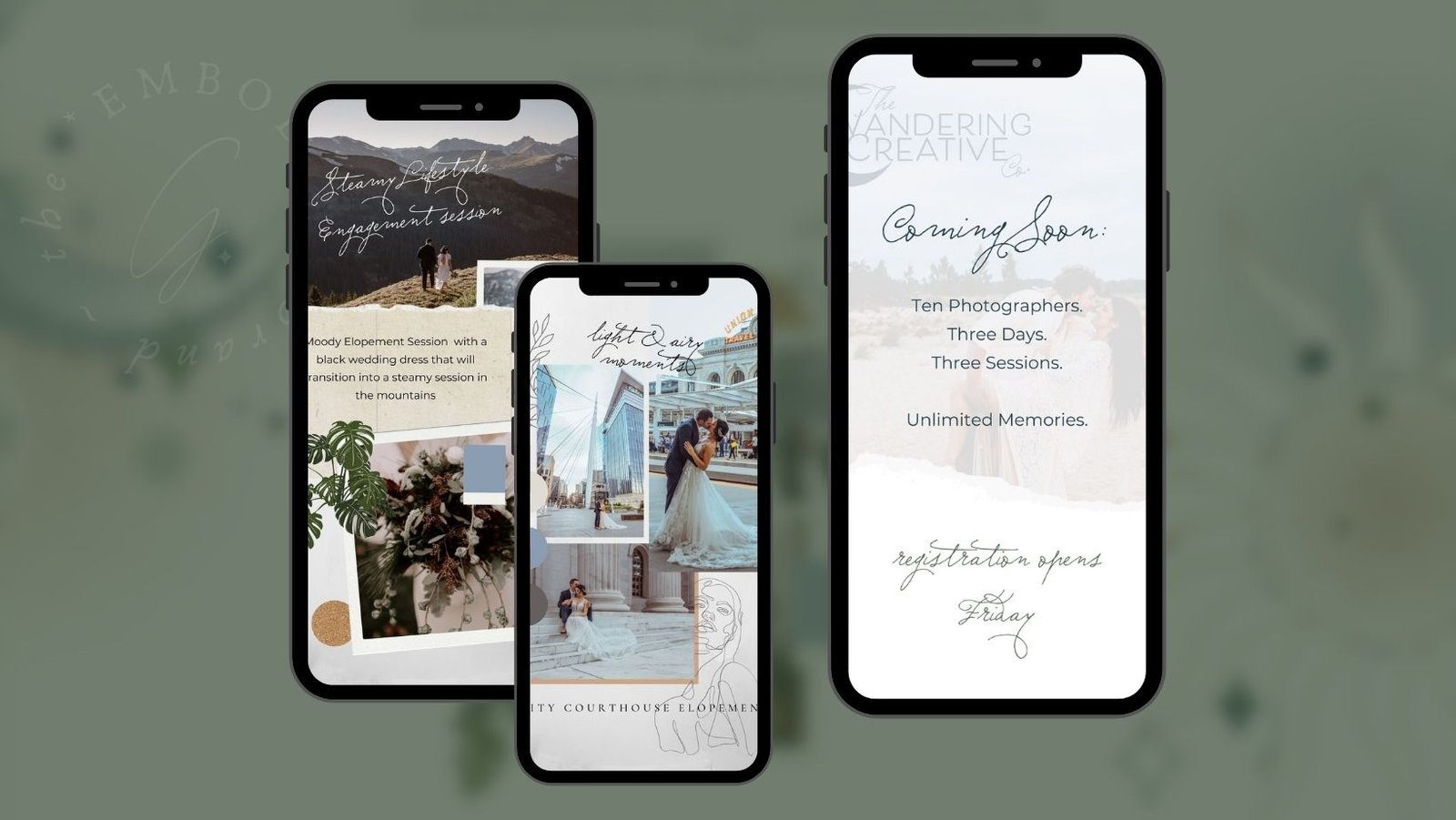
But there are rules in design that we definitely want to follow.
But… (You knew there was a “but” coming, right??) there are rules that need to be followed if you’re going to have branding that sings the right song for your cool humans. Mostly, because SOME design rules make sure your content is attracting people for the right reasons, not the wrong ones. The WRONG reason, in this case, basically being “something about this looks off, so I’m going to look at it to figure out why”.
That isn’t the statement you want to make with your stuff – whether it’s an Instagram post, or an ad you’re running. You want people to look at it because they LOVE it, and it makes them want to see more. Not because they’re trying to identify the flaw.
Creating busy designs is distracting.
One of those rules, is about visual overwhelm. Visual overwhelm happens for your audience members when your content has… well… an overwhelming amount of STUFF happening all in one place!
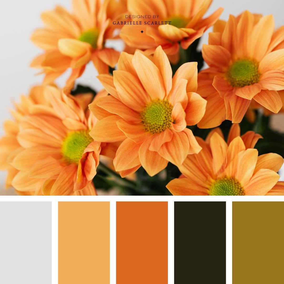
The placements of elements in your designs should complement the overall tone and message you’re going for, and if you have too much going on in the space – too many elements, overuse of colour – then you’re going to muddle that message. Your audience won’t know where to look – like a Where’s Waldo page. And that’s NOT what we’re going for with content you put out there to promote your business or brand.
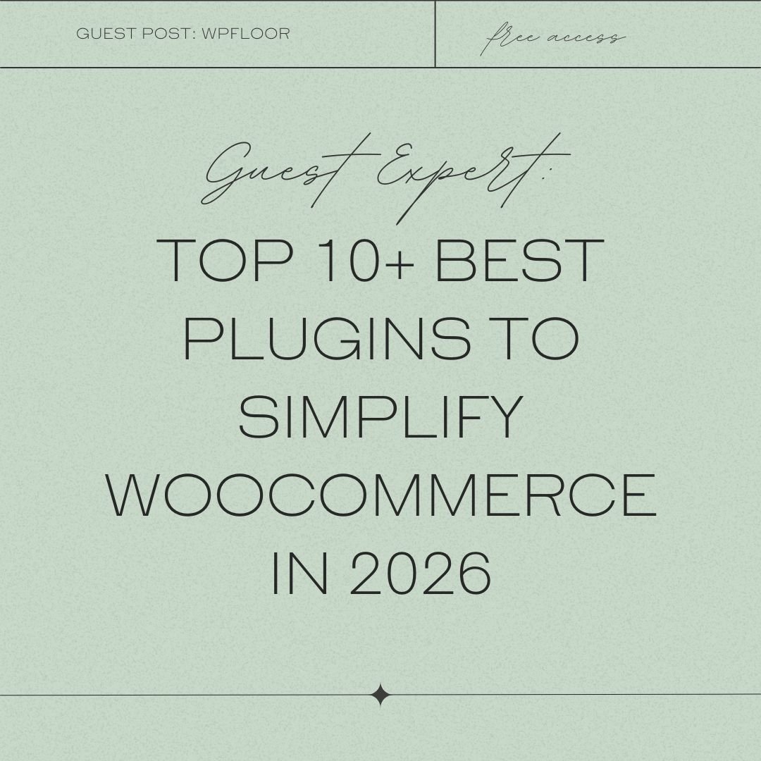
It’s important to let your designs breathe, and to create them in a balanced way. A great example is the difference between the two designs you see below – one, is fairly overwhelming. It’s chaotic. There’s a lot going on, tons of layering – and not even of design elements that stylistically match. There’s text in the centre of the design, but it’s overwhelmed by the design elements around it so much that you honestly don’t really know where to look. The second design, by contrast, lets the message BREATHE. It gets the point across, because the design complements the message. It’s about not including fluff in your content, and… the image itself is NOT fluffy. It does have design elements, but they’re not right up against the written message, and they’re stylistically matched to each other.
At the end of the day, the first graphic sends a mixed message. It says something different visually than it says with the literal text overlaid on the graphic.


You want your clients to remember your content for the RIGHT reasons!
It’s true that your audience might remember the first image – the super busy one. But it’s less likely that they’ll remember it because they care about the message, or want to read your perspective about it, and more likely that they’ll remember because the graphic was straight up confusing.
And when they think about your stuff, you want them thinking “wow, they are SO right” or “Dude, I NEED those yoga pants” not “Oh hey, I saw a thing on Instagram that was like all over the place” and disregarding the message itself entirely.
Brand recognition is important, but it’s only brand recognition if what’s being recognised is what you DO. Not how confusing your design was. If that’s what’s sticking in your audience’s head… that’s not ideal, and it’s not likely to lead to conversions.
Having trouble balancing your business content design?
Creating effective designs to promote your business if you’re not a designer (and even if you ARE a designer!) is all about balance. Balancing form with function, balancing the message with the visuals, and balancing trends with the core values that underlie what you do.
So if you’re having trouble balancing the graphics and brand content for your business, it’s time to practice! Look at what works well for other businesses in your niche, and study the similarities. Try to identify what others are doing well, so that you can apply those same rules to your own brand’s ecosystem. And if you’re not into the idea of doing it all yourself, well… it might be time to reach out to someone like me. There are brand designers all over the world who would love to help you refine your brand’s visual identity, and I’m one of them! So feel free to reach out, and we can have a chat. Because your business deserves graphics that send the RIGHT message, not a MIXED one!

Looking for Canva templates for your business?
If I haven’t convinced you to use Canva in your design business, I’m aware it might be because you’re not a designer, you’re another business owner, and you’re LOOKING for Canva templates for your business! If you are… we should chat. I would love to create a custom, branded set of templates for you to use to create your online social content, or point you to premade templates that would work for your purposes.




0 Comments