✦ My favorite Elegant Aesthetic Canva Fonts ✦
There are so, so, SO many options for what fonts to use on Canva, especially if you’re a Canva Pro user.
I could (and sometimes do) spend hours scrolling, and testing, and changing, and tweaking, until I get to the perfect combination. But because I’ve spent all of this time on the platform, scrolling, and testing… I figured you shouldn’t have to. Someone might as well benefit from my lost hours, right?
These fonts are a few of my favorites, and most of them are available within Canva free accounts, too! So you don’t necessarily have to be a pro user to access the fonts I personally love in Canva.

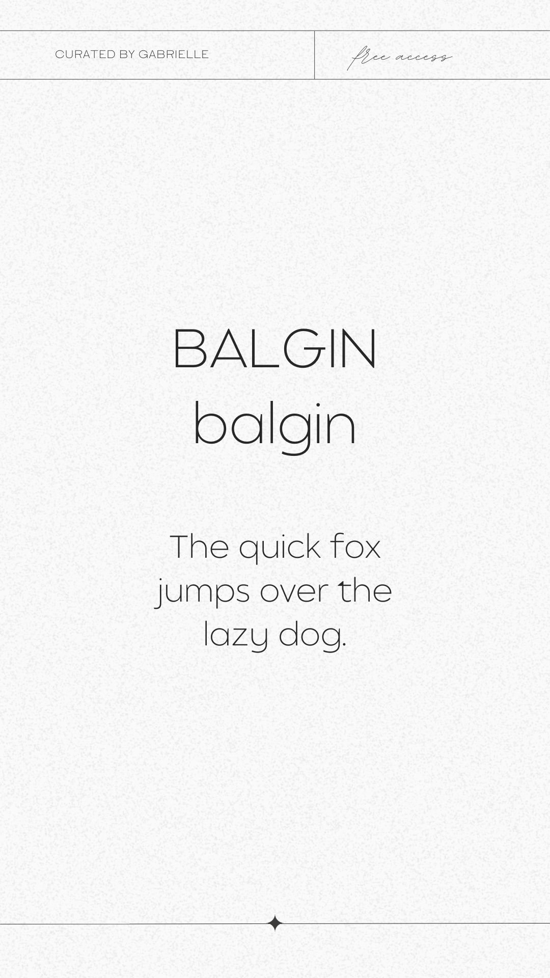
1. Balgin (Available Free)
If you want to go back in time and do something big, look no further than the Balgin Font! This font will help you do that.
Balgin brings back the nostalgic era of ’90s when everything was big, massive, and sometimes scary. Even simple shapes became complicated and complex. It’s a font designed for everything big, compact, and powerful.
Balgin’s harmonious proportions, sharp lines, and clean structure are the perfect fit for retro gaming graphics or any other brand image that wants to feel authentic and original.
The fonts are based on geometric/basic shapes (Triangle, Square, Circle) form, but they have a twist – they are rounded shapes as well. The characters are sturdy and bold, but also have a freshness to them. It’s like if you add some salt to your macaroni and cheese: it whispers “this is going to be good”.
Originally designed by Cahya Sofyan.
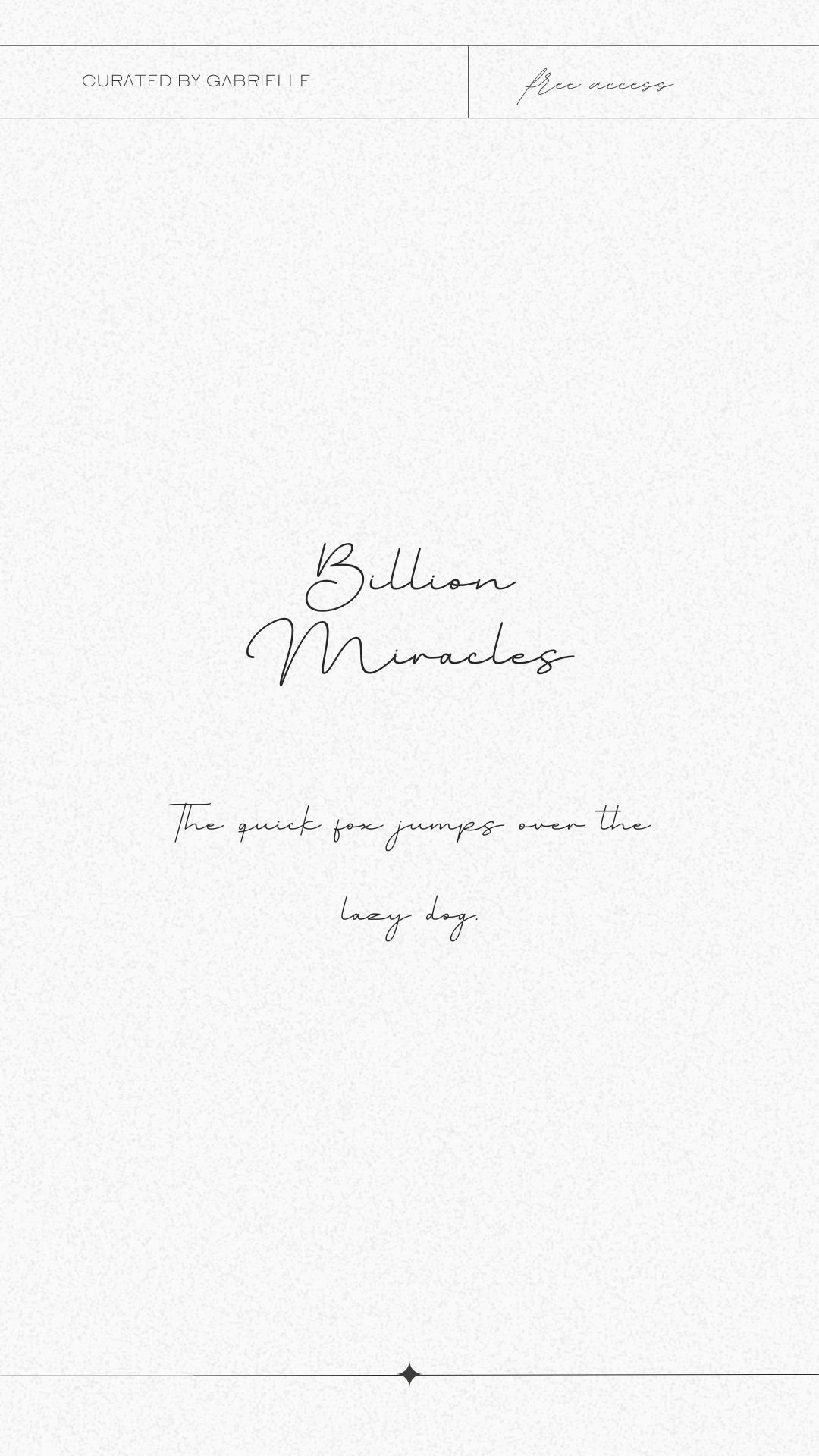
2. Billion Miracles (Available Free)
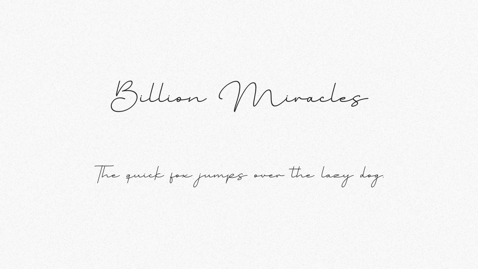
A Billion Miracles is the perfect combination of classic calligraphy and modern style. It may not be made of chocolate, but its beautiful and well-balanced characters are sure to satisfy—and its hand-drawn appearance makes it match nearly any project.
The imaginative and playful font combines traditional script with a modern sensibility. Every curve, every stroke—each was designed to capture the whimsy of our everyday lives. (Hence, “Billion Miracles.”)
Billion Miracles was designed with versatility in mind so it can be used on everything from social media posts and ads, printed quotes, t-shirt designs, packaging, or even as a modern text overlay to any background image. The font is PUA encoded which means you have access to all of the glyphs and swashes with ease!
Originally designed by Donis Miftahudin

3. Cooper Hewitt Thin (Available Free)
Looking for a good time?
Well then let me introduce you to Cooper Hewitt Thin, the sultriest sans serif out there.
Sure, you’ve heard about him—he’s got a reputation—but now that he’s back in town, you can see what all the fuss is about. It’ll take your breath away when he wraps you up in his modified-geometric curves and arches.
But don’t expect him to settle down with just anyone! He’s been around the block a few times—he was originally commissioned by Pentagram and evolved from Polaris Condensed, so it’s going to take something special to get him to commit.
“Developing this typeface specifically for Cooper Hewitt has been enormously gratifying,” said Jenkins. “Instead of building on the Polaris structures, I drew everything from scratch, using the existing forms as a rough guide for letter widths and master-stroke thicknesses.”
Cooper Hewitt is also available in a variety of weights to suit any project – all accessible in Canva Free accounts!

4. Flatlion (Available Free)
If you’re looking for a font that will turn your audience’s heads, look no further.
Introducing Flatlion—a typeface with all the elegance and panache of a lion on its way to an important business meeting.
Flatlion is a font that has it all: it’s elegant and modern, sleek and professional. But it also has some fun and creative twists that give it personality.
You could use this font to create anything from blog posts to social media graphics, but we think its real strength comes when you’re trying to make an impression. Imagine the fonts curled around your new logo, or in bold on the cover of your book.
Flatlion is a great choice for making your next big project really stand out from the crowd!
Originally designed by Din Studio
5. Gordita Light (Canva Pro)
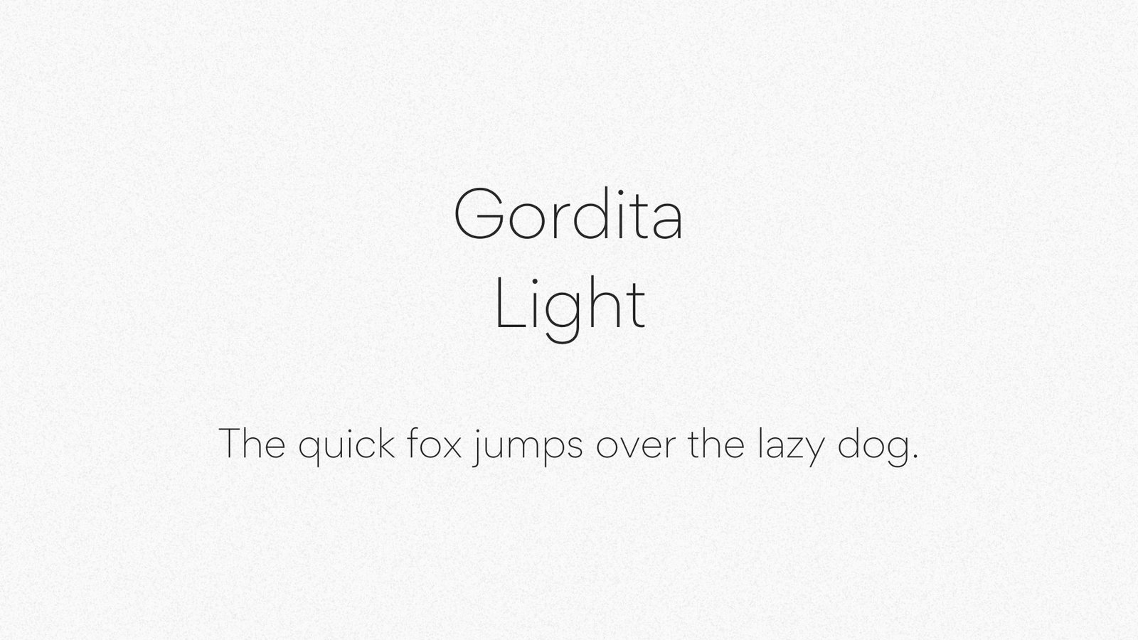
Gordita is the font you never knew you wanted.
It’s been described as “minimal but not too minimal” and “serious but not too serious.” It’s the sans serif font you’ve dreamed of, with a geometric foundation that has been built upon with modern details that result in an optically balanced, friendly typeface.
When designing Gordita, designer Thomas Gillett was heavily influenced by Futura and Gotham.
So what does that mean for you? Well, it means that Gordita is both aesthetically pleasing AND extremely versatile—you can use it in print or online, large or small. It makes a fantastic alternative to Montserrat (I know, I know… it’s classic, but it’s also EVERYWHERE!) if you’re looking for a solid paragraph text that is highly readable, and structured.
6. The Seasons Light (Available Free)
When you’re designing something, you’re creating an experience. Whether it’s a website or a magazine, you’re setting a tone and establishing an atmosphere. So what kind of experience do you want to create? Do you want your readers to feel like they’ve just visited the Museum of Natural History, or do you want them to feel like they’ve just taken a trip back in time?
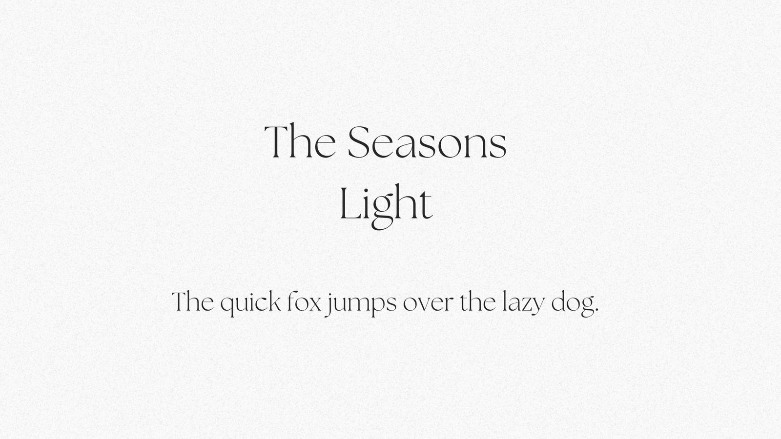
With The Seasons, it’s all about feeling like you’re in the past—but a fun version of the past. It’s not your grandma’s serif font (but don’t worry, we have that one!). This font will make your readers feel like they’ve taken a trip back in time—and that it was fabulous!
This is what we call “vintage chic.” It’s old school, but it feels fresh and new. It’s perfect for any design project that needs an old-fashioned vibe with a modern look.
The Seasons was designed by Elena Genova and published by My Creative Land.

7. Mont Thin (Canva Pro)
As far as fonts go, Mont is a classic overall. The full family includes 20 different fonts, at a variety of weights. In other words, there’s a Mont that will meet your needs no matter what you’re working on. Looking for bold and badass? Mont Bold has you covered.
However today, we’re looking for classic and aesthetic. And in the Mont family? That’s where “thin” comes in.
It’s well balanced, and feels like Montserrat’s older, slightly more evolved brother. It’s a font that, depending on your project, might serve ALL of your needs – headline, subtitle, and paragraph. All in one swoop.
If that’s not badass, I don’t know what is.

8. Signature (Available Free)
Signature is like the perfect dance partner – always lined up with you just right. It knows what you’re going to do next sometimes before you do – and it pairs incredibly well with a simple sans serif. This is a font that’s not meant to dance alone.
The calligraphic elegance of Signature’s strokes feels luxuriously handwritten, so interrupting that movement by pairing it with a structured geometric choice is the perfect level of juxtaposition.
Perfectly suited to be used as a highlight in your content, Signature will give a handwritten touch to placecards, invitations, and notes. And, it can add some elegance to your brand content, if you’re looking to bring a bit of handwritten whimsy to your presence.
Pin me for later!





0 Comments