


✦ 25 Green Colour Palettes to Inspire Your Next Project ✦
I might be a little biased, but green makes a GREAT colour for all kinds of brands!
Whether you’re creating a branding project for your business, or getting ready to decorate a space in your home, green is a brilliant colour to lean into. There are cool greens, warm greens, moody greens – SO many greens, and all of them say something different to your ideal clients.
Which sounds like an exaggeration, but as a colour nerd… colour communicates. A lot. Quickly.
Green is the BALANCE colour.
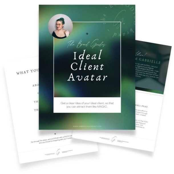
One of the reasons that I lean into green so hard in my own branding (I mean look around, it’s not a secret) is green is the BALANCE colour. This is, in some senses, tied back to how natural green is. It’s all around us, it is the colour of energy creation.
It’s also an abundant colour, given how much we associate it with money. One of the variety of things I wanted to communicate in my own branding, is that I help people grow their businesses. And that means I needed to use tones that imply moving to the NEW. And what’s more new, than fresh, green growth on a tree, in the spring?
Green is PLAYFUL
Green is also a playful, energetic colour – when it’s used in brighter, or lighter hues. But when it’s used in your spaces, it strikes a lovely balance (there’s that ‘balance’ word again) – between promoting creativity and playfulness, and being calming and restorative. It’s also one of the easiest colours on your eyes – which I personally like to think is because ya know… trees are green. Grass is green. It would make sense that our eyes would evolve to be pretty good with green hues!


When it comes to using green in your branding…
One of the other many brilliant things about green as a colour, is it’s a GO colour. That is, as opposed to being a STOP colour. It’s a great colour to use on things like buttons on your website, for example. Because it’s the colour people associate with moving forward, getting things done, and taking action. I mean, if the stop light is green… you keep driving, right?


Having trouble picking your green tones?
There are a lot of options when it comes to greens you can use for your brand – just like there are for any palette, whether it’s monochromatic or not. Greens are versatile – there are bright ones, and muted ones, and light ones, and all of them are tonally going to communicate something slightly different to your people.
When you’re picking the greens you’re going to use for your brand, you want to work from the TONE you want communicate with your future clients. What do you want them to FEEL when they look at your branding? Do you want them to feel calm? Energized? Thoughtful? All of those are going to require different pairings of tones.
If you want to go for a thoughtful vibe, you can try leaning into lighter hues, or muted ones. If you’re going for “energetic” try a palette with a pop of a super saturated green, that will bring vibrance and youth to your online presence
Want to start with your own image?
These palettes make great starting points, but if you have a specific image or mood board you want to start with, you can totally do that instead! Grab your image or images, and then, get that colour picker going!! If you’re not a Canva user, or an Adobe guru, then sites like Coolers.co can make your process super simple. Just pop your image in, and it’ll generate palettes based on it for you to tweak and choose from! Adobe has a similar free tool here, if you’re more of an Adobe human.


So I have my palette – Now What?
Start using it consistently! Success after rebranding (or branding for the first time) comes down largely to consistency. You want to make sure that once you’ve chosen your green colour palette, you use it across all of your social media, as well as your entire online presence. Inject it into any branding images that you take for your company, including the wardrobe in your headshots. Make sure that the vibe created in your content aligns with the mood created by the palette!
If your green palette is light, and airy, and uplifting, keep things light, and airy, and uplifting. If the green colour palette you’re using is deep, and moody, and ethereal… same deal. Stick within the mood that is curated by the colours you’ve selected.


Pin me for later!


0 Comments