

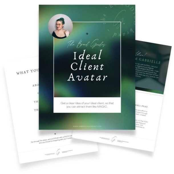
I don’t usually recommend DIY brand design…
I’m a branding designer and strategist, and you might be thinking it’s not super smart for me to go around telling people they should design their own brand. But I’m also realistic, and I completely understand that not everyone is at a stage in their business journey where they can afford professional branding design, or where it makes sense to make that investment up front.
If you’re still in the “figuring things out” stage, then working with a professional brand designer can help with the “figuring”. The processes we go through can clarify things like the values that underlie your brand – but like I said, that doesn’t mean it’s always a realistic choice to begin with. You might find yourself needing to DIY some brand materials for your new business, and that’s okay! Whether it’s for financial reasons, or other reasons entirely, you can absolutely start yourself off with content you design.
So you might as well get a feel for what to think about, and where to start, right?

Five Core Concepts for Creating Vibrant Branding
If you’re hoping to end up with vibrant, bright, engaging brand materials for your small business, then there are a few core “rules” to keep in mind while you’re creating. These will help make sure your DIY brand materials are effective, and don’t just end up as a distracting jumble of colours that don’t feel cohesive.
Now, this list isn’t exhaustive, and it’s not quite a step by step (even though it’s close!). But, it should help you hit the ground running with some DIY design pro-tips that can help smooth out your process, so you create branding that will work FOR you!
1 – Start with something REAL
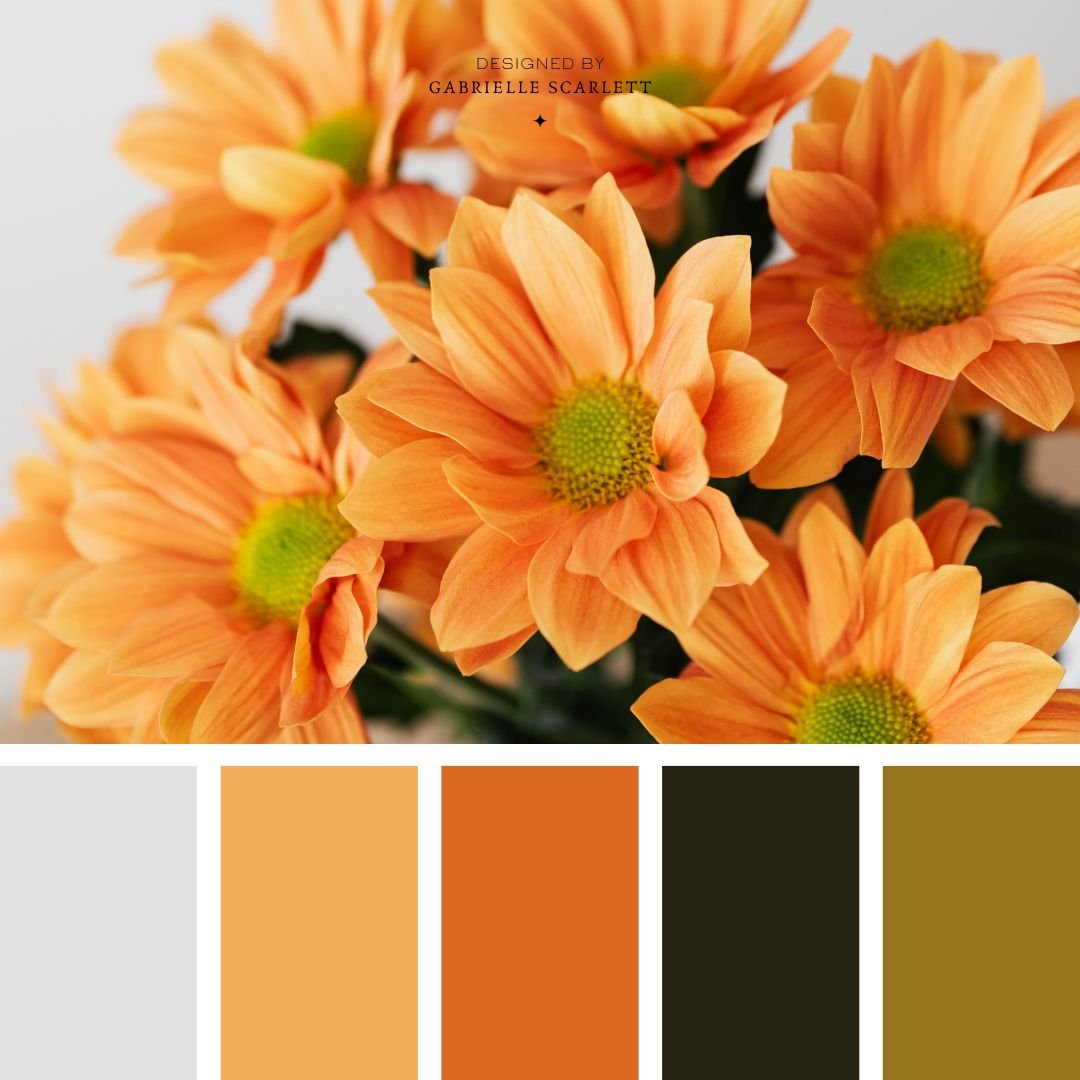
When you’re creating a palette for anything – whether you’re just starting a mood board for a painting, or you’re starting the process of brand design – I always, always, ALWAYS recommend starting with something REAL. Start with photos you’ve taken, stock photos you’ve collected from around the internet – and then PICK the colours you’re going to use from there.
This is especially important if you’re a photographer or creative, and your branding is going to need to line up with your work and create a cohesive environment where your art feels like the star. If that’s the case, pick your favourite images from your portfolio, pictures of your favourite paintings, or drawings – and use those as your starting point. Picking colours from life helps make sure you keep things grounded, and even if your branding is going to be vibrant, rooting it in life helps prevent the vibrance being TOO overwhelming! We want your DIY branding to be memorable, but not so vibrant people scroll past it because it makes their eyes hurt.
2 – Pay attention to chromatic aberration
Speaking of making people’s eyes hurt, you need to pay attention to chromatic aberration when you’re creating DIY branding materials for your business. Not JUST because it feels and looks kinda wonky, but also because it can literally make your content unreadable. (And give everyone who looks at it a headache)
If you don’t know what I’m talking about, I’ll explain: you know that thing that happens to your eyeballs when you try to read saturated red text over a saturated blue background? It goes all wobbly, and your eyes can’t really parse the information, so it feels like it’s flashing a little bit, or that you can’t focus on it properly. This is a strong example of chromatic aberration, and it pretty much happens because of the ways our eyes process light, but I’m not going to get into the wild science of it all.
But THAT is chromatic aberration. It happens when you place colours that are opposite eachother on the colour wheel, immediately next to eachother, while at the same value (saturation, tone, shade, AKA level of lightness vs darkness). It makes things all wobbly. But it can happen if you’re using a variety of neon hues, or a variety of saturated hues in general, and plan on layering them.
You can avoid this by making sure you’re keeping good contrast in your palette, and largely by following the other rules here too! But basically… if it gives you a headache, it’s going to give everyone else a headache too.

3 – Consider the colour ratios for use
When you’re creating any branding for yourself – but SPECIFICALLY a vibrant brand – you want to make sure you think about the ratios that the colours will be used in. Now that’s not to say that you can’t use all of them, or that you can’t balance them across things like your Instagram feed, for example.
But it’s important to make sure that you have a planned approach to how you’re going to use colour, if you’re creating a vibrant brand. It can completely change the tone of your palette, to focus on one hue over another! So consider the relationships between the hues you’re choosing, and whether they’re going to have specific associations with different elements of your work. In the past, I’ve created vibrant branding that was intended to have a sense of “colour coding” to it, using certain hues from the brand for some service sets, and others for other service sets! That’s just one way to organise the way your colours will be used across your presence though. You can keep things fairly fluid, as long as you make sure you’re doing it intentionally. If that makes any sense at all.
4 – Make sure text will be readable
This might sound like a given. I mean people need to be able to read the things you’re sharing about your business, otherwise… your content isn’t doing its job. But sometimes, especially when we’re DIYing all the things, it’s easy to miss out on readability because we’re super attached to a specific font, or a colour pairing.
Making sure you have enough contrast for your text to be readable is also an accessibility standard, which I don’t think is talked about enough. But if you want to test whether the colours in your palette will be visually readable when they’re used together, there are super cool tools for that! But if you do a cheeky google search, just make sure you’re searches are along the lines of “colour palette contrast accessibility” and not “readability” – because that’s going to take you to scoring for the WORDS you’re using, not the colours they’re in.

5 – Have fun, but stay grounded!
Look. I’m not here to yuck anyone’s yum. And if you’ve seen my work, you’ll notice I’m not shy about working with colour. Vibrant gem tones are FABULOUS, and I will never be someone who says you have to stick with three hues in your branding. But (I know, I know, you saw a “but” coming), there unfortunately IS such a thing as too much chaos in your branding. There’s such thing as colours that are going to sow discord in your audience’s thoughts about your business – and there’s such thing as too much colour in certain contexts.
So have fun creating your DIY vibrant brand – have FUN with the palette. But stay grounded, because even if you need a brand that has a bit of (or a LOT of) chaos, we want that chaos to be intentional, targeted, and for it to do work for you at the end of the day.
Vibrant branding isn’t for everyone, but neither is neutral branding!
Your business is unique – I’ll scream that at the top of my lungs to any business owner who will listen. And what that means, is you need a unique approach to your branding, that takes all of the variety of pillars and tenets that uphold your values, and the basis for your business, into account. From your ideal clients, to your own preferences. They’ve ALL got to be represented. So even if you personally love vibrant colour palettes, it might not be right for your business.
But if you love neutral palettes, the equal opposite may be true. Neutral might not be right for you either. And in truth? Most businesses are going to fall somewhere in the middle. So if you’re taking the DIY approach, and you’re thinking “this isn’t vibrant enough” or “this isn’t neutral enough” – that might actually mean you’re headed in exactly the right direction. Keep going, keep creating, and if you need help? Just ask!
If you need help creating your brand palette…
Whether you’re creating a vibrant brand, a neutral one, or just hoping for your existing brand to evolve a bit for 2026… I’m here to help you make that happen. I’m currently taking clients on an application only basis, so let me know your needs, and we can chat about what I can take off your plate!
I would love to help you create branding that lets your service and product set sing – online, and offline. And that, of course, does work for you. Because your brand has a JOB to do, so that you can focus on what you love.

Pin Me!


0 Comments