

The Colours You Use Do Work For Your Business
If you know me, you know one of my most long-standing beliefs when it comes to client branding, is that your brand isn’t meant to just be pretty. Like, yeah, I love making pretty things, don’t get me wrong. That’s how I describe my job when people ask – I’m a branding strategist and designer, which means I make life pretty! (And then I elaborate so I don’t look insane).
But when it comes to your colours, there’s no splitting hairs – it DOES do work for your business, no matter what you’ve chosen. EVEN if you’ve just picked things that you think are pretty. The only problem there, is… well, the “work” in question might not be what you actually want it to be, if the palette hasn’t been chosen intentionally and with the right things in mind. It might be “appealing to the wrong clients” or “undermining trust where it could have been shored up,” instead of “attracting exactly who you need and want to work with” and “showing your business is worth trusting”.

Colour Psychology Doesn’t Have to be Rocket Science
The palette you use for your business is, as a default, going to be seen by your future clients, and when it is… you can’t stop it from being interpreted. And it’s in the interpretation by a viewer, that the work of colour out in the world happens, influencing the people who see it.
Now, I’m not going to lie to you, this is a complex topic. And I cannot pretend that I can teach you everything you need to know about colour psychology to use it effectively, in one blog post. Or even a series of blog posts. There’s a lot to take in on the topic in general, and like everything… a huge amount of it is subjective. I mean, in American culture, for example, green is associated with money, because of dollar bills. However… before this relatively recent stretch of history that wouldn’t have been a factor, because green wasn’t associated to money.
Some colours can also have contradictory associations. Red, for example, is associated with both love and fertility across many cultures, but also to power, menstrual blood, and impurity (as in, the opposite of pure white snow, is blood stained snow).
So in other words, every colour has a ton of associations to think about, different implications, and a variety of ways it will work on the subconscious level when you use it in your branding. People won’t always 100% know WHY a colour makes them feel a specific way… but it works nonetheless.
On the up-side, you don’t need to know all of the individual details of every colour before you create a palette for your brand, if you make sure you think about the pillars that should underlie the foundation of your business!
The Theory Phase
Think About the Emotions
The first thing I always suggest you think about when you’re considering a DIY palette for your business’ brand, is emotion. The reason we consider this first, is because it plays one of the biggest roles in determining what palette is going to do the work you WANT it to do! Because branding is all about emotion, and creating an ecosystem that will cocoon your people in a blanket of feelings.
So… what do you want your clients/customers to feel? Calm? Energized? Understood? Do you want them to feel that you’re trustworthy, or that they’re hungry, or that working with you will bring order to their life?
I tend to recommend selecting three primary feelings that you want to highlight in your branding, and note these down. Then, we’re going to combine it with the next criteria, and eventually arrive at a palette!
Think About Your Ideal Client
Remember how I mentioned that at its core, colour psychology is subjective? Well this is where that subjectivity comes in. You have the emotions you want your people to feel – but next up… is who they actually are! Because who they are, impacts how different colours will influence their feelings. For example, if you’re starting a fashion brand, and you intend for it to be targeted to people who are into gothic, maximal style, and you want it to feel calm (as in, that’s your primary selected emotion), you might want to incorporate soft, deep, rich purples into your branding. But if you’re starting a yoga studio, targeted to people who love holistic wellness, and you ALSO have the primary emotion of “calm” as your goal, then leaning into a cool blue palette might be more in line with what your ideal clients need.
To get down to how your ideal client’s distinct profile will interact with your palette, you need to outline what that profile is! So, take some time, and think about who needs what you do. Who do you want to work with? What do they like? Paint yourself a picture of this person – not literally, figuratively. Or literally would work too, if you want to be super extra!
But again… if you noticed from the examples, it’s not JUST the ideal client profile that changed how “calm” could be created through branding colours. Did you notice that those two businesses were totally different? That’s where the next step comes in!
So for now, you should have the list of three core emotions, and a clear idea of who you’re targeting with your brand. And that’s when we move on to the next one!

Think About What Makes Sense
When I say “what makes sense,” I’m using my own shorthand. But, it’s the best way I’ve figured out how to communicate this element succinctly! What I mean, is “are there logical elements of what you do that have to be communicated through colour”. So for example, going back to the fashion brand I mentioned above – the gothic inspired one – it likely makes sense to include black in the brand palette. Possibly a LOT of black, paired with other deep, rich tones – or even, on its own.
It’s not just fashion brands that fall into this category of having colours that “make sense” though! Another solid example is businesses in the sustainability sector – there’s an obvious choice to at least CONSIDER (whether it’s what you land on or not!) and I’d bet money you can guess it! Green. If you’re a creative, and you work in a similar palette most of the time, then that right there is a ready-made palette, that you’ve intuitively gravitated toward, because your art is meant to evoke emotions in the first place, and it’s naturally targeted to the people who need/love it!
So I want you to think about whether there’s a palette that just “makes sense” for your work. There might not be – this one doesn’t apply to everyone! But take at least a moment to think it over, and make sure you’ve done your due diligence. So at this point, you should have:
- A list of three core emotions you want your clients to feel
- An outline of who your ideal client/customer is
- A list of potential colours that “make sense” for your business or industry based on what you do/make, and why it “makes sense”
Think About What You Love
Once you have all of those details, and ONLY once you have all of those details… it’s time to think about you. We do this last for a reason – first, because it’s usually the easiest, which means putting it at the end lets you do the harder work first! Second, because as much as you DO need to love your branding (otherwise you won’t want to use it), you’re actually not the most important person in this scenario – your ideal client is (Sorry not sorry). And when it comes down to it, the things that you love may or may not actually align with the other three areas we’ve talked about.
Odds are, you’ll be able to ensure that you DO love the branding that works for your business and takes all of those elements into account, but that doesn’t mean it’s going to be comprised of your favourite colours. That being said… if you have a creative business, or you’re an artist, or even have a personal brand, there’s a solid chance that you were once (if not still-are) your own ideal client! That makes this step a TON easier, because if you are, you get to merge your favourites with that outline you have of your ideal client/customer. But if not, it’s still worth considering your own opinion. It’s your business, after all!
So, what colours do you love? What tones? When you think about feeling the emotions on that list you made earlier, what colours come to mind for you? Are they in a certain shade, depth, or richness?

The Design Phase
All of these elements come together, to help frame your palette!
At this point, you should have the following:
- Your list of core emotions that you want people to feel
- The outline of your ideal client
- A list of what ‘makes sense’ for your business, and why
- An outline of what you love when it comes to colours
Now that you have all of it, and ONLY when you have all of it, it’s time to actually start picking colours! I know it probably feels like we’ve done a lot of work before getting to this point, but that’s because we want to pick a palette that brings together the core elements of your business, your ideal clients, and YOU, in gorgeous, simple balance.
Now, if you’re a professional branding designer, I suggest starting with the emotions, and using your knowledge of colour to go from there. That’s why it’s first on the theory list. But when you’re reviewing your list to work out where to start for your palette, if you’re doing this as a DIY branding project as someone who doesn’t have a lot of baseline design information, I suggest actually starting with “what makes sense”. Or option “three” on your list!
This allows us to do a bit of a “process of elimination” that will help you arrive at the best palette, quickly, and without needing to know a ton of colour theory to get you there.
Step One: What Makes Sense
So step one of the actual palette design phase, will be looking at the “what makes sense” of it all, and basically doing a little bit of process-of-elimination.
If you’re an artist or creative, and in the “what makes sense” portion of your list, you have a palette idea that’s inspired directly by your work, then… congratulations! You’ve done it, and you’ve arrived at a palette that will work for your business, and create an ecosystem online where your work feels natural.
Like I previously vaguely mentioned, this is because if you’re an artist or creative, your work is ‘the thing’. It’s what you’re selling, it’s the core of what you do – and if it is indeed what you’re selling… then in an ideal world it’ll also appeal directly to the perfect clients anyway.
But if you don’t have a creative/artistic business, you still might be able to start with the “what makes sense” of it all! So – I want you to look at the listing of “makes sense” colours, and their reasons. Are any of the reasons like, aggressively compelling? For example, if you’re selling tea that involves a specific type of flower petal, it would make VERY good sense to use that colour in your palette, and grow the rest of the palette around that, using a tone that lines up with your customers’ intended emotions.
Or if you’re selling sustainable toy sets for kids, and those have a specific colour palette, again… there are exceptions to the rule, but overall, most likely, you’re going to want to lean into one or multiple of those colours for your palette.
Obviously I can’t go through every option here – because there are SO many, and all businesses are unique! But if any of the items on your “what makes sense” list are calling to you, start there. If it lands you at a full palette that you’re happy with, even better! If not… keep the “what makes sense” items in the back of your mind as we move through the rest of the areas to look at.

Step Two: The Outline of Your Ideal Client
When you’re creating a DIY palette, after you’ve checked the items that “make sense” and ruled out whether they’re going to land you at a final palette, I suggest moving on to the outline of your ideal client. Partially, because it’s the next simplest tool in our new toolbox, but partially because it works well with the “process of elimination” approach we’re taking.
So pull up your ideal client outline. Keeping in mind “what makes sense,” if you do indeed have those on your list, consider what your ideal client is drawn to, in your industry and niche. What’s their aesthetic like? Can it help weed down your options? If you have an affiliate blog, where you recommend affordable ways your readership can bring minimal organization into their home, what does that mean you should communicate to them through your brand palette, that they’ll feel aligned with?
On the other hand, given our process of elimination approach here, can we rule out any palettes or colours based on who they are and their aesthetic? For example, if you have a yoga studio, and your ideal clients are focused on wellbeing and looking to add calm to their day, it might mean you can rule out vibrant, saturated palettes right off the bat. Or, it might mean that you can combine a bit of “what makes sense” and “your ideal clients’ aesthetic” together to arrive at a palette here and now, without going further in the list!
But this step does have some overlap with the next one – emotions – because it’s likely that the emotions you want your ideal clients to feel when they look at your cool stuff, is dependent on who they are and their own context.
Step Three: The Emotions of it All
And that’s why we’re going to move on to this one, pretty quickly! So thinking about your ideal clients, their aesthetic, as well as what you do – bring in the emotional side of things. You might have noticed this is already pretty embedded in the other steps as well, because at its core, branding is about emotions. But if you haven’t arrived at a palette from the other steps, then this one is going to change the game.
Like I said, there’s a lot of interplay between the emotions, and your ideal client. Colour psychology isn’t 100% science – in my opinion, it’s more 50/50, science and art. But there are some things we can rely on, like pastel hues generally having a calming impact, and saturated hues having an energetic tone. And as long as you have an idea of the cultural associations of your ideal client, then you should be able to weed down to some general categories of colours that will be aligned to certain emotions and ideas.
And to make things a bit easier, if you’re also your own ideal client, then you can use your own emotional associations to line things up even more clearly! Not everyone will be in this situation, but if you are… you get a head start!
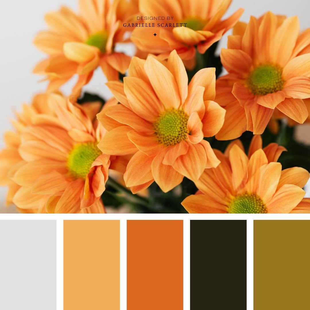
As a general rule, you can think about the following emotions, and colour associations/tones. Yes, I know they’re not all 100% “emotion” words, but for the sake of shorthand, I’ve not written “They feel like purchasing your product will help them participate in sustainable choices” I’ve just written “sustainable”. So with that caveat, before you come for me for being imprecise, we have:
- Calm: Soft colours; blue; green; lavender
- Energetic: Vibrant colours; Saturated colours
- Warm & Cozy: Warm toned red, orange, yellow, brown; sometimes, varieties of greens
- Professional/Corporate: Power colours, black, blue, red, black, white, gold; monochromatic palettes; mid-saturated colours
- Trustworthy: Blues; Purples
- Magical/Ethereal: Multi-coloured palettes; Purples; Blues; Pinks; High contrast
- Moody: Deep colours; Highly shaded (hue + black) hues; Navy; Black; Purple; Charcoal
- Clean: Bright colours; Highly toned (hue + white) hues; White; Pink; Light Blue; Light green; Sunshine yellow
- Natural/Sustainable: Colours from nature; Green; Blue; Brown
- Growth: All variety of greens, and other natural tones
- Happiness: Depends HUGELY on your audience, but as an overarching vibe – Yellow; Orange; mid-toned hues (not too saturated, not too desaturated); Multi-coloured palettes (think “dopamine dressing” – it looks different for everyone, but is usually bright!)
This is obviously a massive oversimplification, and I’m not going to pretend that if you pick “purple” for your branding palette core, then it’s automatically going to be magical. And I’m not saying that if you choose soft greens, it’s automatically going to be calming. That’s not how any of this works – it’s about the combination of things, and how they all mix together to create an environment that appeals to your people, and achieves the goals you have in mind.
And the palette isn’t even the only aspect of your branding that helps to create this ecosystem – it’s your palette, your fonts, your logo materials and graphics, any illustrations or photos you use… the list goes on and on. The tone of your brand is cumulative, not specifically tied to any of these single elements.
Still need a little business colour palette help?
Hopefully, this not-so-succinct walk through has helped with your process – but if it hasn’t, that’s okay too! You can’t be expected (or expect YOURSELF) to learn an entire industry overnight so that you can add that hat to the list of hats you wear on a daily basis as a business owner. It’s just… not fair.
So if you’re looking for a bit more support in this process, reach out! I’d love to help you refine what you’re working with, see if some of my pre-made tools might work for you, or even check whether we’re a good fit for a full design package, to get you everything you need for your business’ rebrand! That way, you don’t have to go through the trial and error, the process of elimination, or go through design steps by yourself – and you know, for sure, that what you end up with for your brand will be targeted beautifully to exactly what will help your business grow. Because after all, that’s the overall job of your brand! It’s supposed to DO work FOR you – not BE work for you.

Pin Me!


0 Comments