Why does colour psychology matter in your branding?
If you’re at all familiar with my approach to branding, you’ll know that I spend a lot of time considering the intentionality behind the mood created by your brand’s palette. To make your brand work for you, you have to consider the way that colour will influence the clients looking at your presence – and that means taking colour psychology into account! If you’re new to all this – don’t worry.
To put it as plainly as possible, “colour psychology” refers to the ways that colours individually and in combination impact the mood, emotions, and even decision making of people viewing them. So obviously, it makes sense that it would matter for your branding, since the whole point of your brand is to create an ecosystem around the feelings you want your clientele/customers to have about what you provide, and ultimately, about your business as a whole!
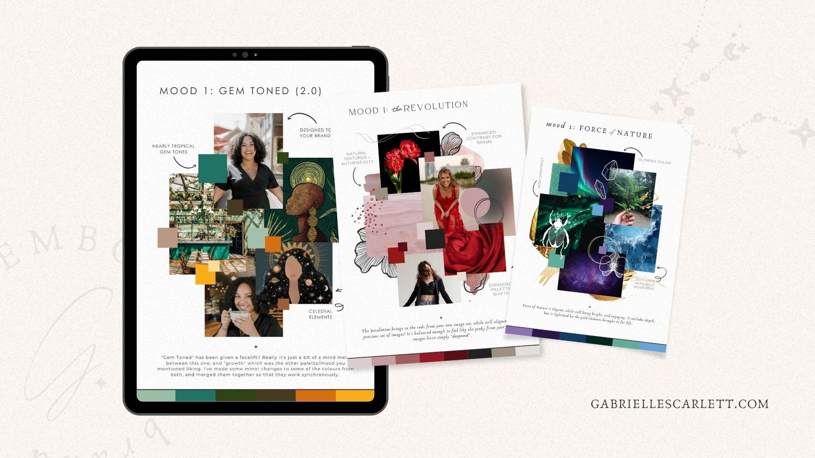
Most Colour Psychology works subconsciously.
Some elements of colour psychology in branding (and in general!) are fairly intuitive. For example, it’s fair to assume that most people within what we can refer to as “western cultures” associate green loosely with nature, because… well, a lot of nature is green. We also associate it with money, because of the US dollar being physically green.
Red, we culturally associate with love, and romance, pink, with femininity. We could get into the specific histories of each of these associations, but culturally speaking, they’re the more intuitive, straightforward ones to think about.
Other elements of colour psychology, run further beneath the surface. This is the case for other aspects of branding, too, like the way that things like the shape of the lettering in the fonts you choose as the primary text in your branding communicate things about your business to viewers. And all of those more “subconscious” ways we’re influenced by colour, are a bit like an iceberg. There’s the “visible” portion – the part your clients see – and then there’s leagues and leagues of strategy hidden underneath the waves.
Branding is all about Communication.
Colour psychology in branding is all about communication, and those emotions I mentioned earlier. That’s true about every aspect of your branding, to a degree, but is particularly true when it comes to the palette you use. And just like every aspect of branding, there are layers to the way that influence can help shape viewer perception.
For example, blue is, in colour psychology, our “loyalty” colour. It instills a sense of calm in lighter, less saturated hues, but can be bold, and powerful (it’s also a power colour, for this reason) in more saturated applications. Due to cultural alignments, it also tends to have a masculine association, too. So you might choose a monochromatic, light, airy blue palette, if you’re attempting to foster a sense of calm for the clients of your yoga studio. Or, you might choose a slightly bolder blue palette for a medical setting, to communicate that you can be trusted.
So in other words, it’s not just about the hue itself, it’s also about the specific shade, tone, saturation, and more. All of these aspects of the colours you choose for your branding play into how it’ll impact your audience on a subconscious level!
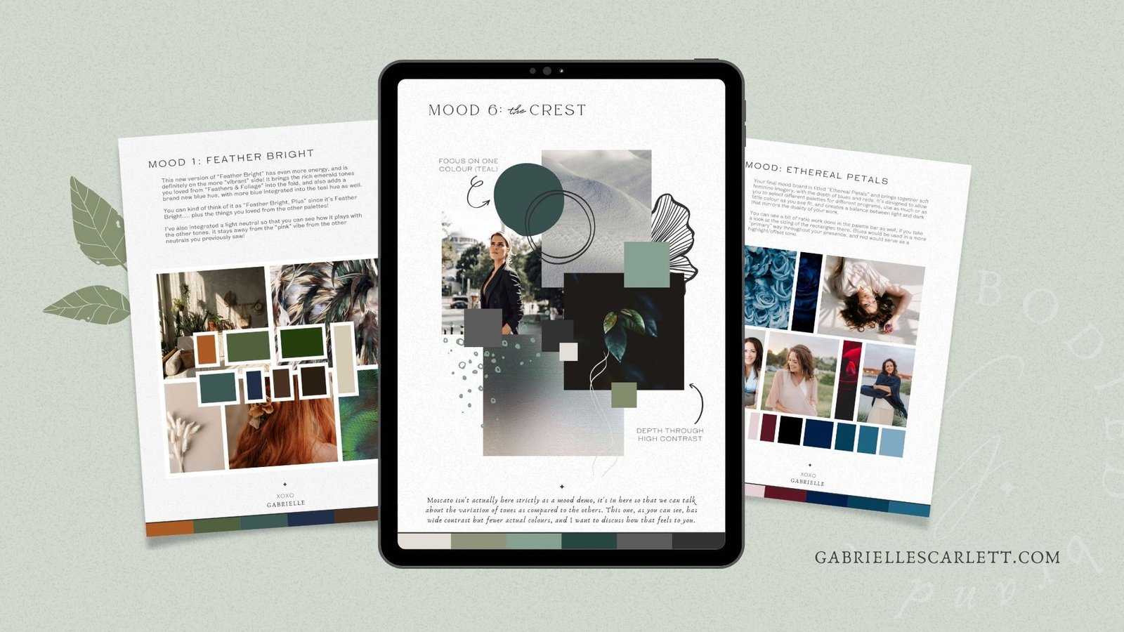
Are you using colour intentionally in your brand?
I could go on and on about each individual hue of the rainbow, and what each one equates to in a colour psychology context – as well as the more nuanced elements of how using a pastel hue versus a gem tone hue changes those meanings and influences in subtle or drastic ways.
But what this really leads us to, is actually a question. Are YOU using colour psychology intentionally in your branding? And if not… is it time to make some changes so that you are? Sometimes, whether you’ve intentionally looked into the psychology of each colour you’re planning to use in your branding or not, your palette comes together to have the exact impact it needs to have anyway.
Are you using your favourite colours in your brand?
That, however, is not always the case! Sometimes, we’re drawn to our favourite colours for our branding, because… well, because we want to love our brands. And that makes perfect sense – it’s important to love the colours (and all aspects of your branding, for that matter) that you use to promote your business on a daily basis. Otherwise it’ll feel like a major slog to do things like creating online content.
As I always tell my clients, it’s all about balance. If you’ve chosen colours that you love, but your brand isn’t having the impact you want it to have, it might be time to examine how you can create more balance between loving your content, and influencing your audience the way you need to for conversion.
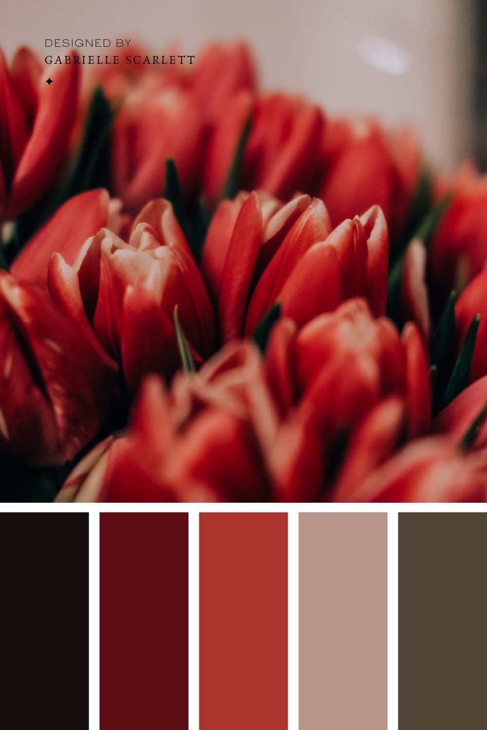
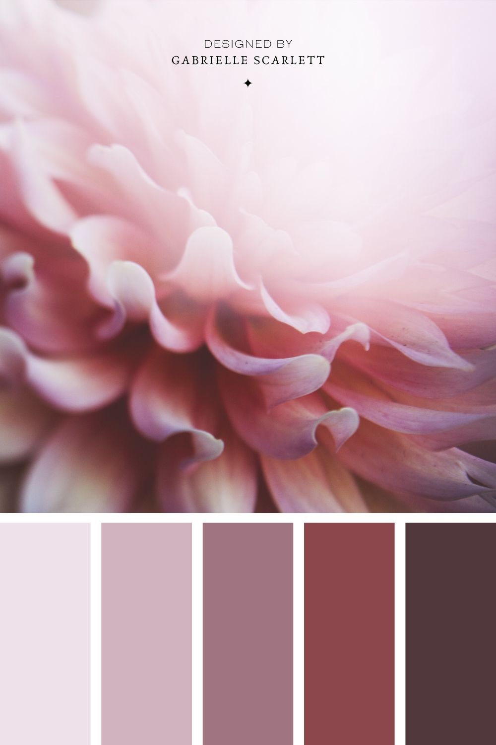

Check out my colour guides for more inspo, and details on specific colours!
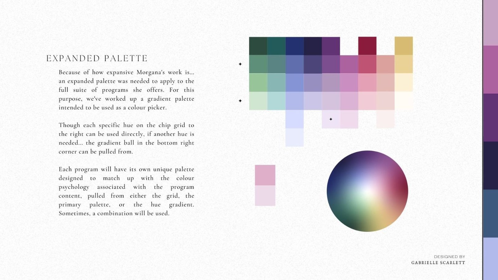
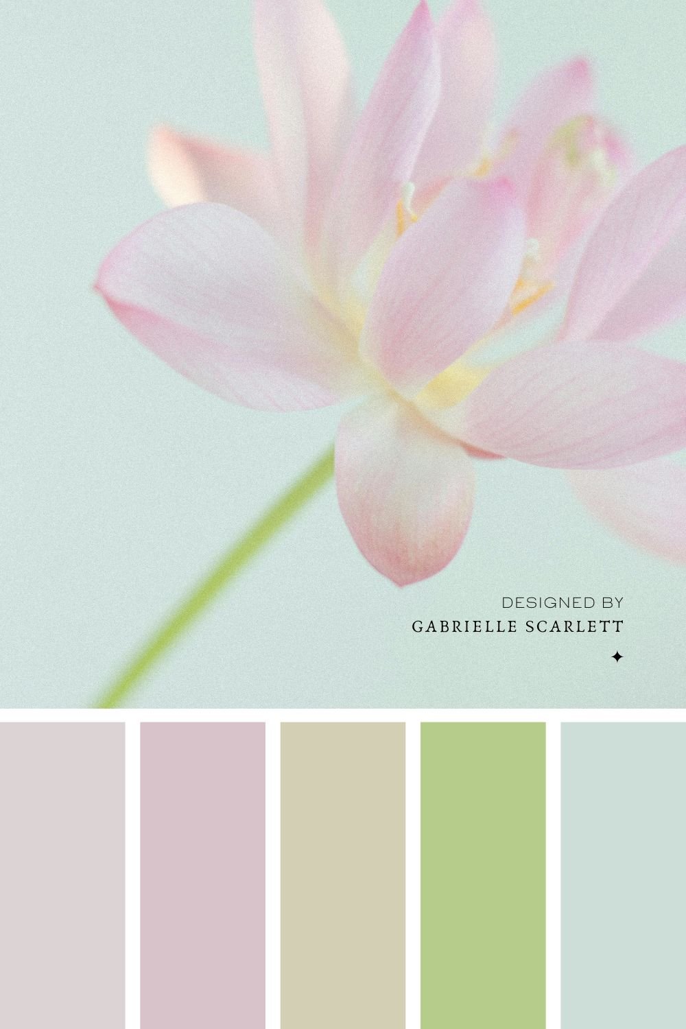
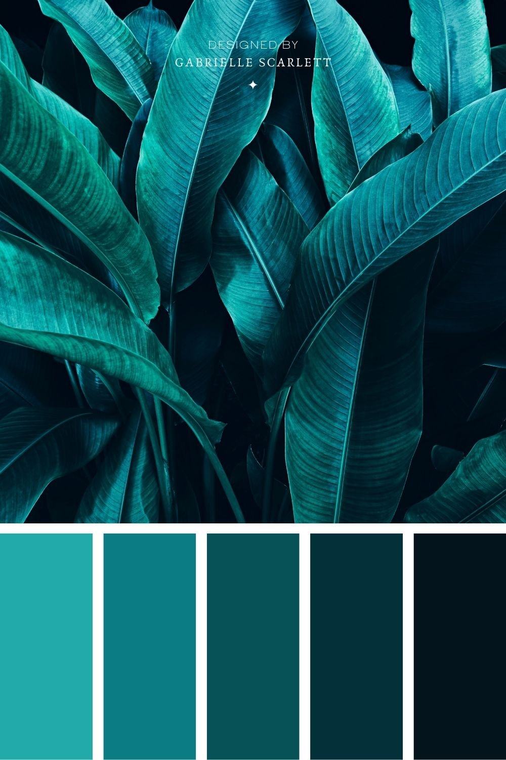
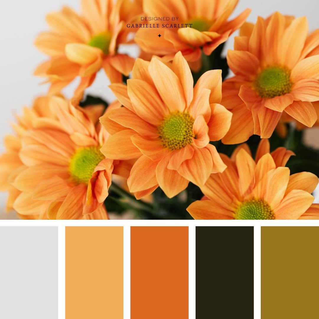
If you’re looking for more details on the colour psychology of individual hues, you’re thinking about shaking up your branding, or you just want some inspiration for colour palettes for an upcoming project… I have some palette inspiration posts you might want to look through! And of course, if you’re looking for a branding overhaul… we should talk. I’d love to take a look at your existing branding, and see whether there are areas where changes, big or small, could benefit the influence your branding has over your potential customers – all while balancing the fact that YOU have to love it too!!
Colour Psychology Breakdowns for:
Pin Me!





0 Comments