

Businesses largely need the same branding materials
Alright I’m not going to lie to you here, because I don’t like lying in general. When it really, truly comes down to it, most of the time different businesses, whether you’re a photographer, a painter, a yoga instructor, or a dog trainer, need the same branding materials. No matter what you do you’re going to need to promote those things similarly, and that means having things like a logo.
So, again being (possibly too) honest, the title of this post? It might as well be “What Every Business Everywhere Needs in a Branding Package.” But that’s not as Google-friendly, and it also doesn’t let me talk about how each of these things relate to photographers specifically.
Your branding package should be designed to meet your needs
Now I know I basically JUST told you that every business largely needs the same materials – but when I say that, I mean it at a BASELINE level. Like, every business should have a colour palette, a logo, etc. That’s not rocket science, you already know that. But every business will need tweaks and customizations to the things included in their package. Like, if you have a studio, then you’re going to need materials that are PHYSICAL, not just digital assets.
Not every business needs a primary logo AND a logo variation. Sometimes, it’s totally reasonable to keep the package more minimal, because as much as I love the idea of making ALL the things for ALL the people – if you don’t need it… you don’t need it.
Branding for Photographers should include, in my opinion:
When it comes specifically to branding for photographers, there are a few recommendations I ALWAYS think should be included in your professionally designed assets!
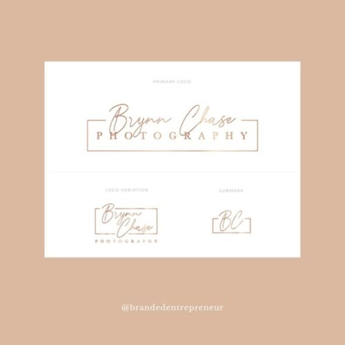
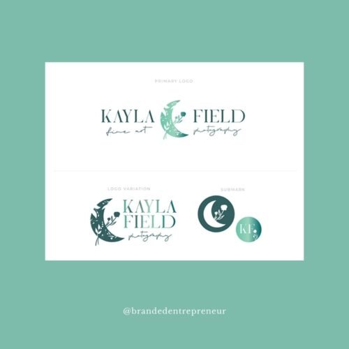
1 – Primary Logo + Optional Logo Variation
First of all, there’s your primary logo. Now, this doesn’t have to be endlessly complex. And honestly, for a lot of creative studios/creative professionals, a wordmark (logo featuring ONLY typography) is the right choice! Simplicity can get you VERY far, and while it’s easy to WANT a complex logo with detailed illustration and multiple formats… it’s not right for everyone. This is especially true if you’re not going to need printed materials, or large scale signage, or items of that nature that have size restrictions/guidelines to work within.
That being said, if you ARE going to need/want to have multiple formats, (long + stacked, for example) then it’s best to make sure your branding package will include both a primary logo, and a logo variation – and possibly, even more!

2 – Submark + Icon
Submarks and icons are sometimes a grey area, because there’s a lot of overlap between their uses, and some designers consider them the same overall. The distinction is nuanced, and sometimes not entirely clear. But largely, we can consider a submark the version of your logo, that fits well into your Instagram profile photo. It’s usually round or square, sometimes doesn’t include the full description of your business (that is usually included in your primary/secondary mark(s)) and it’s overall a bit simpler. Sometimes, this can ALSO serve as your icon!
The difference, is the Icon version is EVEN simpler. It is the smallest, simplest item in your suite, and usually, we want the Icon to be distinct and recognizable at a size of just a quarter inch. You know the little icons up in the edge of Chrome window tabs? THOSE are what I mean when I say Icon.
You’re going to need at LEAST a submark, if not both! Though sometimes, your submark can serve as an icon anyway, and you’ll get two-for-one on that component.

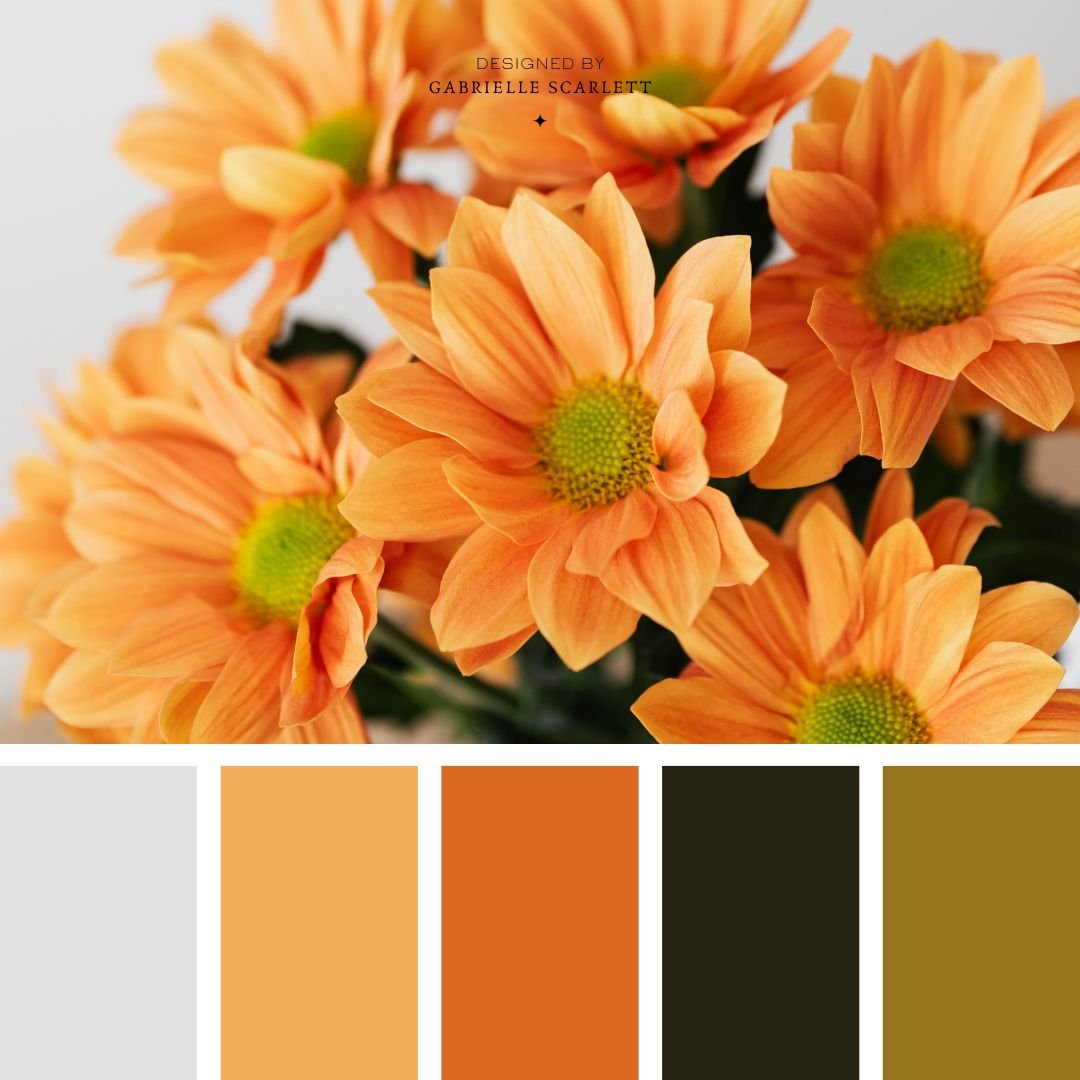
3 – Colour Palette
Colour palettes are the BEST, first of all, but second, they’re absolutely a component you’re going to need in your branding package if you’re a photographer or creative. They’re essential. And for you and what you do, it’s going to need to be built specifically with your work and your style in mind! We have to always remember when we’re making colour palettes for creatives, that your branding is an extension of your portfolio. If it’s not aligned with the tone you tend to lean toward in your work, then your photos or art or products aren’t going to look natural when they’re on your website. That will automatically decrease the perceived quality of your work, not because it’s not amazing – but because something just straight up looks “off” to people when they check you out online/on your social profiles.

4 – Font Selections
The last component I say photographers definitely, 100% need in their branding package, is a set of fonts! Now, this also doesn’t need to be uber-complicated. You can have just one font you use, and as long as you use it consistently, you’ll be golden. But most suites include at least a pairing of two, and possibly even a third, artistic or calligraphic script to add a pop of attitude/elegance to things.
These are usually derived from your logo materials – as in, your designer will create your logos FIRST, capture the tone, and then that will naturally select your fonts for you.
Then OPTIONALLY, branding packages for photographers could include…
For photographers, the four items above are pretty much the baseline that you’ll ABSOLUTELY need in your branding package, but there are optional items that help in specific situations, that you should totally think about when you select a branding designer to work with – or when you’re DIYing your own branding! Some of them are just… honestly super fun. But others are a way to bring a little more oomph to your presence, and can rocket your content consistency and general vibes above your competition in a heartbeat.

5 – Texture(s) or Pattern(s) or Illustration(s)
I’ve got to admit it was difficult for me to put this item in the optional section of the list, but I was STRONG and I did it. The reality is, not every creative NEEDS to have textures included in their package. It’s just not a requirement. If you’re a coach, or another type of business owner, who DOESN’T have visual content as the baseline of what they do, then there’s a higher likelihood that having textures to use to, for example, break up the backgrounds on your website, and add depth to the content you’re posting on social media, might be visually game-changing.
But when you’re a creative, you already HAVE visuals. Lots of them. And they work together to create a tone all on their own, and should be allowed to speak for themselves. But that being said… including a texture, or pattern, or set of illustrations can bring even more consistency and professionalism to creatives’ branding packages, and will make your online presence feel even more unique. So if you know that your clients have a bit of quirk, or are looking for a specific tone in the website of the pro they’ll hire to do what you do… consider making sure you have custom illustrated assets to give your presence more attitude!

6 – Packaging
As opposed to the idea of textures, I had less difficulty putting packaging materials in the optional section here. That’s because honestly? A lot of photographers just… don’t need it. But that being said, there are reasons it might be essential to how you do what you do, because if you, for example, offer gifts to your wedding clients… packaging makes a HUGE difference! Imagine stuffing your own branded tissue paper into the gift bag you give your next bride and groom. SO COOL, right?? We can create your own custom boxes, tissues, bags, wrapping paper, bottles, packing tape… ask and ye shall receive. But like I said, not EVERY photographer needs these assets! So if you’re not going to use it… let’s not include it in your package.

7 – Print assets, like STICKERS!
Stickers aren’t the only print asset we can make exist for your business, but they’re one of my favorites!! Print materials in branding packages for photographers can include everything from stickers, to thank you cards, to printed product menus, to welcome guides – and some of these items toe the line between “branding package” materials and “design package” materials.
Honestly, the way I draw the line is actually administrative. If you order it when you select and purchase your brand package, they’re brand package materials. If you get them after the fact, they’re a supplemental design component for your branding. That’s mostly because I personally define “branding” as any internal or external communicative component used to promote your business – which is… broad, I’ll admit.
But just like textures and packaging, not all creative business owners (or photographers!) absolutely NEED these items in their branding suite. It might be you need some digital versions of these tools – but print is for specific businesses, with specific situations.
And of course, all branding packages for photographers should create an ECOSYSTEM.
No matter what, all of the materials in your package should work together elegantly to create an ecosystem in which your work feels like it naturally occurs. It’s “natural habitat,” so to speak. Otherwise, you’re going to have that “something is wrong” feeling I was talking about earlier… and so will your prospective clients/customers.
Your print materials, digital materials, core items – they should all be tonally and visually connected, even though the items themselves are intended to serve distinct purposes. Sounds obvious, I know, but especially when you’re DIYing your materials, it’s easy to end up with bits that are disjointed, because you’re trying to aim for “unique” when the aim should be “cohesion”.
Thinking it’s time to update your photography business’ branding?
If DIY isn’t doing it for you, and you’re looking for an upgrade in any/all of the above materials you’re currently using for your business promotion… it might be time for us to talk! At the time of writing, I’m booking clients for branding packages on an application basis only. But you never know – we might be a perfect fit! And I would love to be the design professional who helps your creative work shine.


0 Comments