DIY Design can be a hot mess, even with all the tools available to you
There are about a million tools out there now to help you with the process of DIY design – up to and including tools that will just… use a prompt to make the thing you wanted (or something vaguely close to it). But even with all of those tools, creating DIY content for your brand can be a hot mess. Yes, even if you’re using AI to do it. I mean… I don’t personally use a any AI in my business processes (or personal processes) because I don’t agree with the carbon footprint additions at the moment, not to mention the ethical use of people’s IP. But when it comes to prompting AI systems to make your content, I’m sure you’ve been in the position, if you DO use it, of prompting, and tweaking, and prompting, and tweaking… when really it might have just been easier for you to do it yourself.
But AI isn’t the point here – the point, is creating the design content for your business yourself isn’t easy, especially if you’re not a designer. But… sometimes it’s the only real option. So, how do you deal with this problem?
Templates sometimes feel flat, and not exactly like what you’re going for.
Templates (on platforms like Canva) are a great option, that keep you away from the moral quandaries of using AI, and also help support an industry that designers are trying to keep alive in this new era. But when you’re using templates… sometimes you can end up with something that feels flat, or wrong, or just… not exactly what you were going for, once you’re done making your edits.
And on the far end of that, you may even end up with something that LOOKS wrong, even if you can’t really identify why, after you’ve made your edits. The good thing, is when you’re making changes to templates to match your branding, you can focus on a few simple themes, that will help keep your designs engaging, and prevent that “wrong” feeling when you (and your audience!) are looking at your content after the fact.
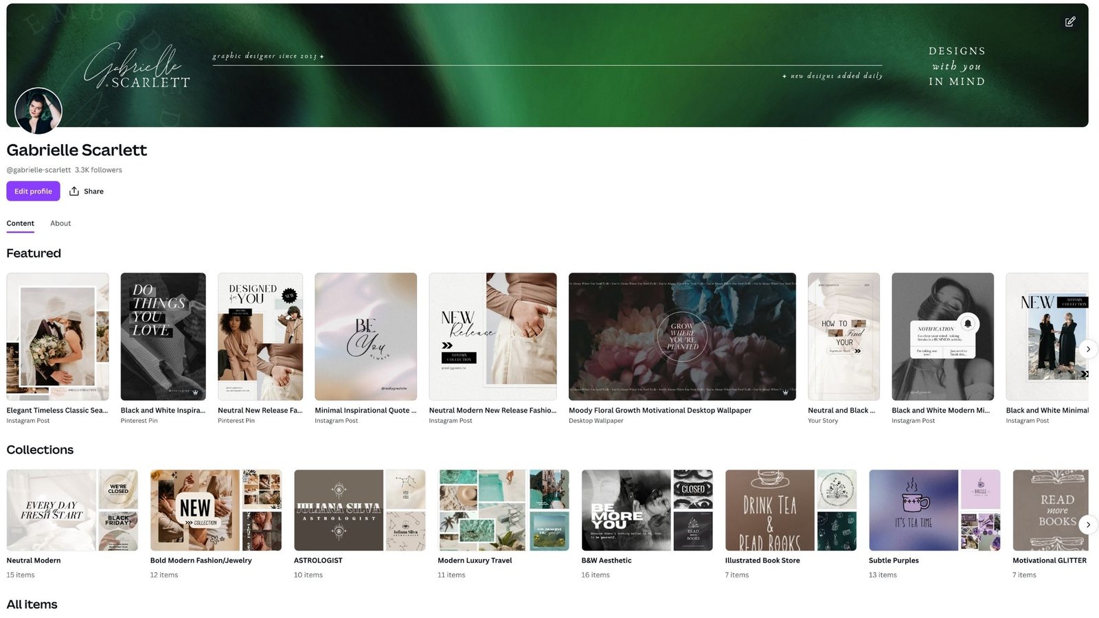
Changing your templates means making ENGAGING DIY changes
Using design templates correctly means making enough changes that they feel like they’re yours, without shifting them so much that they’re no longer aligning to standard design rules. And like we’ve talked about before… there are some rules you really shouldn’t break. Not because “they’re a rule” – but because they’re rules for a reason, and the reasons impact the way that your audience will see your content. Miss paying attention to these, and your content will feel a bit haphazard – something will seem “wrong” to your audience, but they might not be able to identify what specifically, or why.
So paying attention to these, will help ensure you create engaging DIY content, that will bring clients to your brand!
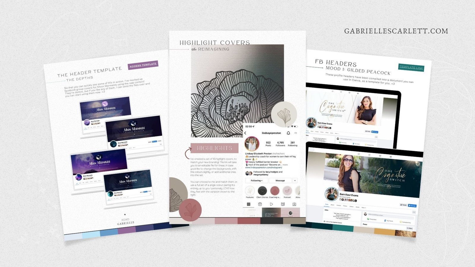
1 – Pay attention to spacing
When you’re making adjustments to templates for your brand, think about spacing. More specifically, think about spacing things EVENLY. It can feel easier, and faster, not to double check that the things you intend to have centred are actually centred, or to check that the items you want left aligned are actually left aligned. But if you don’t check it, and that content goes live, people are absolutely going to notice that the design elements aren’t laid out quite right, even if it’s one of those situations where they can’t pinpoint why. So pay attention to spacing, as well as visual overwhelm – gotta leverage that negative space, babes!
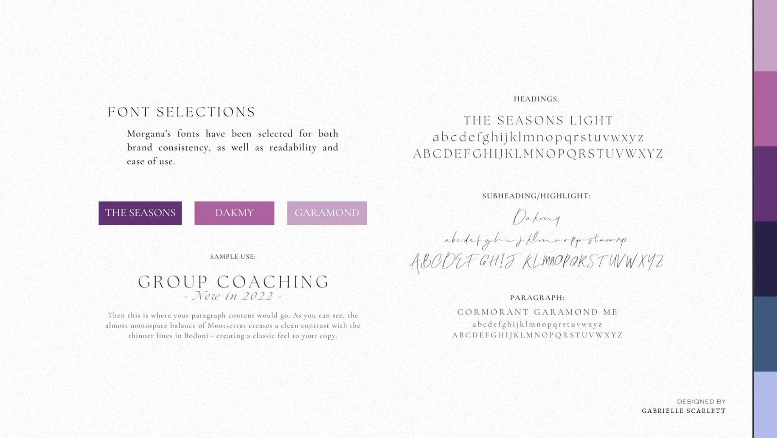
2 – Pay attention to hierarchy
We could talk about hierarchy in design for hours and hours and hours and I wouldn’t run out of things to say. In fact, I should probably write an entire post about it because it’s SO important. If you’re not familiar with the term, it refers to how the relative importance of design elements is communicated by their placement, sizing, and overall usage within a layout. This takes into account SO many aspects of your design, from the text, to the elements – and it’s how you guide viewers through your content.
But the good news, is a ton of aspects of hierarchy are baked into templates if you’re using them from somewhere like the Canva library, or something you’ve purchased from a designer online. And the parts that aren’t already baked in… are fairly intuitive! For example, your heading should be the largest text on your design, if it’s a design that includes text. Relatively speaking, the larger items you use will be noticed more quickly, because they’re top of the hierarchy – so… take this into consideration when you’re creating.
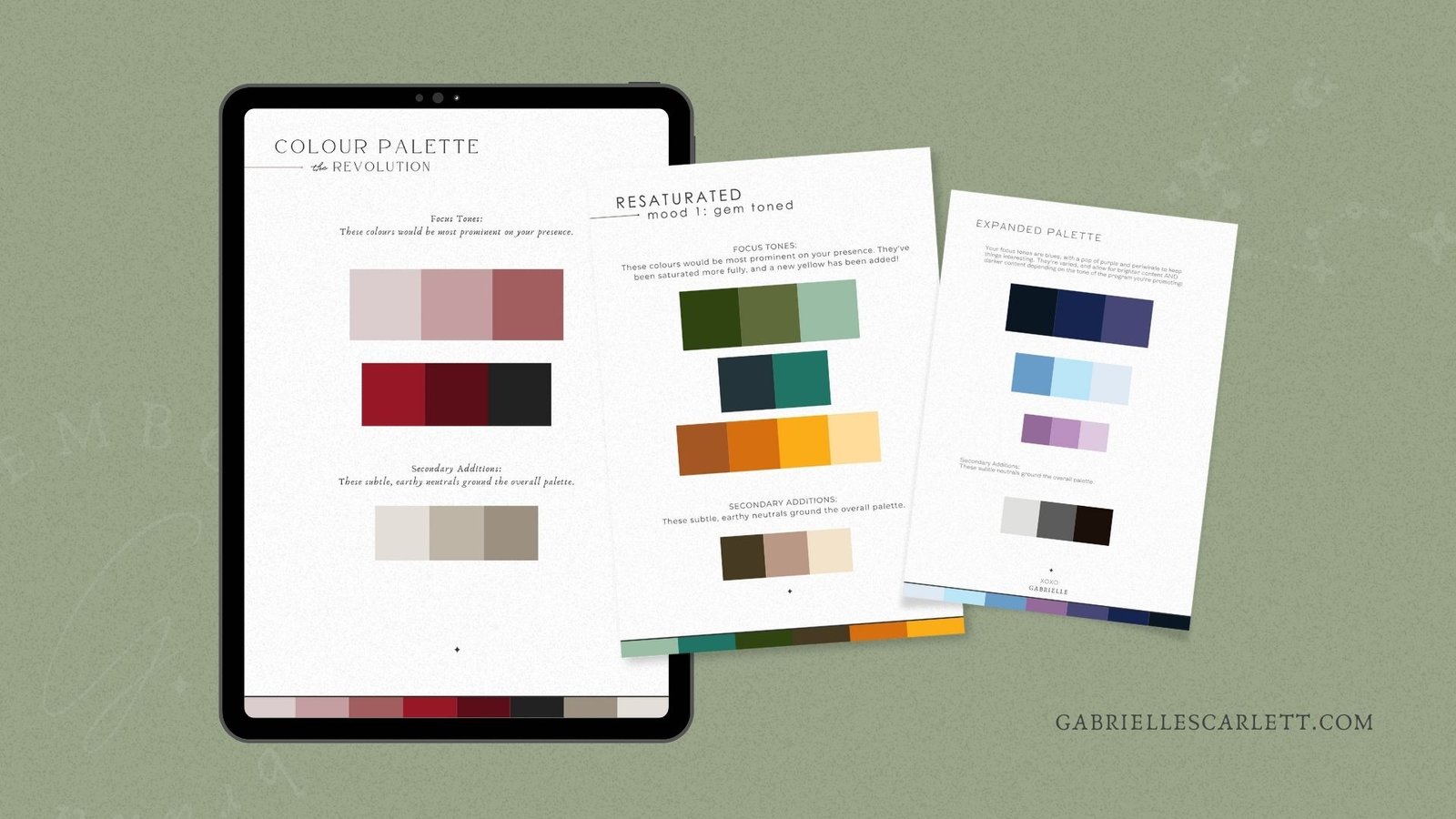
3 – Pay attention to tone
In the branding and design world, tone is king. It’s how you set the mood, and create a little world your people can fall into. Tone refers to the attitudes and emotions communicated through the style of elements you use – and overall? The most important aspect of tone is keeping it consistent, and aligned with the needs and expectations of your ideal clients.
So when you’re selecting elements (like images or illustrations) to use in your designs, consider their tone. What do they communicate? Are you using stock images that have an energetic vibe to them? Or something more low key and calming? What about illustrations? Are you using clean, clear linework art, to accentuate a minimalist aesthetic? Or bringing in a bit more chaos, with sketched linework that highlights the imperfection of being a human? Obviously these aren’t the only options, but… they all contribute to the tone you create in your content. So, choose intentionally, and keep it consistent!
4 – Pay attention to elements
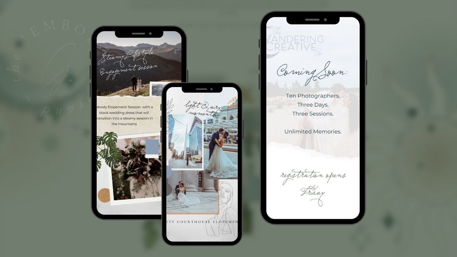
Making sure you’re curating (or creating!) your elements to use in a strategic way is part of tone – and also part of your overall branding like all of these aspects of design. But consistency in your element usage is absolutely key, and it’s why many of my branding design clients come away with illustrations in their packages. It’s just more straightforward to stay consistent if you have a package created just for you!
But if you’re curating them yourself, think about the tone they create through their characteristics. Consider colour use, line weight, style – make sure when you’re choosing elements to add to a design, you’re not just choosing it because you like that one. Think of it as a part of a larger whole, and think about the role that it plays in that whole. Some elements you love… may not be right for your branding. And that’s okay!!
5 – Pay attention to animation
I always mention animation in these lists, because it’s one of those places where it’s really easy to get super chaotic and distract from the point of your content. Keep animation intentional, whether you’re creating designs for somewhere like Instagram stories, or even your website. Animation is fun – I get it. And it feels SO COOL to add slides, and spins, and swipes – but too many of them? It goes from “playful” to “massively unprofessional” really quickly. And I don’t mean in the “I’m being too judgy and I’m just not fun enough to get it” kind of way. I LOVE maximal design. But it’s down to execution, and even in an intentionally maximal design… there IS such a thing as “too much”.
So keep it simple, stick to a few animations with more “pop” and minimal animations for other items – remember, you can also use animation to communicate hierarchy, so consider that when you’re choosing what to animate, and what not to!
If all this isn’t doing it for you, let’s talk about templates that might help!
Hopefully these little reminders help ensure you know where you’re headed when you DIY design content for your brand, and… keep those designs engaging. But if they’re not really doing the trick, then maybe it’s time for some CUSTOM templates, that you don’t have to modify other than inputting images and text! If that’s something you’re looking for… let’s talk. I create custom template suites for my clients all the time, that way they can still be in control of their social content posting schedule, and the specific content that goes up… without having to be the ones who decide what the designs themselves look like! It’s the best of all worlds, and you still get your hands all over your own content.
But if you’re doing the DIY route – best of luck to you! And feel free to reach out if anything here isn’t clear, or you want more details. I’d love to help in any way I can!




0 Comments