Wandering Creative
Skylar had a specific idea for her presence –
One that I was thrilled to bring alive.
Witchy Creatives
Are my FAVOURITE creatives!
I love all of my clients – especially my creative ones. Photographers, artists… those who spend their time making things are near and dear to my heart. But witchy creatives? You guys are basically my dream clients. You merge all of the things that I love, into one magical brand that I get to build for you.
That was the situation for Skylar’s brand. She is a photographer, but she also rents gowns to other photographers, and has a studio space that she rents out for both events, and other professionals. She’s a creative jack-of-all-trades in the BEST possible way, and she needed a presence (and a brand) that spoke to not only her overarching witchy vibes, but also the creative side of what she does.
We wanted to ensure that this presence would be able to grow with her, alongside the offerings that are a part of her work. She came to me with her name already decided, our job became representing that with imagery that flowed naturally from her work.
As with most photographers I work with, her colour palette is a graceful merging of tones that come from her work, along with the mood that she wanted to create! A tad bit bohemian, witchy as hell, with a hint of mystery. BUT, without being dark.
I think we achieved it beautifully, and I’m pretty obsessed with her palette overall.
To bring in more of those witchy vibes I keep waxing eloquent about, I hand drew a bunch of celestial, witchy elements to overlay on her content, which you can see around the edges of her brand board! Not only were these super fun to create, but they’re completely unique to her brand, and help to ensure that she stands out to her ideal clients.
When it came to her logo suite, if you can tell from the full set that was created, I went a little overboard. This sometimes happens, though I do try to reign myself in when I can. For her content, I genuinely could not decide on a secondary mark, so she has a set that will work in different formats, on different content, and in differently sized/ratio spaces for the rest of forever! Some will work well as, for example, leather burning stamps for things like client albums, while others work better in printed or digitally displayed formats.
No matter what, she has a tool that will fit in the space she’s trying to match!
Finally, selecting fonts for Skylar’s presence was a careful balance. I wanted to ensure that we stuck to a luxurious feel, but I also wanted a script font with movement and variation. That’s how we landed on Sudestada, because it has movement, is varied, and looks elegant… but it has a roughness to it that definitely calls back to the witchy tones in her overall branded presence.
But there was more:
Signage, and Socials –
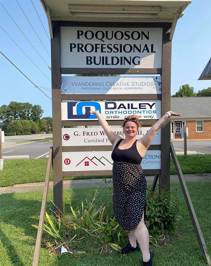
Shortly after we created the branding for Skylar’s business, she ended up opening a physical location! Wandering Creative Studios, as I mentioned, isn’t just a photography studio – it’s also an event space, not just for Skylar, but for other creatives in the Poquoson area. It’s pretty bangin, and the generally badass things that happen there make me wish I wasn’t an ocean away.
But my point is, when she opened the new space, she needed signage! And so we made signage happen. Specifically, the sign you see here!
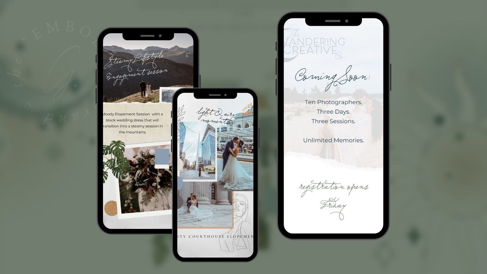
On top of this, Skylar also reached out about some limited social tools, for promotion of a retreat she was hosting. So I popped together a set that was specifically targeted to marketing the styled photoshoots that were a part of that retreat (hence the mood board mockups you see in an IG story style below).
Our final task was Skylar’s Website
And the vibes give me CHILLS every time!
As with some other sites I’ve done case studies on… I don’t have a full before and after for her presence.
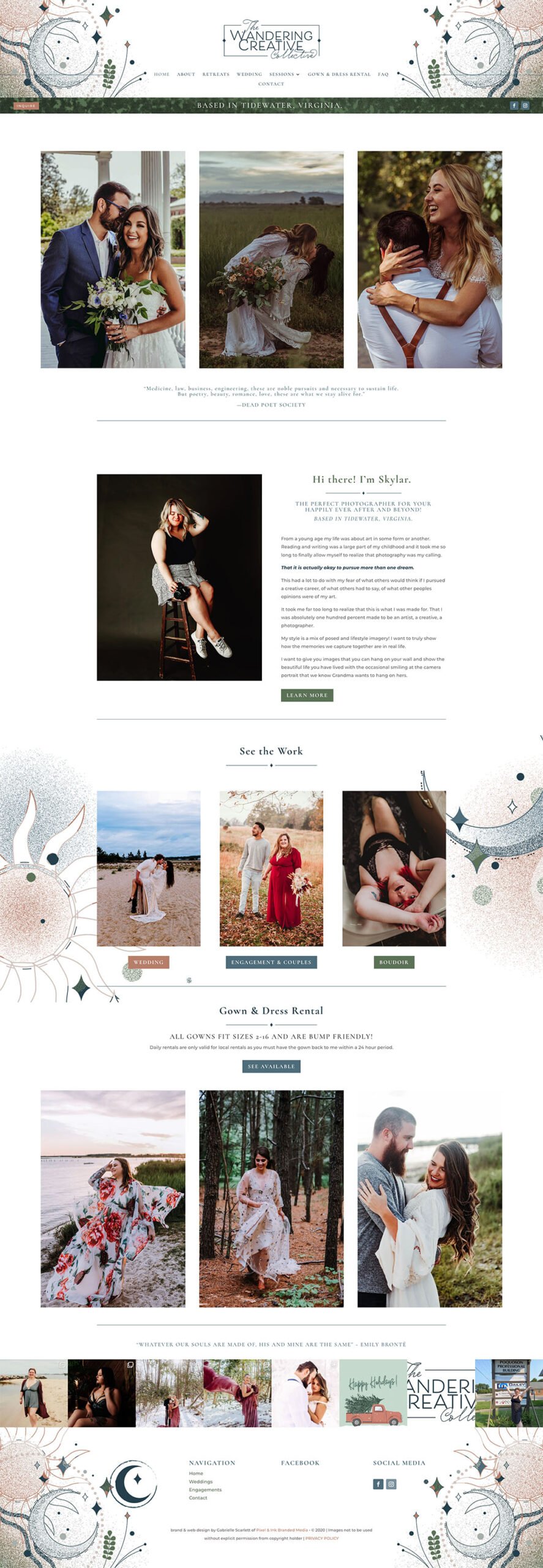
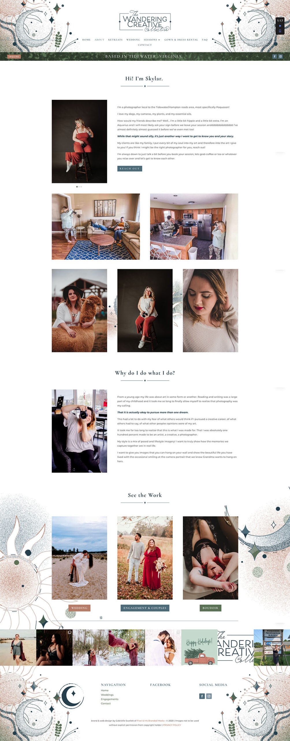
Sometimes I get too excited, and I build things without taking the before shots. I know, I know, it’s terrible. But, at least you can take a look at the finished content, and see the final result! Skylar’s site walks her potential clients through her service suite, who she is, and what her pricing looks like, before it presents them with the option of reaching out. This means that they have an appropriate level of exposure to her service suite, thus pre-qualifying them, before they end up in her inbox!
Branding Design
Your brand should create an ecosystem for your work, no matter what you do. Your business should settle into the expanse of your branding - naturally, like magic. Making client conversion, EASY.
WEB DESIGN
Your website should be a lead generation powerhouse. Your ideal clients? They should feel at home there. This is where we put your brand to work for you.
Information about 1:1 support
Sometimes accountability is key, and having someone over your shoulder, making sure you're taking the steps you need to take is what makes the difference!


