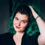
Lindsey Munro
Not only was she in a big transition when it came to her location, but she was also shifting her offerings!
Lindsey wanted to start offering luxury boudoir –
So we reframed her presence with a clear focus.
Building Lindsey’s Brand:
We started with rich, autumnal tones.
When Lindsey reached out to me, she was offering a wide selection of sessions for her clients – but she felt deeply drawn to boudoir photography. I could completely understand why, after I saw her boudoir work. It’s STELLAR, y’all.
But anyway – initially, we had discussed creating two branding suites for her, to target the two different audiences for her work. Sometimes, this is necessary! If you’re going to be targeting different demographics, with different ideal client profiles, you’re naturally going to need separately targeted content for those audiences. Otherwise, you’re not going to be able to draw in the ideal clients you’re targeting for each service, and instead of having a laser focus in your content… you’ll be casting a net that attracts no one instead.
So initially, we approached her two service sets as different audience bases, after going through the Embodied Brand© process for her services.
Over time, as her service suite developed, we realized that her goals aligned more clearly with offering luxury boudoir as her focus, with the option for clients to book other types of sessions. But those sessions wouldn’t be her overall focus. And once I had samples of her boudoir work to play with, it crystalized for the both of us that we could actually use a single, unified, overarching brand suite for her business! I was of course thrilled, because the more cohesive you can be with your content, the better.
We decided that within that brand suite, we could create a set of logos targeted specifically to boudoir clients, and a set for her more overarching photography sessions.
The autumnal colour set you see in her brand was originally derived from her standard sessions, but because of the consistency of her work, those tones are also predominant in her boudoir work as well! She has a warm, moody vibe to all of her sessions that is absolutely to DIE for, so we wanted that to be front and center in the colour palette selection to create an ecosystem for her work on her web presence and beyond.
The symbol included in her logo suite was another super fun tidbit to design! It’s a call back to her heritage, and adds a personal, sweet touch to her printed content. It also allows for size variation (if you follow me, you know about the “BIG, Small, smaller” rule) within her logo sets.
The symbol also serves as an elegant touch on her website, as you can see if you go check out the link! It’s been worked into the backgrounds, overlaid with her photos, and is overall used to visually break up the content and ensure that her site has a luxurious, streamlined vibe… with just enough chaos and imperfection to humanize her work.
After we completed her brand suite, we moved on to implementation on the site, and other social tools included in her package!

The Social Implementations:
Her VIP Group Needed Some Love –
Many photographers and other professionals have VIP groups to share information about their services, and otherwise communicate with their clientele. Lindsey has a group like this! Of course, with the rebrand, we needed to get that content updated to match her new vibe. So, we created a set of covers for the group that she can use, to ensure that whether her visitors are there on mobile, or desktop, they’re still going to see the relevant information in the header image.

But that wasn’t all:
She needed Business Cards!
Business cards are like the bite sized version of your brand. They fit in the palm of your hand, and need to set the tone for your presence and all of your content in a single glance. And that’s exactly what the business cards we developed for Lindsey do! We actually ended up creating two versions – one for her to use with her boudoir clients, and another for her to use to promote her individual sessions that aren’t in the boudoir niche. Both, however, have a similar vibe. The version for her boudoir sessions is deeper; moodier. It leans into the luxurious textures associated with her brand. Both of them, use an exceptionally luxurious copper printed foil texture, from my favourite foiled card vendor! They create INCREDIBLE works of art with printed foil, and Lindsey’s cards EXCEEDED my expectations once they were delivered.

Our final task was Lindsey’s Website
And I’m thrilled with the outcome!
Her new site pages speak for themselves!
In truth, there are two websites for her presence. One that focuses on Boudoir, and one that focuses on her other session offerings. However… I’m pretty fucking obsessed with the boudoir version of the website. The overall mood is AMAZING, and it not only highlights her work, but it also walks her potential clients through a client journey that makes practical sense. They move through being introduced to her work, and her values, before being shown contact options to actually reach out to book with Lindsey!


Branding Design
Your brand should create an ecosystem for your work, no matter what you do. Your business should settle into the expanse of your branding - naturally, like magic. Making client conversion, EASY.
WEB DESIGN
Your website should be a lead generation powerhouse. Your ideal clients? They should feel at home there. This is where we put your brand to work for you.
Information about 1:1 support
Sometimes accountability is key, and having someone over your shoulder, making sure you're taking the steps you need to take is what makes the difference!